Unlock a world of possibilities! Login now and discover the exclusive benefits awaiting you.
- Qlik Community
- :
- Forums
- :
- Analytics & AI
- :
- Products & Topics
- :
- App Development
- :
- Re: Pie chart: Creating two fields - Group with ma...
- Subscribe to RSS Feed
- Mark Topic as New
- Mark Topic as Read
- Float this Topic for Current User
- Bookmark
- Subscribe
- Mute
- Printer Friendly Page
- Mark as New
- Bookmark
- Subscribe
- Mute
- Subscribe to RSS Feed
- Permalink
- Report Inappropriate Content
Pie chart: Creating two fields - Group with max group sum and sum of all other groups
Hi all 
I have data that looks like the following:
| Group | Amount |
| Group 1 | 1 |
| Group 1 | 2 |
| Group 1 | 3 |
| Group 2 | 2 |
| Group 2 | 3 |
| Group 3 | 1 |
| Group 3 | 2 |
| Group 3 | 3 |
| Group 3 | 1 |
I am wanting to create a pie chart (as a KPI) that shows the sum of all amounts for the max group compared to the sum of the rest of the groups added together - obviously the 'max group' will change when more data gets added to the data set so the pie chart needs to be fluid.
The way I am wanting to get the data to graph looks like this:
| Group | Amount |
| Group 3 | 7 |
| Other | 11 |
The pie would look something like this (Where the orange is the added amounts for all other groups and the grey is the added amounts for the group that has the max added value amounts for it's group)

Accepted Solutions
- Mark as New
- Bookmark
- Subscribe
- Mute
- Subscribe to RSS Feed
- Permalink
- Report Inappropriate Content
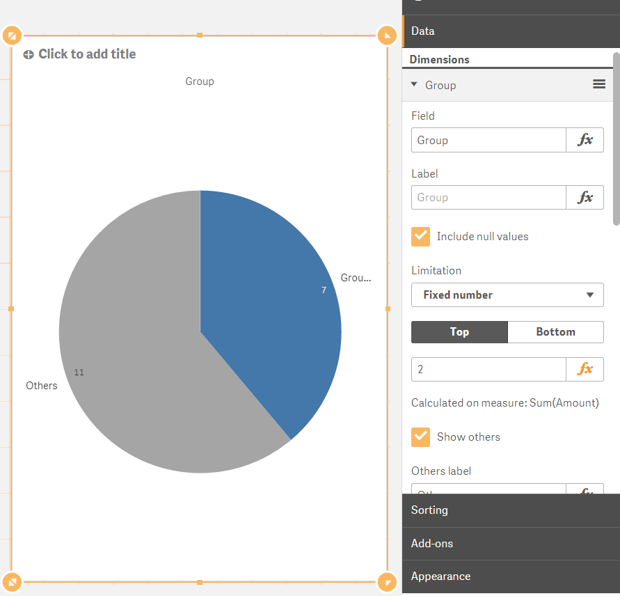
Hello! Do this:
Dimension: Group
Measure: Sum(Amount)
Apply this settings in the Data tab:
- Mark as New
- Bookmark
- Subscribe
- Mute
- Subscribe to RSS Feed
- Permalink
- Report Inappropriate Content
Hello! Do this:
Dimension: Group
Measure: Sum(Amount)
Apply this settings in the Data tab: