Unlock a world of possibilities! Login now and discover the exclusive benefits awaiting you.
- Qlik Community
- :
- Forums
- :
- Analytics & AI
- :
- Products & Topics
- :
- App Development
- :
- Remove zero values from maps
- Subscribe to RSS Feed
- Mark Topic as New
- Mark Topic as Read
- Float this Topic for Current User
- Bookmark
- Subscribe
- Mute
- Printer Friendly Page
- Mark as New
- Bookmark
- Subscribe
- Mute
- Subscribe to RSS Feed
- Permalink
- Report Inappropriate Content
Remove zero values from maps
Hi there,
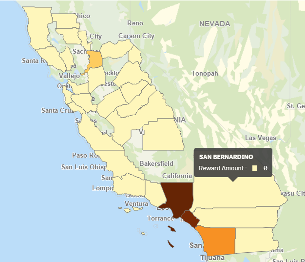
I am using the color by measure feature in a Qlik Sense map chart and I only want to show data that is >0. Unfortunately, Qlik is mapping areas that contain 0 values, making it look like there is data where there isn't. I've tried to change the Range to Custom with the Min at 1 and the Max at Max([Reward Amount]) but it is still showing 0s. These are not NULL values, they are calculated at 0 using an expression (Yes, I've tried un-checking the 'Include null values' box). Is there a way to omit zeros from the maps? This makes the color by measure option virtually useless for mapping calculated data.
I have also tried using an if() statement to only include values >0 but it just grays out the areas with 0s, it doesn't remove them (see 2nd image below).

- « Previous Replies
-
- 1
- 2
- Next Replies »
Accepted Solutions
- Mark as New
- Bookmark
- Subscribe
- Mute
- Subscribe to RSS Feed
- Permalink
- Report Inappropriate Content
In my opinion there is no other way for the dashboard, if you want to have more performance you have to do this calculation via SCRIPT, you have to test the impact, I thought of something quick and simple to help you.
- Mark as New
- Bookmark
- Subscribe
- Mute
- Subscribe to RSS Feed
- Permalink
- Report Inappropriate Content
Hi Shana,
Could you send me your qvf ? Wath version of qliksense ?
- Mark as New
- Bookmark
- Subscribe
- Mute
- Subscribe to RSS Feed
- Permalink
- Report Inappropriate Content
Sure, I'm using Qlik Sense desktop June 2018. I noticed it first in our enterprise instance (April 2018 release) so I decided to play with it on my desktop to see if the June release had any fixes or enhancements. See attached for .qvf.
- Mark as New
- Bookmark
- Subscribe
- Mute
- Subscribe to RSS Feed
- Permalink
- Report Inappropriate Content
I believe this solves your problem.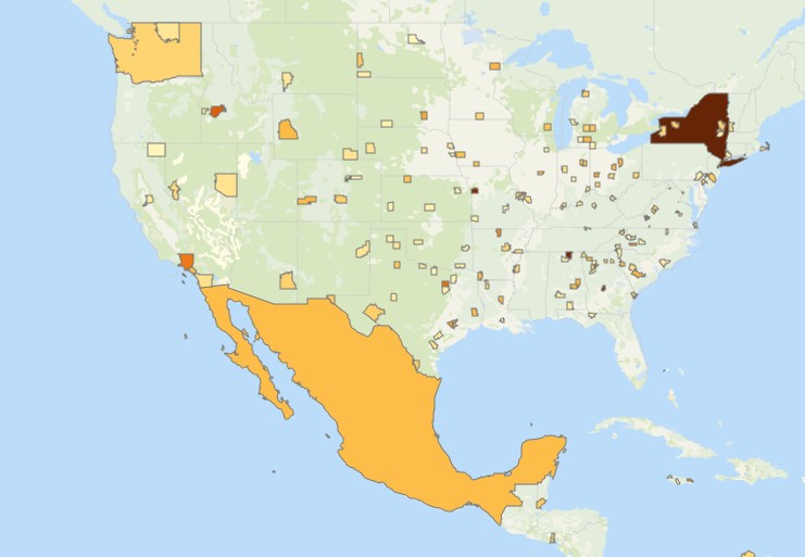
- Mark as New
- Bookmark
- Subscribe
- Mute
- Subscribe to RSS Feed
- Permalink
- Report Inappropriate Content
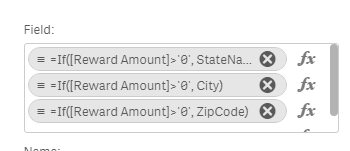
So we have to create a calculated dimension to remove zeros then? How will this impact reloads when we're dealing with millions of rows of data?
- Mark as New
- Bookmark
- Subscribe
- Mute
- Subscribe to RSS Feed
- Permalink
- Report Inappropriate Content
In my opinion there is no other way for the dashboard, if you want to have more performance you have to do this calculation via SCRIPT, you have to test the impact, I thought of something quick and simple to help you.
- Mark as New
- Bookmark
- Subscribe
- Mute
- Subscribe to RSS Feed
- Permalink
- Report Inappropriate Content
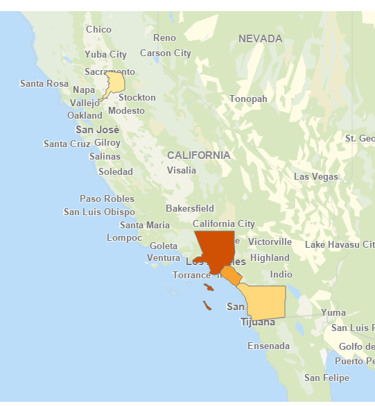
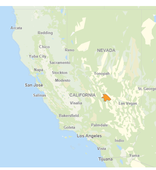
So I implemented this calculated dimension but now there is some data that is not plotting on the map unless I select it elsewhere.
Image 1: Cities showing with State of CA selected. Note Death Valley is not showing on the map.
Image 2: City of Death Valley selected from a table. It now shows up on the map
- Mark as New
- Bookmark
- Subscribe
- Mute
- Subscribe to RSS Feed
- Permalink
- Report Inappropriate Content
I did some testing, this is happening on your initial model, before I even make changes. Are you using a KML to draw cities?
- Mark as New
- Bookmark
- Subscribe
- Mute
- Subscribe to RSS Feed
- Permalink
- Report Inappropriate Content
Hi,
Do it in the script as Pablo mentioned above. If you could share some rows then we could help out with that.
Best,
Ali A
- Mark as New
- Bookmark
- Subscribe
- Mute
- Subscribe to RSS Feed
- Permalink
- Report Inappropriate Content
no, that is the plan for very soon, we just haven't implemented it yet. I figured that would help fill in the areas Qlik isn't finding on it's own. Thanks for the help on this one! I marked your answer above correct.
- « Previous Replies
-
- 1
- 2
- Next Replies »