Unlock a world of possibilities! Login now and discover the exclusive benefits awaiting you.
- Qlik Community
- :
- Forums
- :
- Analytics & AI
- :
- Products & Topics
- :
- App Development
- :
- Rolling Last 24 Months Metric - Line Chart
- Subscribe to RSS Feed
- Mark Topic as New
- Mark Topic as Read
- Float this Topic for Current User
- Bookmark
- Subscribe
- Mute
- Printer Friendly Page
- Mark as New
- Bookmark
- Subscribe
- Mute
- Subscribe to RSS Feed
- Permalink
- Report Inappropriate Content
Rolling Last 24 Months Metric - Line Chart
Hello all!
I'm developing an application to compare my real Demands against my Forecast data.
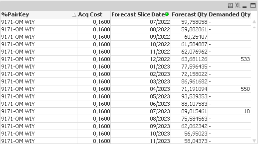
I have a primary key called "%PairKey" that represents a specific material in a specific region. This material has an Acq Cost, and I have a date column called "Forecast Slice Date", that is a month/year info.
Each Forecast Slice Date, for each PairKey, has a Forecast Value and a real Demanded value. Example below:
I calculate my financial accuracy in L24M by making it this way:
Total Forecast (L24M) = Acq Cost * Forecast Qty L24M
Total Demand (L24M) = Acq Cost * Demanded Qty L24M
See how I do it (validated) in my text object:
=

	Num (

		// "1 - " because Deviation is what is calculated, so we define Accuracy as the inverse
		Fabs (1 -

		// Absolute difference between Demanded and Forecast

		Fabs (

			Sum (

				Aggr (

					Sum ( [Forecast Qty] ) * [Acq Cost]

				, [%PairKey] )

			)

			-

			Sum (

				Aggr (

					Sum ( [Demanded Qty] ) * [Acq Cost]

				, [%PairKey] )

			)
		)

		// Divided by Demand (real value that is intended to predict)
		/
		Sum (

				Aggr (

					Sum ( [Demanded Qty] ) * [Acq Cost]

				, [%PairKey] )

			)

	) * 100

	, '#.##0,00')

		& '%'
When I make L24M selections on Forecast Slice Date, it calculates correctly (around 84%).
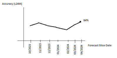
But I want a line chart when, for each month in timeline, it calculates the L24M, like this:
Is there any easy way to do it without changing script?
I've tried, without success, to build a table chart with "Forecast Slice Date" in Dimension and an Expression like that:
=

	Num (

		// "1 - " because Deviation is what is calculated, so we define Accuracy as the inverse
		Fabs (1 -

		// Absolute difference between Demanded and Forecast

		Fabs (

			Sum (

				Aggr (

					Sum ( {< [Forecast Slice Date] = {">$(=AddMonths ( Max ( [Forecast Slice Date] ), -24 ) )"} >} [Forecast Qty] ) * [Acq Cost]

				, [%PairKey] )

			)

			-

			Sum (

				Aggr (

					Sum ( [Demanded Qty] ) * [Acq Cost]

				, [%PairKey] )

			)
		)

		// Divided by Demand (real value that is intended to predict)
		/
		Sum (

				Aggr (

					Sum ( [Demanded Qty] ) * [Acq Cost]

				, [%PairKey] )

			)

	) * 100

	, '#.##0,00')

		& '%'
Any ideas?
Thank you!
- Mark as New
- Bookmark
- Subscribe
- Mute
- Subscribe to RSS Feed
- Permalink
- Report Inappropriate Content
The easiest one is to build grouping calendar. So you link in the grouping calendar MonthYear with all 24 MonthYears which should belong to rolling 24 periods. When you make a selection on one of those you should have 24 months selected in your calendar.
Then you use that as your dimension in the chart.
cheers

