Unlock a world of possibilities! Login now and discover the exclusive benefits awaiting you.
- Qlik Community
- :
- Forums
- :
- Analytics & AI
- :
- Products & Topics
- :
- App Development
- :
- Re: Second Dimension Alters Totals
- Subscribe to RSS Feed
- Mark Topic as New
- Mark Topic as Read
- Float this Topic for Current User
- Bookmark
- Subscribe
- Mute
- Printer Friendly Page
- Mark as New
- Bookmark
- Subscribe
- Mute
- Subscribe to RSS Feed
- Permalink
- Report Inappropriate Content
Second Dimension Alters Totals
Hello All,
I'm hitting a wall on this one... My data set is relatively simple. Yet for some reason, I'm not getting the right totals.
I am only dealing with two fields at this time: a Date/Time field, and an Employee field. I need to graph the number of Conditions ordered over time, with respect to employee. Ideally, Something like this:
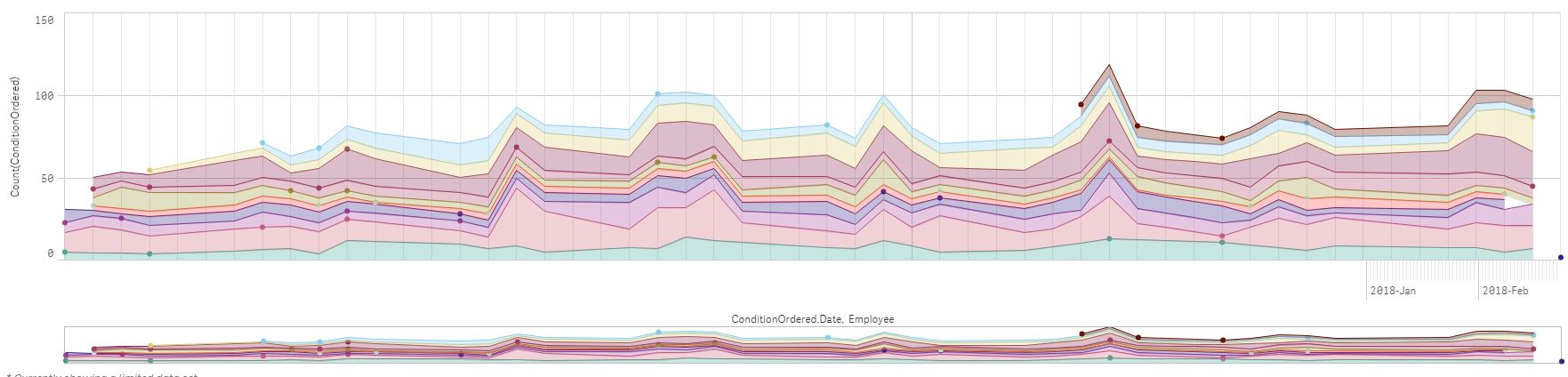
To achieve the graph above, I have used the following setup:
Dimension 1: [ConditionOrdered.autoCalendar.Date]
Dimension 2: Employee
Measure: Count([ConditionOrdered])
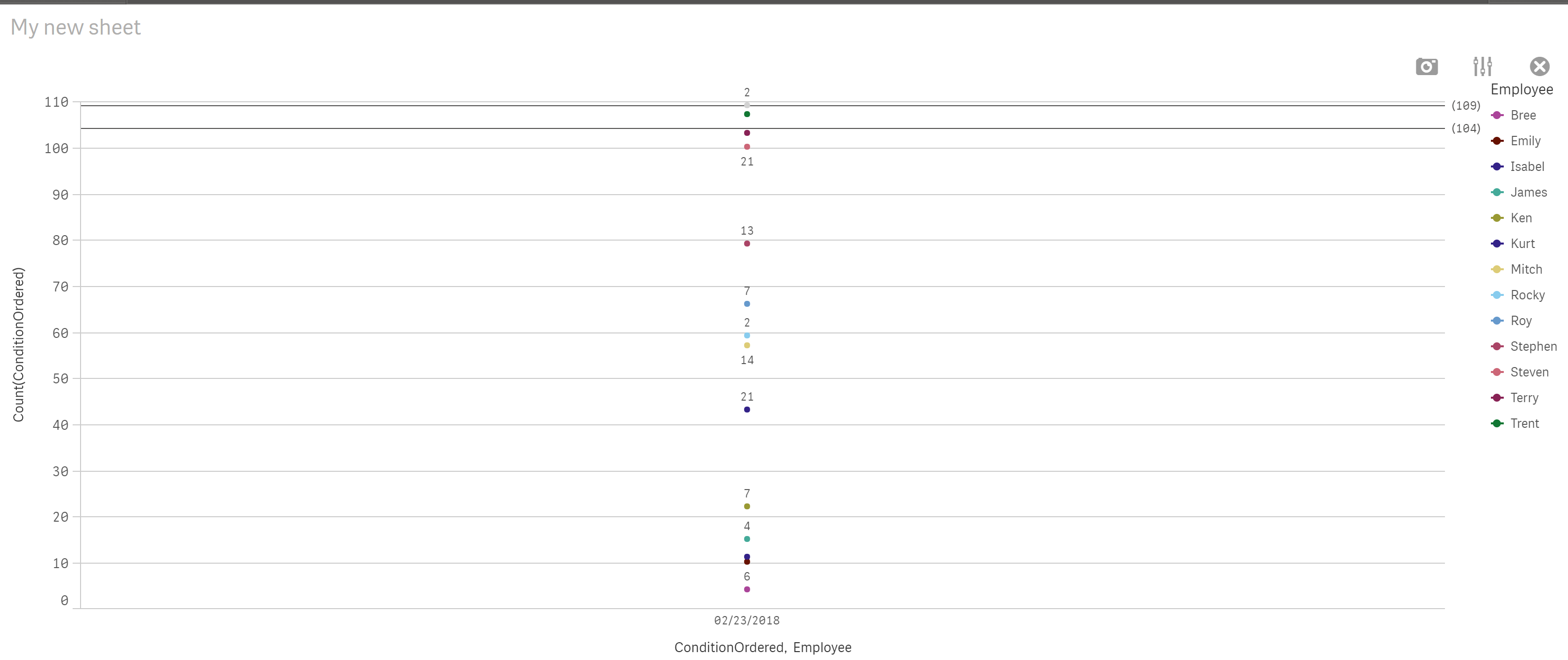
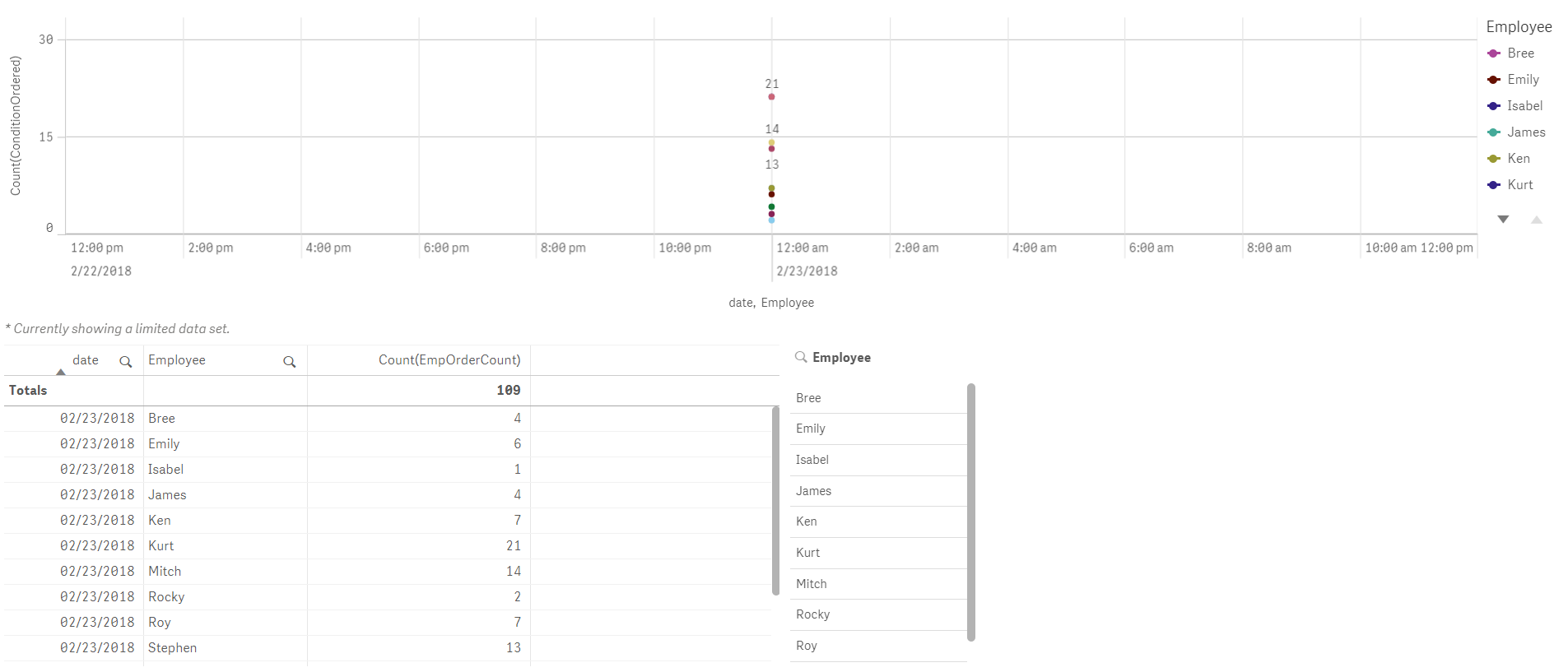
It seems like this should work, but the totals are off from what they should be. As an example, I have attached data from the most recent business day. Without the [Employee] dimension, the graph shows that there were 109 orders made, whereas with the [Employee] dimension, I get a total of 103. It makes sense that the two blanks in the [Employee] field would not be counted, but that does not account for another four that aren't being counted.
Has anyone had a similar issue when including a second dimension? Any ideas for solutions?
Thanks,
Aaron
Accepted Solutions
- Mark as New
- Bookmark
- Subscribe
- Mute
- Subscribe to RSS Feed
- Permalink
- Report Inappropriate Content
When I removed continuous scale from X axis, it started showing 109, also it shows dots for Bree and Isabel for me.
See attached
- Mark as New
- Bookmark
- Subscribe
- Mute
- Subscribe to RSS Feed
- Permalink
- Report Inappropriate Content
It could be a date thing. Are you doing any date conversions?
- Mark as New
- Bookmark
- Subscribe
- Mute
- Subscribe to RSS Feed
- Permalink
- Report Inappropriate Content
The only manipulation that I can see is what Qlik did automatically.
The format in Excel is MM/DD/YYY hh:mm. The data is loaded into Qlik with the timestamp() function and assigned to the autoCalendar.
- Mark as New
- Bookmark
- Subscribe
- Mute
- Subscribe to RSS Feed
- Permalink
- Report Inappropriate Content
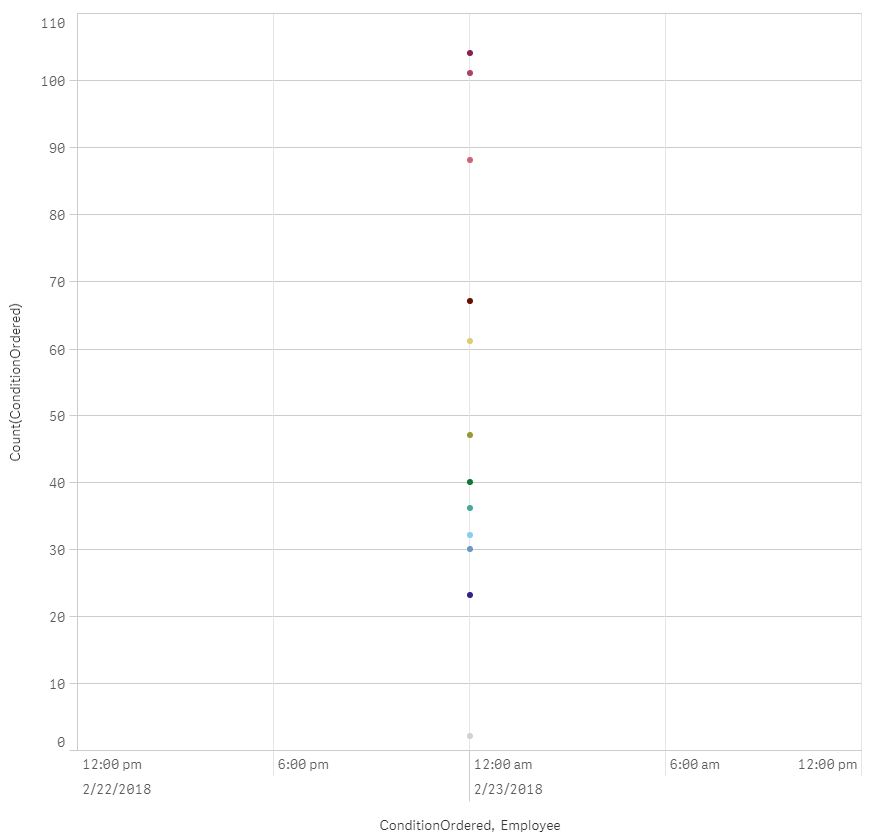
I see the correct total in straight table even with employee dim, I am not sure how did you count total with one day data in line chart. See attached.
- Mark as New
- Bookmark
- Subscribe
- Mute
- Subscribe to RSS Feed
- Permalink
- Report Inappropriate Content
My data set is larger. I just singled out one day to make things simpler.
Yes, the straight table has the correct total. The pivot table does as well. However, if we set the graph that you made to a stacked area graph, it does not have the correct total. This is the same problem that I am facing. (Notice that even with null values included, the stacked total is only 104, where it should be 109.)
- Mark as New
- Bookmark
- Subscribe
- Mute
- Subscribe to RSS Feed
- Permalink
- Report Inappropriate Content
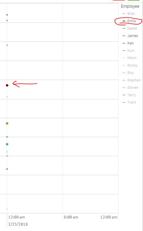
When I select Bree or Isabel from the legend, no dots are highlighted. This would account for the lost 5 orders, but why would they not be included in the graph?
When Bree is selected:

When Emily is selected:
- Mark as New
- Bookmark
- Subscribe
- Mute
- Subscribe to RSS Feed
- Permalink
- Report Inappropriate Content
When I removed continuous scale from X axis, it started showing 109, also it shows dots for Bree and Isabel for me.
See attached
- Mark as New
- Bookmark
- Subscribe
- Mute
- Subscribe to RSS Feed
- Permalink
- Report Inappropriate Content
Check this out.Attached is the qvf.
- Mark as New
- Bookmark
- Subscribe
- Mute
- Subscribe to RSS Feed
- Permalink
- Report Inappropriate Content
Removing the continuous scale did it! Although I still don't understand why... Any ideas?
- Mark as New
- Bookmark
- Subscribe
- Mute
- Subscribe to RSS Feed
- Permalink
- Report Inappropriate Content
Looks like a bug to me as I am not finding any reason of change in total due to some feature but at the same time I don't use continuous scale so cannot be 100% sure.