Unlock a world of possibilities! Login now and discover the exclusive benefits awaiting you.

- Qlik Community
- :
- Forums
- :
- Analytics & AI
- :
- Products & Topics
- :
- App Development
- :
- Set Analysis: Weird Dimension Bug
- Subscribe to RSS Feed
- Mark Topic as New
- Mark Topic as Read
- Float this Topic for Current User
- Bookmark
- Subscribe
- Mute
- Printer Friendly Page

 SonPhan
- Mark as New
- Bookmark
- Subscribe
- Mute
- Subscribe to RSS Feed
- Permalink
- Report Inappropriate Content
Set Analysis: Weird Dimension Bug
Hello Guys,
i have a problem regarding set analysis.
I prepare a simple demo app.
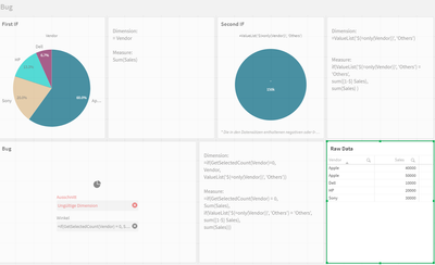
I came across an error, which I do not understand, I think in my eyes I have built everything logically correct.
The third chart should be a pie chart, if the dimension Vendor is selected as a filter, it should take the upper right chart, otherwise the upper left chart.
Hope you guys can help me with my problem!
Thanks a lot .
Son
Accepted Solutions

 GaryGiles
- Mark as New
- Bookmark
- Subscribe
- Mute
- Subscribe to RSS Feed
- Permalink
- Report Inappropriate Content
To get the functionality that you have described in your 3rd chart, use the following expressions:
Dimension:
=aggr({1} if(Only({1<Vendor=P(Vendor)>}Vendor)=Vendor,Vendor,'Other'),Vendor)
Measure:
sum({$<Vendor=>} Sales)
If you select one Vendor, it will present that vendor and group the rest into 'Others'.
Note: If you select 2 Vendors, it will present those 2 vendors and group the rest into 'Others'. I think that gives you more functionality.
GaryGiles
- Mark as New
- Bookmark
- Subscribe
- Mute
- Subscribe to RSS Feed
- Permalink
- Report Inappropriate Content
To get the functionality that you have described in your 3rd chart, use the following expressions:
Dimension:
=aggr({1} if(Only({1<Vendor=P(Vendor)>}Vendor)=Vendor,Vendor,'Other'),Vendor)
Measure:
sum({$<Vendor=>} Sales)
If you select one Vendor, it will present that vendor and group the rest into 'Others'.
Note: If you select 2 Vendors, it will present those 2 vendors and group the rest into 'Others'. I think that gives you more functionality.
SonPhan
- Mark as New
- Bookmark
- Subscribe
- Mute
- Subscribe to RSS Feed
- Permalink
- Report Inappropriate Content
