Unlock a world of possibilities! Login now and discover the exclusive benefits awaiting you.
Announcements
Qlik and ServiceNow Partner to Bring Trusted Enterprise Context into AI-Powered Workflows. Learn More!
- Qlik Community
- :
- Forums
- :
- Analytics & AI
- :
- Products & Topics
- :
- App Development
- :
- Show Flow of Connections between KPI Objects
Options
- Subscribe to RSS Feed
- Mark Topic as New
- Mark Topic as Read
- Float this Topic for Current User
- Bookmark
- Subscribe
- Mute
- Printer Friendly Page
Turn on suggestions
Auto-suggest helps you quickly narrow down your search results by suggesting possible matches as you type.
Showing results for
Contributor
2021-08-11
12:59 PM
- Mark as New
- Bookmark
- Subscribe
- Mute
- Subscribe to RSS Feed
- Permalink
- Report Inappropriate Content
Show Flow of Connections between KPI Objects
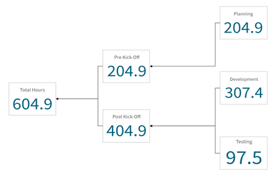
Is there a way to draw arrows or at least plain lines between charts? I'm attempting to make what will look like a complex tree or process flow of KPI objects. The client needs to see the relationship between the objects to clearly tell which metrics feed into another. I haven't been able to find a way to do this without the use of extensions or mashups (client requirement). Simple wireframe of this concept attached for example.

1,246 Views
1 Reply
Partner Ambassador/MVP
2021-08-12
02:37 PM
- Mark as New
- Bookmark
- Subscribe
- Mute
- Subscribe to RSS Feed
- Permalink
- Report Inappropriate Content
You should check the Org chart in Qlik Sense.
Please remember to hit the 'Like' button and for helpful answers and resolutions, click on the 'Accept As Solution' button. Cheers!