Unlock a world of possibilities! Login now and discover the exclusive benefits awaiting you.
- Qlik Community
- :
- Forums
- :
- Analytics
- :
- Topics
- :
- App Development
- :
- Re: Slider: 1 to 10 and > 10
- Subscribe to RSS Feed
- Mark Topic as New
- Mark Topic as Read
- Float this Topic for Current User
- Bookmark
- Subscribe
- Mute
- Printer Friendly Page
- Mark as New
- Bookmark
- Subscribe
- Mute
- Subscribe to RSS Feed
- Permalink
- Report Inappropriate Content
Slider: 1 to 10 and > 10
I have some data where the bulk of it falls into a range but there are a few outliers. The outliers skew the range displayed on the slider.
Is there a way to show a range of, for example, 1 to 10 and then > 10? or something that represents >10?
Accepted Solutions
- Mark as New
- Bookmark
- Subscribe
- Mute
- Subscribe to RSS Feed
- Permalink
- Report Inappropriate Content
There are 2 ways that you can do something like that.
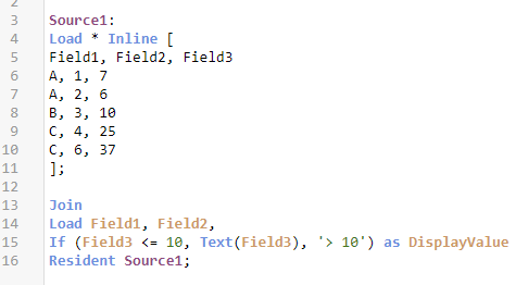
1. Simply add some code in your load script that looks at the values and decides if the Display Value should be the number itself, or it should be lumped into a category. Personally I always like to use the Load Script so that the CPU work needed is only ever done 1 time and any user, at any time can then refer to it in any chart that they create as self-service and charts display faster.
2. The altnernative is to simply use that kind of expression inside the chart for the dimension itself. Notice on the left chart I just used the DisplayValue field from the data while on the right side I used the expression seen in the label and that I changed the text for the group to ensure you realized it was not the DisplayValue from the load script.
2.
- Mark as New
- Bookmark
- Subscribe
- Mute
- Subscribe to RSS Feed
- Permalink
- Report Inappropriate Content
I tried Method 1. It worked nicely. Thank you.

