Unlock a world of possibilities! Login now and discover the exclusive benefits awaiting you.
- Qlik Community
- :
- Forums
- :
- Analytics & AI
- :
- Products & Topics
- :
- App Development
- :
- Stacked area chart forms big downward spikes
- Subscribe to RSS Feed
- Mark Topic as New
- Mark Topic as Read
- Float this Topic for Current User
- Bookmark
- Subscribe
- Mute
- Printer Friendly Page
- Mark as New
- Bookmark
- Subscribe
- Mute
- Subscribe to RSS Feed
- Permalink
- Report Inappropriate Content
Stacked area chart forms big downward spikes
Hi community,
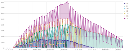
I am trying to stack time series on each others. The problem is that it showes unwanted and in my opinion artificial spikes. Also, they only show up when i choose a continuous scale on the x-axis.
I would like to know how I can possibly get rid of them. I am Using Version February 2020
It lookes like that:
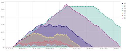
before I do the stacking, the areas look like this:
Many thanks
- Tags:
- line chart
- qlik sense
- Mark as New
- Bookmark
- Subscribe
- Mute
- Subscribe to RSS Feed
- Permalink
- Report Inappropriate Content
Not sure why you are adding MONTHS to some for comparison and YEARS to others for comparison but that could be why some products tail off so much faster than others.
Copy the table and then drag a Simple Table over it and say "Convert to" so that you can check the actual values to see if they are real or not.
Continuous scale is good for showing data over time so that end user doesn't miss periods where the data source might be missing a chunk of values.
- Mark as New
- Bookmark
- Subscribe
- Mute
- Subscribe to RSS Feed
- Permalink
- Report Inappropriate Content
Thanks for your suggestion @Dalton_Ruer .
I found out that the graph is not correct. As soon as I zoom in, or remove the Product, the graph looks normal.
I downloaded the table data and tried it in a new app, but the spikes appear again.
Maybe it is because of the version. (February 2020) I had a similar graph earlier and after we upgraded i suddenly found those spikes in my stacked area graph. If someone wants to try it, the table data is attached.
Cheers
Markus


