Unlock a world of possibilities! Login now and discover the exclusive benefits awaiting you.
Announcements
Qlik and ServiceNow Partner to Bring Trusted Enterprise Context into AI-Powered Workflows. Learn More!
- Qlik Community
- :
- Forums
- :
- Analytics & AI
- :
- Products & Topics
- :
- App Development
- :
- Stacked waterfall graph
Options
- Subscribe to RSS Feed
- Mark Topic as New
- Mark Topic as Read
- Float this Topic for Current User
- Bookmark
- Subscribe
- Mute
- Printer Friendly Page
Turn on suggestions
Auto-suggest helps you quickly narrow down your search results by suggesting possible matches as you type.
Showing results for
Contributor
2024-04-02
03:28 AM
- Mark as New
- Bookmark
- Subscribe
- Mute
- Subscribe to RSS Feed
- Permalink
- Report Inappropriate Content
Stacked waterfall graph
Hey,
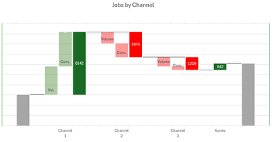
I need to implement a slightly special looking waterfall graph in a dashboard. This has previously been implemented in excel as a POC where we used a stacked bar graph to get it to work (using invisible bars like in this example https://superuser.com/questions/1711738/stacked-waterfall-chart-with-positive-and-negative-values-in...). I dont know where to start, am i likely to need an addon to do this?
Essentially we start with a normal waterfall, of the Job difference v last year by channel. Then i split out these differences to show the effect of our change in volume leads and conversion rate on the jobs.
0 Replies
