Unlock a world of possibilities! Login now and discover the exclusive benefits awaiting you.
- Qlik Community
- :
- Forums
- :
- Analytics & AI
- :
- Products & Topics
- :
- App Development
- :
- Re: Sum of amount after a certain values of a fiel...
- Subscribe to RSS Feed
- Mark Topic as New
- Mark Topic as Read
- Float this Topic for Current User
- Bookmark
- Subscribe
- Mute
- Printer Friendly Page
- Mark as New
- Bookmark
- Subscribe
- Mute
- Subscribe to RSS Feed
- Permalink
- Report Inappropriate Content
Sum of amount after a certain values of a field
Hi All,
I have a below data set
| Name | Profile | sales |
| A | Student | 10 |
| B | Student | 50 |
| C | Student | 60 |
| E | Teacher | 15 |
| D | Teacher | 35 |
| F | Principal | 10 |
| G | Principal | 10 |
| H | Principal | 20 |
| J | Principal | 20 |
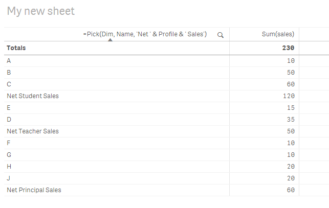
my final chart should display net amounts after certain group . for example , below will be my final chart
| Name | sales |
| A | 10 |
| B | 50 |
| C | 60 |
| Net Student sales | 120 |
| E | 15 |
| D | 35 |
| Net Teacher Sales | 50 |
| F | 10 |
| G | 10 |
| H | 20 |
| J | 20 |
| Net Principal Sales | 60 |
Any extension for this , will also work
- Tags:
- sunny_talwar
Accepted Solutions
- Mark as New
- Bookmark
- Subscribe
- Mute
- Subscribe to RSS Feed
- Permalink
- Report Inappropriate Content
One way to do this is to create an island table like this
Table:
LOAD * INLINE [
    Name, Profile, sales
    A, Student, 10
    B, Student, 50
    C, Student, 60
    E, Teacher, 15
    D, Teacher, 35
    F, Principal, 10
    G, Principal, 10
    H, Principal, 20
    J, Principal, 20
];

Dim:
LOAD * INLINE [
    Dim
    1
    2
];
and then a chart like this
Dimension
=Pick(Dim, Name, 'Net ' & Profile & ' Sales')
Expression
Sum(sales)
- Mark as New
- Bookmark
- Subscribe
- Mute
- Subscribe to RSS Feed
- Permalink
- Report Inappropriate Content
sunny,
How you have sorted the table. for me net value columns are coming at end.
- Mark as New
- Bookmark
- Subscribe
- Mute
- Subscribe to RSS Feed
- Permalink
- Report Inappropriate Content
Sort the dimension using this expression
Match(Only(Profile), 'Student', 'Teacher', 'Principal')
- Mark as New
- Bookmark
- Subscribe
- Mute
- Subscribe to RSS Feed
- Permalink
- Report Inappropriate Content
Have a look here: How-IntervalMatch-Solved-My-Profit-and-Loss-Dilemma if it helps.
- Mark as New
- Bookmark
- Subscribe
- Mute
- Subscribe to RSS Feed
- Permalink
- Report Inappropriate Content
One way to do this is to create an island table like this
Table:
LOAD * INLINE [
    Name, Profile, sales
    A, Student, 10
    B, Student, 50
    C, Student, 60
    E, Teacher, 15
    D, Teacher, 35
    F, Principal, 10
    G, Principal, 10
    H, Principal, 20
    J, Principal, 20
];

Dim:
LOAD * INLINE [
    Dim
    1
    2
];
and then a chart like this
Dimension
=Pick(Dim, Name, 'Net ' & Profile & ' Sales')
Expression
Sum(sales)
- Mark as New
- Bookmark
- Subscribe
- Mute
- Subscribe to RSS Feed
- Permalink
- Report Inappropriate Content
sunny,
How you have sorted the table. for me net value columns are coming at end.
- Mark as New
- Bookmark
- Subscribe
- Mute
- Subscribe to RSS Feed
- Permalink
- Report Inappropriate Content
Sort the dimension using this expression
Match(Only(Profile), 'Student', 'Teacher', 'Principal')
- Mark as New
- Bookmark
- Subscribe
- Mute
- Subscribe to RSS Feed
- Permalink
- Report Inappropriate Content
is there any way to distinguish the Net fields from original fields (by making bold the Net fields or by coloring)
- Mark as New
- Bookmark
- Subscribe
- Mute
- Subscribe to RSS Feed
- Permalink
- Report Inappropriate Content
If(Dim = 2, '<b>')
