Unlock a world of possibilities! Login now and discover the exclusive benefits awaiting you.
- Qlik Community
- :
- Forums
- :
- Analytics & AI
- :
- Products & Topics
- :
- App Development
- :
- Time-aware chart bugs?
- Subscribe to RSS Feed
- Mark Topic as New
- Mark Topic as Read
- Float this Topic for Current User
- Bookmark
- Subscribe
- Mute
- Printer Friendly Page
- Mark as New
- Bookmark
- Subscribe
- Mute
- Subscribe to RSS Feed
- Permalink
- Report Inappropriate Content
Time-aware chart bugs?
Hello,
I am posting these questions again, with an addition, since I have no answer yet. This is in relation to a different post about the same topic:
How to show last datapoint in Time-aware charts
So, I am using time-aware charts to present progress for an ongoing project. The progress is measured by weeks. This means that the customer needs to see intuitive information in the graph and in the tooltip. They allso need to see the latest numbers.
The way time-aware charts work, this seems to be a bit buggy, or I am missing something crucial.
First; The tooltip for any given week shows the first day of the week. This makes it difficult to know if the numbers represent the current week, or the past week (it is the past week). But, still, the graph shows weeknumber of the current week, hence the confusion.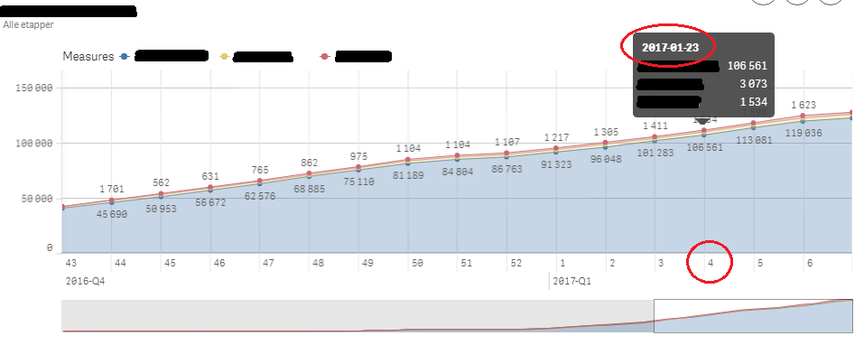
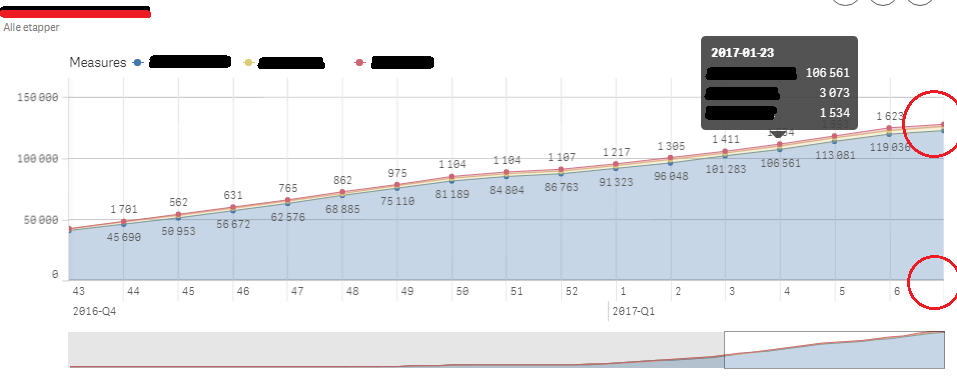
Second; Since this is a time-aware chart, it makes sense to show the last point in the chain
This can be critical in a time-aware chart since the last point is often the current date, or atleast the most recent date and, therefore, most interesting.
Any tips, fixes or pointers are appreciated!
Regards,
Kristian Kirkeng