Unlock a world of possibilities! Login now and discover the exclusive benefits awaiting you.
- Qlik Community
- :
- Forums
- :
- Analytics & AI
- :
- Products & Topics
- :
- App Development
- :
- Re: Time value labels on area chart x-axis
- Subscribe to RSS Feed
- Mark Topic as New
- Mark Topic as Read
- Float this Topic for Current User
- Bookmark
- Subscribe
- Mute
- Printer Friendly Page
- Mark as New
- Bookmark
- Subscribe
- Mute
- Subscribe to RSS Feed
- Permalink
- Report Inappropriate Content
Time value labels on area chart x-axis
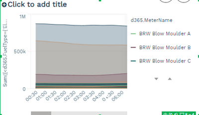
I'm trying to format the following area chart so that the full range of time values displayed on the x-axis show (half hourly; 48 readings). I can achieve this when I expand the chart, but unfortunately I need it to be minimised to fit alongside other graphs on my sheet. Is there a way to force the appearance settings to show the full range from start to end? I.e. no x-direction scrollbar?
TIA, Ben
- Mark as New
- Bookmark
- Subscribe
- Mute
- Subscribe to RSS Feed
- Permalink
- Report Inappropriate Content
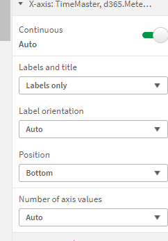
You can try setting the number of axis values to max but you might still find it affected by the limited space the object has been afforded to scale in.
- Mark as New
- Bookmark
- Subscribe
- Mute
- Subscribe to RSS Feed
- Permalink
- Report Inappropriate Content
Yes, already tried this. Unfortunately max doesn't fix the issue
Thanks,
Ben
- Mark as New
- Bookmark
- Subscribe
- Mute
- Subscribe to RSS Feed
- Permalink
- Report Inappropriate Content
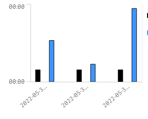
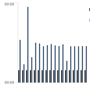
On non SaaS with fewer values than your case, though in a bar chart, mine does respond within the restricted space but also loses showing of the values, it may be that with more values as you have, there's a scaling limit being applied to maintain some sort of readability. They can be tweaked to a point with label orientation but still hit a limit based on the sizing.
Auto
Max


