Unlock a world of possibilities! Login now and discover the exclusive benefits awaiting you.
- Qlik Community
- :
- Forums
- :
- Analytics & AI
- :
- Products & Topics
- :
- App Development
- :
- Two themes, one dashboard?
- Subscribe to RSS Feed
- Mark Topic as New
- Mark Topic as Read
- Float this Topic for Current User
- Bookmark
- Subscribe
- Mute
- Printer Friendly Page
- Mark as New
- Bookmark
- Subscribe
- Mute
- Subscribe to RSS Feed
- Permalink
- Report Inappropriate Content
Two themes, one dashboard?
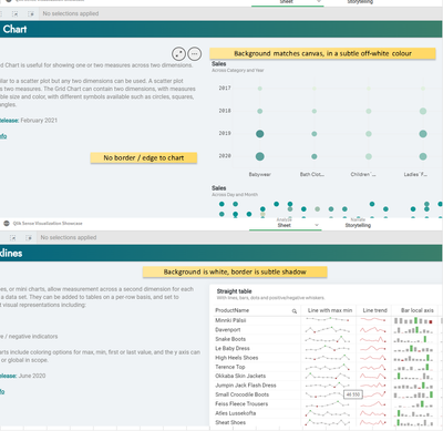
Not sure where else to post, but simple question ( I hope ) - Is this a theme / style we can use?
I was looking through the latest releases from August 21 and noticed what appears to be a new , more subtle styling to elements.
What really caught my attention was that some chart elements appeared to blend seamlessly into the background, other elements had a bright background / subtle drop-shadow,
This really makes the page MUCH cleaner and much more modern that other themes.
The question is, can we use it in our own apps yet, or is this further down the line for user implementation?
- Mark as New
- Bookmark
- Subscribe
- Mute
- Subscribe to RSS Feed
- Permalink
- Report Inappropriate Content
Has anyone figured this out? Is it just a case of removing all styles from table elements ?
- Mark as New
- Bookmark
- Subscribe
- Mute
- Subscribe to RSS Feed
- Permalink
- Report Inappropriate Content
This can be done by editing your theme.
this requires some .css know-how.
To make the your apps look seemless, just match the colir of the sheet background and the object backgronds.
the sheet background can be edited in the theme.css using:
.qvt-sheet {background: #ffffff !important;}
the object backgorund is defined in the theme.json (in most themes it is defined in a variable block:
  "_variables": {
    "@TitleSize": "16px",
    "@SubtitleSize": "15px",
    "@TextSize": "12px",
    "@FooterSize": "10px",
    "@TitleColor": "#555555",
    "@SubtitleColor": "#555555",
    "@TextColor": "#555555",
    "@FooterColor": "#555555",
    "@BackgroundColor": "#ffffff",
    "@AxisMajorColor": "#dad7cc",
    "@AxisMinorColor": "#dad7cc"
Hope, this is helpfull for you.
- Mark as New
- Bookmark
- Subscribe
- Mute
- Subscribe to RSS Feed
- Permalink
- Report Inappropriate Content
Thanks @chris_djih - yeah I've been experimenting with themes a bit ( see another thread about doing a dark theme ) - I guess the challenge is more that just the JSON / CSS , since it appears to be context sensitive.
I.E. In themes, you can set 'title' colour etc, but as far as I can see, you can't see title color for table specifically.
I'd be really curious to see if Qlik publish the method through which this was done 😄
- Mark as New
- Bookmark
- Subscribe
- Mute
- Subscribe to RSS Feed
- Permalink
- Report Inappropriate Content
Yeah unfortunatley it is quite unconfortable to build your own theme since some of the settings are done in the json and some in css. But in my experience you start best by donwload an existing theme (https://sensetheme.com/gallery) that resembles your desired outcome and then start customizing this.
For Darkmode you may have a look on these extension: https://developer.qlik.com/garden/5d371fc3356cb50019d90dc7
The .css from this extensions gave me much enlgihtment on which objects i need to customize.
Any way there are some well written guides out there, like this one: https://www.clearpeaks.com/qlik-sense-custom-themes/
