Unlock a world of possibilities! Login now and discover the exclusive benefits awaiting you.
- Qlik Community
- :
- Forums
- :
- Analytics & AI
- :
- Products & Topics
- :
- App Development
- :
- Re: stacked bar charts
- Subscribe to RSS Feed
- Mark Topic as New
- Mark Topic as Read
- Float this Topic for Current User
- Bookmark
- Subscribe
- Mute
- Printer Friendly Page
- Mark as New
- Bookmark
- Subscribe
- Mute
- Subscribe to RSS Feed
- Permalink
- Report Inappropriate Content
stacked bar charts
Hiya
In qlik sense I am using a stacked bar chart.
Is it possible to have a black line to appear..to sperate the sections? On each stacked bar?
The stacked chart shows how many days ...a customers order process takes...for each department. Sometimes a customer has ordered twice from that department. So if I count number of days...it adds up the two instances. Is there a way to seperate these instances...but keep the same department colour on the key
?
Please help
Accepted Solutions
- Mark as New
- Bookmark
- Subscribe
- Mute
- Subscribe to RSS Feed
- Permalink
- Report Inappropriate Content
Hi Joanna,
You cannot add explicit tool tips as of now but can be expected soon. But for your requirement, you can achive it the way I mentioned above.
- Mark as New
- Bookmark
- Subscribe
- Mute
- Subscribe to RSS Feed
- Permalink
- Report Inappropriate Content
Hi Joanna,
You cannot do that on a stacked bar chart. Instead if it fits your use case try using a combo chart with markers option. But there are limitations with the coloring of a combo chart.
If this is a requirement you need very badly, I would suggest you to developer an extension to fit your use case.
- Mark as New
- Bookmark
- Subscribe
- Mute
- Subscribe to RSS Feed
- Permalink
- Report Inappropriate Content
Hiya will try that option. But also is there a way of seperating the counts..when the same department gets counted?
E.g customer order takes for catering 30 days...and homeware...7 days then addtional order for catering...3 days . But on stack it's adding up catering as 33.
Please help
- Mark as New
- Bookmark
- Subscribe
- Mute
- Subscribe to RSS Feed
- Permalink
- Report Inappropriate Content
Hi Joanna,
You cannot segment the counts when summed up but instead, try using a drill down when that stacked bar is selected. So when the bar for catering which says 33 as the over all count is selected/clicked, it drills down to the individual orders by date.
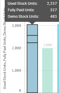
You can actually have a brak down shown up in a tooltip like this:
- Mark as New
- Bookmark
- Subscribe
- Mute
- Subscribe to RSS Feed
- Permalink
- Report Inappropriate Content
Hiya
I don't know how to add tooltips in sense...will this be an added feature in next release of sense?
- Mark as New
- Bookmark
- Subscribe
- Mute
- Subscribe to RSS Feed
- Permalink
- Report Inappropriate Content
Hi Joanna,
You cannot add explicit tool tips as of now but can be expected soon. But for your requirement, you can achive it the way I mentioned above.
- Mark as New
- Bookmark
- Subscribe
- Mute
- Subscribe to RSS Feed
- Permalink
- Report Inappropriate Content
Hiya
Thank you, I will use this option for now.
Kind Regards