Unlock a world of possibilities! Login now and discover the exclusive benefits awaiting you.
- Qlik Community
- :
- Blogs
- :
- Technical
- :
- Design
- :
- Buckets
- Subscribe to RSS Feed
- Mark as New
- Mark as Read
- Bookmark
- Subscribe
- Printer Friendly Page
- Report Inappropriate Content
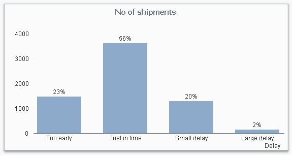
Usually, the number in itself is not interesting, but the rough value is interesting as attribute. It could be that you group people into age groups: Children, Adults and Seniors. Or you want to classify shipments to or from your company in how delayed they are: Too early, Just in time or Delayed.
These groups are often called buckets.
The most straightforward way to create buckets, is to use multiple nested if() functions, e.g:
If( ShippedDate - RequiredDate <= -5, 'Too early',
If( ShippedDate - RequiredDate <= 0, 'Just in time',
If( ShippedDate - RequiredDate <= 5, 'Small delay',
'Large delay' ))) as Delay,
Or if you use dual values:
If( ShippedDate - RequiredDate <= -5, Dual( 'Too early', -5 ),
If( ShippedDate - RequiredDate <= 0, Dual( 'Just in time', 0 ),
If( ShippedDate - RequiredDate <= 5, Dual( 'Small delay', 5 ),
Dual( 'Large delay', 10 )))) as Delay,
However, if you have many classes, the above statements are neither pretty nor manageable. Then it might be better to use a rounding function or the Class() function:
Round( ShippedDate - RequiredDate , 5 ) as Delay,
Class( ShippedDate - RequiredDate , 5 ) as Delay,
A third option is to use IntervalMatch:
DelayClasses:
Load Lower, Upper, Delay Inline
[Lower, Upper, Delay
-E99, -5, Too early
-4, 0, Just in time
1, 5, Small delay
6, E99, Large delay];
IntervalMatch (DelayInDays)
Load Lower, Upper Resident DelayClasses;
The above three methods all create a field Delay already in the script, and this is what you should do if you have a static definition of the grouping.
However, there are cases where you may want a dynamic definition, and then you need to create a calculated dimension using the Aggr() function. Say, for example, that you want to assess the reliability of your suppliers – but since this is something that varies over time and location, you want to make the classification after you have made the appropriate selections. This you cannot make in the script.
But you should still calculate the necessary static fields in the script, i.e. in this case the delay of a shipment, e.g. by
ShippedDate - RequiredDate as DelayInDays,
One way to define the reliability is to measure how many percent of the deliveries that were on time, classified into percent intervals.

In the above chart, the following expression was used as dimension:
=Aggr(Num(Round(Count(If(DelayInDays<=0,ShipmentID))/Count(ShipmentID ),0.1),'0%' ), Supplier)
The Aggr() function creates an array of values – one value per supplier: For each supplier, the number of “good” shipments are counted and divided by the total number of shipments. The number is rounded to nearest 10% to create the buckets and finally the Num() function formats the number as a percentage.
You can also rank the suppliers and bucket them in quartiles:

In the above chart, the following expression was used as dimension:
=Aggr(
Pick(
Ceil(
4*Rank(Count(If(DelayInDays<=0, ShipmentID))/Count(ShipmentID),4)
/
Count(distinct total Supplier)
),
'1st quartile','2nd quartile','3rd quartile','Bottom quartile'
),
Supplier
)
By clicking on a bar in either of these charts, you will select the corresponding suppliers.
Bottom line: Create buckets in all cases where a classification helps the user to get a better overview of data.
PS This is my 100th blog post. If you want to read previous posts, click my initials above.
Further reading related to this topic:
You must be a registered user to add a comment. If you've already registered, sign in. Otherwise, register and sign in.