Do not input private or sensitive data. View Qlik Privacy & Cookie Policy.
Skip to main content

Announcements
Meet Qlik's New CEO. The Future Is Bright — Here's What to Expect
Yianni_Ververis
Employee
Employee

Another great mashup from the Demo Team!


After my favorite CIO where we introduced KPIs into the navigation, salesforce is beautiful, elegant and made mostly of custom extensions!


I started with the custom Selection toolbar (Angular Directive) that I introduced in the CIO dashboard. This changes based on the number of selections, if it's only one item of that dimension selected, or more than 6, it displays "Dimension: item selected". If there are more than one, but less than 6 items selected, it changes to a dropdown menu with the x button to deselect it. This is listening to selections, which means that whatever selections are made in the webpage, they will be displayed here as well.
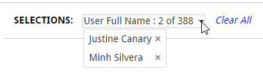
2017-03-03 08_51_07-Salesforce.png

Then, we needed Sense like filters but as drop down menus (Angular Directive). I have done this with the UN Gender Statistics site but this one is more advanced and stays open until you finish making all selections and sorts them by state. It scrolls if many items.
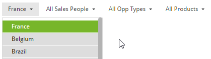
2017-03-03 08_56_03-Salesforce.png


Another issue we were faced with, was that we created a combo chart in Sense but we needed to customize the colors to match our webpage. This lead me to create the Combo Chart extension.‌ This not only gives you the option of changing colors but, hover states, borders, set bar widths, dot widths, has a better display of the labels etc.
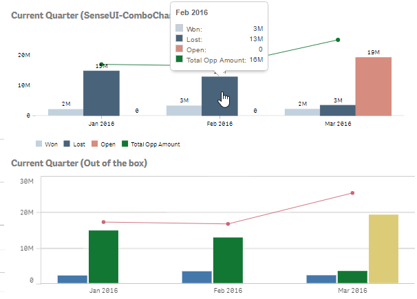
2017-03-03 11_23_51-Salesforce_Mashup_Demo_Team _ Sheets - Qlik Sense.png


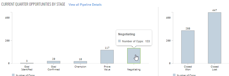
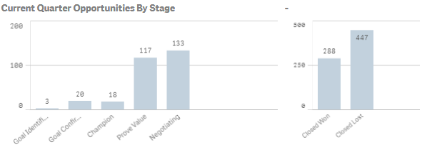
In the same page, we had to display and compare two vertical bar charts. The problem is that when we placed the out-of-the-box ones, the y-axis max were different thus visually misleading.  So I used the combo chart with only one measure and set the max to achieve the desired results
2017-03-03 09_32_24-_Salesforce_Mashup_Demo_Team - Dashboard 2 _ App overview - Qlik Sense.png

2017-03-03 11_26_06-Salesforce.png


Moving on to the next page, we had two more issues to solve.

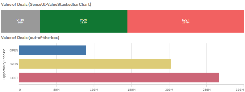
We needed to have a Stacked bar Chart based on the value of the measure and not the number of measures. For this, I created the SenseUI-ValueStackedbarChart.‌ I used the same tooltips, coloring, hover states etc as I used in my other extension like my most popular one, SenseUI-BarChart.
2017-03-03 10_27_46-_Salesforce_Mashup_Demo_Team - Opportunities 1 _ Sheets - Qlik Sense.png

The other issue was that we needed a horizontal menu for quarters and years. For this I used an older extension, the SenseUI-Filter.

2017-03-03 10_47_36-Salesforce.png

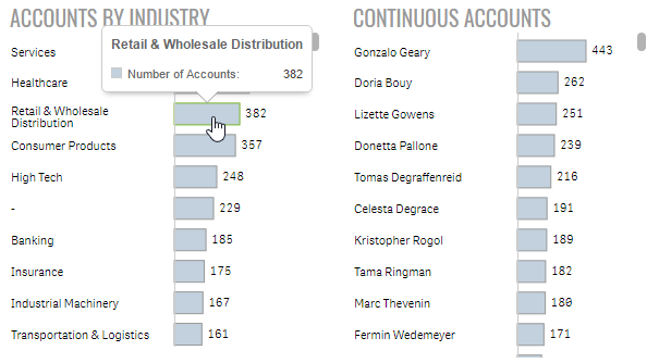
Lastly, I used my SenseUI-BarChart extension for all of the horizontal bars. I used the same bar color, border and hover color to match the rest of the website's objects.
2017-03-03 14_04_16-Salesforce.png

The mashup is found at http://webapps.qlik.com/salesforce/index.html

Please note that this is a work in progress. I still have to work on the mobile version and some other UI issues


Extensions mentioned here:

Senseui-ComboChart

SenseUI-ValueStackedbarChart

SenseUI-BarChart

SenseUI-Filter


For more of our work, you can go to webapps.qlik.com


Yianni

14 Comments
paulcalvet
Specialist
Specialist

Hi Yianni,

Thank you for all your work which is a great source of inspiration !

I notice that you have to create extensions to color your expression.

I think this is a big gap in Qlik Sense, is this feature will soon be natively integrated in Qlik Sense ?

Extensions are great but there is no support and some do not work after a Qlik Sense upgrade.

Regards

0 Likes
2,095 Views
Yianni_Ververis
Employee
Employee

Hello Paul,

I am glad you liked it. This is the reason I created these extensions.

I am pretty sure there will be a way in the future but I do not know when.

Yianni

0 Likes
2,095 Views
Or
MVP
MVP

Hello Yianni,

I'm actually pleasantly surprised with this design insofar as the visuals - with a single exception (using red for the "Open" bars seems an odd choice, as it suggests there is something negative about these values), this is the certainly an excellent visual design - not too cluttered, not too blank, little wasted ink.

There are two aspects of this dashboard that do feel "wrong" to me, admittedly as someone who has no experience with the software or information being analyzed:

1) This dashboard appears to run more than the height of a computer monitor - this is (almost) never recommended, as important values should be immediately visible and unimportant values should be relegated to secondary sheets rather than placed on the dashboard.

2) This dashboard does not seem to highlight any specific information or action that should be taken - it displays a volume of information and displays it well, but I can't see any way to look at this dashboard and decide what needs my attention, which is usually the whole point of having a dashboard in the first place! Since I am not familiar with the data or process involved, perhaps I'm just not seeing something that is blatantly there, but there seem to be no indicators of whether I am meeting targets, whether I am doing well or poorly in any specific actions, and whether I need to take any actions to improve the situation.

Would love to hear your take on these issues, and perhaps have the gaps in my understanding of this dashboard filled in.

Thanks,

Or

0 Likes
2,095 Views
simondachstr
Specialist III
Specialist III

Paul .that's the exact value proposition of http://www.vizlib.com - stay tuned.


You can read more about Vizlib here https://www.quickintelligence.co.uk/introducing-vizlib/

2,095 Views
Lech_Miszkiewicz
Partner Ambassador/MVP

Hi Yianni,

Did you publish somewhere this mashup template?

regards

0 Likes
2,095 Views
ziabobaz
Creator III
Creator III

jvs

Thank you for this useful article.

I have a question - how can I replicated the selection bar which you are using? Is there a code with styles or some kind of extension? Sorry if the question is lame - I am not a developer, I am a front end business user, but my web-designers are creating a mashup for me and I want them to use the same selection bar which you are using.

Thank you!

Gleb.

0 Likes
2,095 Views
Yianni_Ververis
Employee
Employee
0 Likes
1,849 Views
ziabobaz
Creator III
Creator III

Great, thank you!

0 Likes
1,849 Views
ziabobaz
Creator III
Creator III

jvs

Just the last question: it says it requires Qlik Server.

Does that mean i can't use it on Qlik Desktop version ?

0 Likes
1,849 Views
Yianni_Ververis
Employee
Employee

You can but you will run into CORS issues

0 Likes
1,849 Views