Unlock a world of possibilities! Login now and discover the exclusive benefits awaiting you.


 Yianni_Ververis
- Subscribe to RSS Feed
- Mark as New
- Mark as Read
- Bookmark
- Subscribe
- Printer Friendly Page
- Report Inappropriate Content
Another great mashup from the Demo Team!
After my favorite CIO where we introduced KPIs into the navigation, salesforce is beautiful, elegant and made mostly of custom extensions!
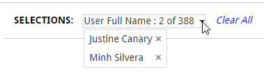
I started with the custom Selection toolbar (Angular Directive) that I introduced in the CIO dashboard. This changes based on the number of selections, if it's only one item of that dimension selected, or more than 6, it displays "Dimension: item selected". If there are more than one, but less than 6 items selected, it changes to a dropdown menu with the x button to deselect it. This is listening to selections, which means that whatever selections are made in the webpage, they will be displayed here as well.
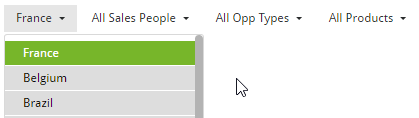
Then, we needed Sense like filters but as drop down menus (Angular Directive). I have done this with the UN Gender Statistics site but this one is more advanced and stays open until you finish making all selections and sorts them by state. It scrolls if many items.
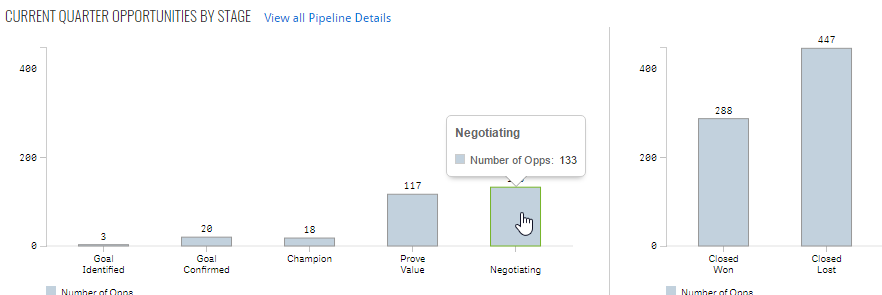
Another issue we were faced with, was that we created a combo chart in Sense but we needed to customize the colors to match our webpage. This lead me to create the Combo Chart extension. This not only gives you the option of changing colors but, hover states, borders, set bar widths, dot widths, has a better display of the labels etc.
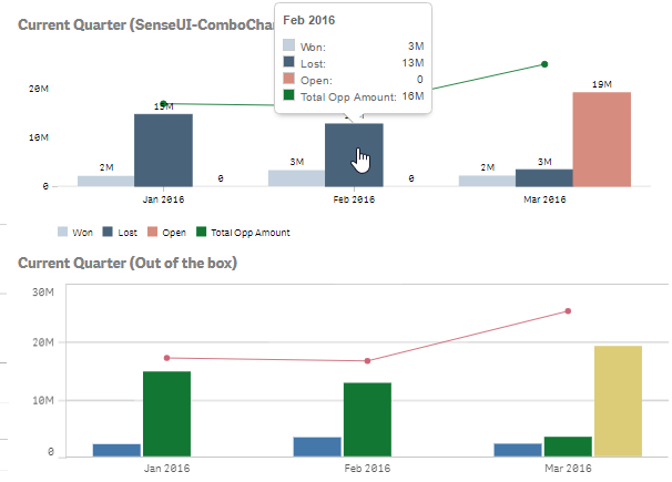
In the same page, we had to display and compare two vertical bar charts. The problem is that when we placed the out-of-the-box ones, the y-axis max were different thus visually misleading. So I used the combo chart with only one measure and set the max to achieve the desired results
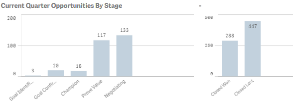
Moving on to the next page, we had two more issues to solve.
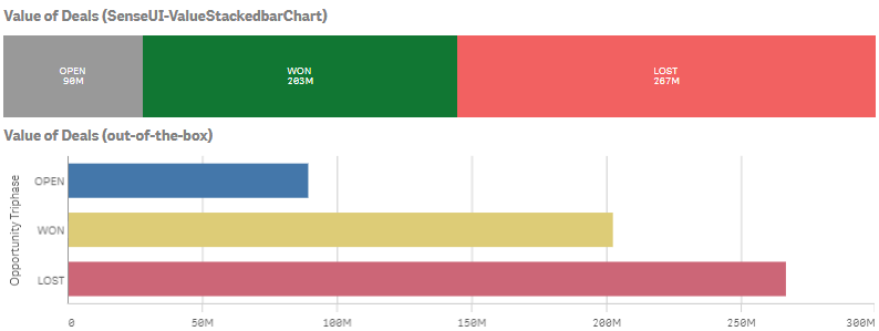
We needed to have a Stacked bar Chart based on the value of the measure and not the number of measures. For this, I created the SenseUI-ValueStackedbarChart. I used the same tooltips, coloring, hover states etc as I used in my other extension like my most popular one, SenseUI-BarChart.
The other issue was that we needed a horizontal menu for quarters and years. For this I used an older extension, the SenseUI-Filter.

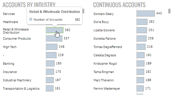
Lastly, I used my SenseUI-BarChart extension for all of the horizontal bars. I used the same bar color, border and hover color to match the rest of the website's objects.
The mashup is found at http://webapps.qlik.com/salesforce/index.html
Please note that this is a work in progress. I still have to work on the mobile version and some other UI issues
Extensions mentioned here:
For more of our work, you can go to webapps.qlik.com
Yianni
You must be a registered user to add a comment. If you've already registered, sign in. Otherwise, register and sign in.