Unlock a world of possibilities! Login now and discover the exclusive benefits awaiting you.
- Qlik Community
- :
- Blogs
- :
- Technical
- :
- Design
- :
- Color Codes
- Subscribe to RSS Feed
- Mark as New
- Mark as Read
- Bookmark
- Subscribe
- Printer Friendly Page
- Report Inappropriate Content
Colors are a very important and critical part of our lives. They not only give meaning to objects but also trigger feeling and emotions within us, influence perspective and affect our psychological being. The study of colors is very complex and a lot has been written and talked about the role and use of colors in various aspects of life.
As QlikView application designers, we don’t have to study in depth the meaning and theories of colors but it is of utmost importance for us to be aware of the usability norms, best practices and social and cultural implication of colors to use them in a conscious and respectful way in our designs and data visualizations. It is very easy to fall in traps of using excessive color variations or inapt color schemes since we have such a wide range to choose from which leads us to falling for temptations of using colors as per our personal likes and dislikes.
A few tips and tricks about how to use colors judiciously can not only help tremendously from falling into these traps that impair usability and deceive the user but also allows datasets to be layered in order to tell eloquent stories. The following guides can be applied to our data visualization for QlikView applications.
1. Use minimal amount of colors in your designs and data visualization. Every application has a focal point or something to highlight. Overly colorful designs can tend to hide the focal point, giving an overall vibrancy to the design and hindering the user from focusing on important points in the data.
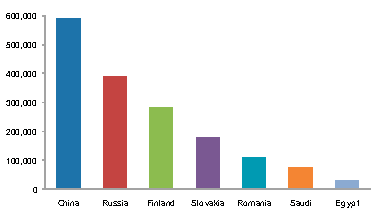
2. Using Shades and tints of the same color while showing quantitative information instead of different hues of colors is preferable, like in the pie chart shown below.

However, it is okay to use different color in the same chart when color is used as an indicator of information as long as the colors are limited to 3-5 and color choice is such that they don’t create visual noise. The example below shows how color is used as an indicator of information.
3. Avoid pure gradient rainbow color scales to show data. Because there is no inherent order in the scale, they all appear to come from different families.
4. Keep the colorblind audience in mind when choosing color schemes. Since a large portion of our audience might be colorblind, it is unaffordable to use colors which are not colorblind safe. Color Oracle(http://colororacle.org/index.html) is a good evaluation tool for colorblindness.
5. In places where Red, Green, Yellow have to be used together, introduce other attributes such as icons so that color is not the only differentiating factor. These colors appear similar to colorblind people.

6. When using Red and green together, choose a green which is closer to blue in hue, this way tthe 2 colors can be differentiated easily by the colorblind users.


Apart from the above basic usability guidelines, there are other things to consider while choosing color schemes for designs. Choice of colors is very subjective, however, this not only because of personal preference but can also due to deep rooted cultural and social connotations associated to colors that are imbedded within us. Colors hold different meanings in each culture and we should be conscious of those meaning when presenting to a global audience or a specific country. This way misinterpretations and offensive use of colors can be avoided.
An elaborate insight on colors, their use and interpretations can be found in this Technical Brief.
You must be a registered user to add a comment. If you've already registered, sign in. Otherwise, register and sign in.