Unlock a world of possibilities! Login now and discover the exclusive benefits awaiting you.
- Qlik Community
- :
- Blogs
- :
- Technical
- :
- Design
- :
- Combo Chart Enhancements
- Subscribe to RSS Feed
- Mark as New
- Mark as Read
- Bookmark
- Subscribe
- Printer Friendly Page
- Report Inappropriate Content
There have been many improvements made to the combo chart in the SaaS edition of Qlik Sense this year. In this blog, I will review some of the highlights. My favorite improvement of them all is the ability to view the combo chart horizontally. Some other enhancements include:
- the ability to have a bar on the secondary axis
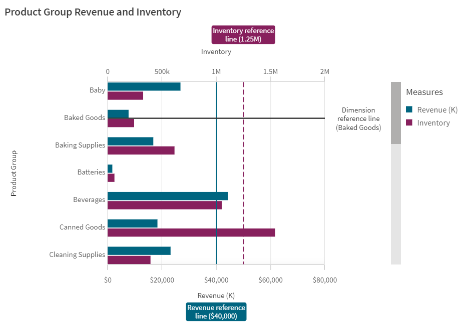
- the ability to have reference lines for both dimensions and measures
- the ability to style each measure with an unique color
- additional styling capabilities
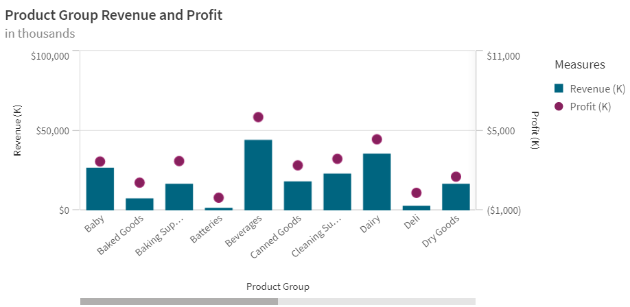
If you have used a combo chart in the past, you may remember that you were only able to view the chart vertically. For example, in the combo chart below, I am showing the revenue and profit for the Product Groups. Revenue and Profit each have their own axis. This vertical layout works well when looking at measures over time, but it is not always ideal when showing longer x-axis labels as seen below.
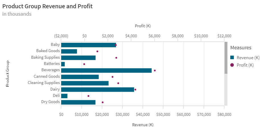
Now, imagine this chart in a horizontal position. When the x-axis has text that can be lengthy, I like to view it horizontally because it is easier to read the labels on the y-axis and they often do not get truncated. See the image below of the same chart viewed horizontally. Here the y-axis labels are easier to read.
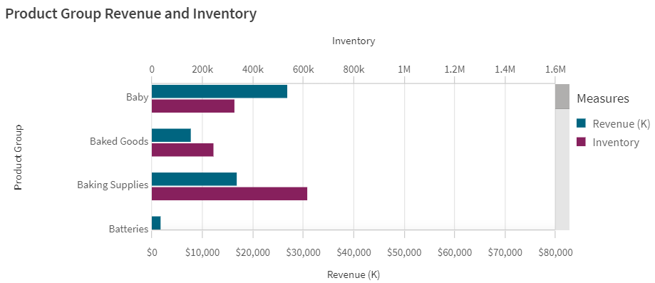
In the SaaS edition, you can also view bar charts on the secondary axis in a combo chart. In the past, line and markers were the only options for the secondary axis. In the chart below, the Revenue and Inventory measures are both bars and have two separate axes allowing me to compare them along the same dimension (product group).
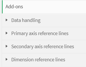
There are also a few style preferences that can be set for reference lines. The color of the line can be set, the style of the line can be solid or dashed and a background can be added to the reference line label. If a background is selected, it will have the same color as the reference line. Regardless of what you use for your measure (bar, line or marker), each can be colored by selecting a single color or by using an expression.
The improvements made to the combo chart so far this year are great. Consider using one the next time you need to compare two measures on the same dimension. Check out Qlik Help to learn more about the combo chart and click here for more details about the combo chart properties.
Thanks,
Jennell
You must be a registered user to add a comment. If you've already registered, sign in. Otherwise, register and sign in.
