Unlock a world of possibilities! Login now and discover the exclusive benefits awaiting you.
- Qlik Community
- :
- Blogs
- :
- Technical
- :
- Design
- :
- Filter Pane Customization
- Subscribe to RSS Feed
- Mark as New
- Mark as Read
- Bookmark
- Subscribe
- Printer Friendly Page
- Report Inappropriate Content
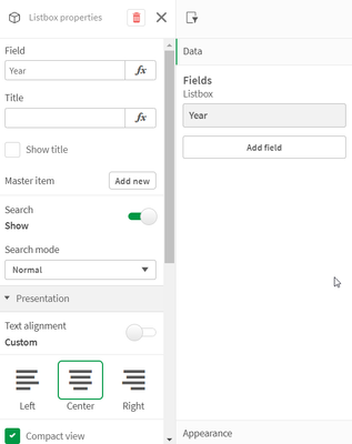
There are now many new ways a filter pane can be customized to change its appearance and/or functionality. In this blog, I will cover the new customizations available. Let's start with the new look of the filter pane properties panel (shown below). Now when the field or master item is selected in the properties panel, an additional properties panel is provided with further appearance and functionality options.
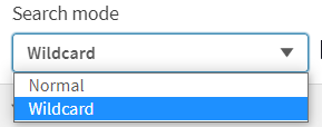
There is now a “Show title” checkbox that can be used by app developers to show or hide the title of the filter pane. App developers can indicate if they want search capabilities on or off in a filter pane by toggling the Search option. By default, the search mode for a filter pane is normal, but now it can be set to Wildcard mode which adds asterisks before and after the search text like this:
This example wildcard search will search for any text with “wear” in it.
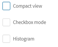
In the presentation section of the properties panel, is where app developers can customize how the filter pane will look. By default, the text alignment is set to Auto, but it can also be set to left, center or right. There are checkboxes for the following options: Compact view, Checkbox mode and Histogram.

The last of the new customization options that can be found in the properties pane is how to show the data – either single column or grid.
Here is a simple example using the Year dimension. The filter pane on the left is showing the filter as a grid while the filter pane on the right is showing a single column.
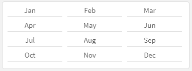
Here is another example of the grid option when there are more values.
When displaying the values in a grid, the app developer is presented with the option to set the order and the maximum number of columns. In the example above the values are ordered by row, so you read them from left to right versus top to bottom. The Max visible columns can be manually set (custom) or can be set to auto.
These new filter pane customization options provide the app developer with more flexibility in how they would like to present filter panes on a sheet. Check out Qlik Help for a video on creating a filter pane as well as additional helpful information. Also take a look at Michael Tarallo’s SaaS in 60 video here for this and other new features in Qlik Sense SaaS.
Thanks,
Jennell
You must be a registered user to add a comment. If you've already registered, sign in. Otherwise, register and sign in.


