Unlock a world of possibilities! Login now and discover the exclusive benefits awaiting you.
- Qlik Community
- :
- Blogs
- :
- Technical
- :
- Design
- :
- Interacting with data using Enigma.js PT 2: Creati...
- Subscribe to RSS Feed
- Mark as New
- Mark as Read
- Bookmark
- Subscribe
- Printer Friendly Page
- Report Inappropriate Content
On Part 1 of this blog post, we went through Generic Objects, learned about definitions of the ListObject and Hypercube structures, and explored some of the settings that they offer in order to interact with data when communicating with the Qlik Associative Engine through Enigma.js.
In this second part, we will see actual implementations of ListObjects and Hypercubes and learn how they can be used as part of your next web application to create filters and charts.
Creating Filters with ListObjects
First, let’s create a filter that corresponds to a single field in our data model that we can use to make selections and filter in.
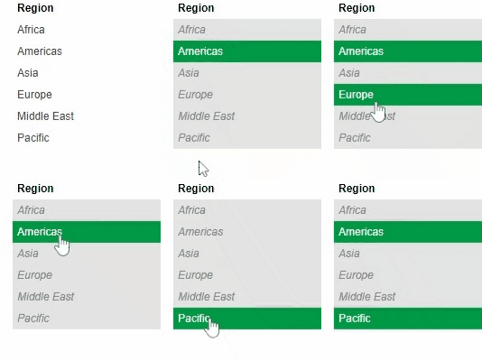
The ListObject structure is best suited in this case since it contains one dimension. It lists all the values in a single field and provides metadata about the current state of each field value (either selected, excluded, or possible)
In order to create a ListObject, we create a dynamic property for it in a generic object, we then add the appropriate JSON definition for a list object via the “qListObjectDef” property. The engine will know how to properly parse this definiton in order to produce a ListObject.
In our case, we define a list object for our “Region” field by using the dimension definition based on the field name via the “qDef/qFieldDefs” property.
All is left if to fetch the data, we do that by defining the “qInitialDataFetch” property to grab the initial data set. In our case, we have 1 column and we know that the number of rows to be pulled is less than 10. So, we define it with “qWidth” 1 and “qHeight” 10.
{
    "qInfo": {
        "qType": "filter"
    },
    "qListObjectDef": {
        "qDef": {
            "qFieldDefs": ["Region"]
        },
        "qInitialDataFetch": [
            {
                "qLeft": 0,
                "qWidth": 1,
                "qTop": 0,
                "qHeight": 10
            }
        ]
    }
}
After connecting to enigma and getting our app object, we create a session object and pass it the ListObject definition above. A session object is a generic object that is only active for the current session and is not persisted in the model.
const regionObj = await enigmaApp.createSessionObject(regionListDef);
const regionLayout = await regionObj.getLayout();

renderFilter(regionListElem, regionLayout, regionObj)
After getting the ListObject layout, we call the function below that takes care of retrieving the data we want to display on our filter via the “layout.qListObject.qDataPages[0].qMatrix” which consists of an array of arrays, each corresponding to 1 row of data.
The JSON object we get by looping through the "qMatrix" includes the following properties:
- qText: a text representation of the cell value
- qNum: a numeric representation of the cell value
- qElemNumber: a rank number of the cell value.
- qState: the selection state of the field value.
We use both qText and qState in our front end. First to display the value name, and to add a CSS class that will allows to differentiate between different states:
- S for selected
- X for excluded
- O for possible
We also listen to click events on the list and call “genericObject.selectListObjectValues("/qListObjectDef", [e[0].qElemNumber], true)” which is a Generic Object method. It takes the path that describes where our ListObject is defined in our Generic Object as a 1st parameter, and the Element Number that we want to select as the 2nd parameter. The 3rd argument is the toggle mode (whether a selection is added to an already existing set of selections or overrides them).
const renderFilter = (element, layout, genericObject) => {
    var titleDiv = element.querySelector(".filter-title");
    var ul = element.querySelector("ul");
    ul.innerHTML = "";

    // Get the data from the List Object
    var data = layout.qListObject.qDataPages[0].qMatrix;

    // Loop through the data and create the filter list
    data.forEach(function(e) {
        var li = document.createElement("li");
        li.innerHTML = e[0].qText;
        li.setAttribute("class", e[0].qState);

        // Click function to select
        li.addEventListener("click", function(evt) {
            genericObject.selectListObjectValues("/qListObjectDef", [e[0].qElemNumber], true);
        });

        ul.appendChild(li);
    });
};
Creating Charts with HyperCubes
When creating visualizations, we make use of Hypercubes which allow us to define a combination of both dimensions and measures in order to get a calculated data set.
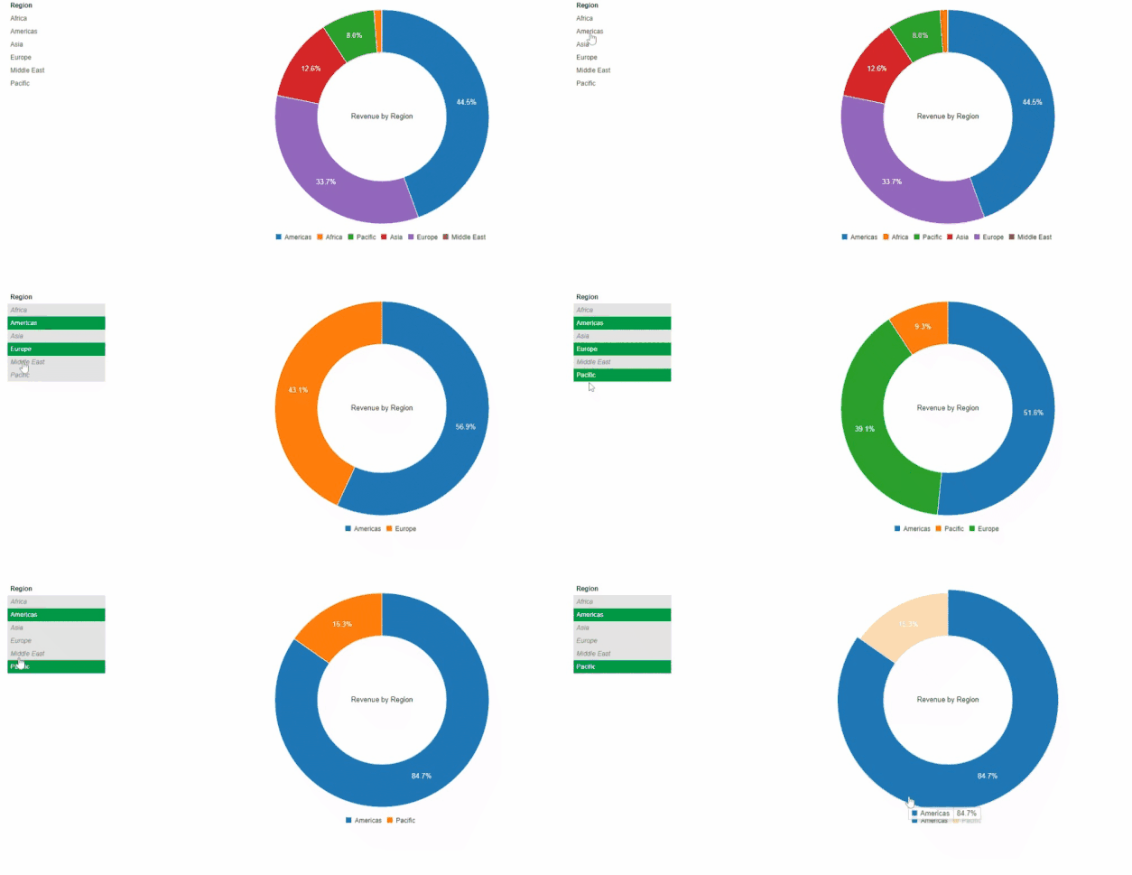
Let’s create a Pie Chart that shows the Sum of Revenues by Region.
The Generic Object definition for this includes 1 Dimension and 1 Measure that we define via the “qHyperCubeDef” property
We then define the initial data fetch, in this case we need 2 columns (one for the Region, and one for the calculated Revenue) and we don’t expect to have more than 1000 rows. Thus we set “qWidth” 2 and “qHeight” 1000.
{
    "qInfo": {
        "qType": "chart"
    },
    "qHyperCubeDef": {
        "qDimensions": [
            {
                "qDef": {
                    "qFieldDefs": ["Region"],
                    "qSortCriterias": [
                        {
                            "qSortByNumeric": 1
                        }
                    ]
                },
                "qNullSuppression": true
            }
        ],
        "qMeasures": [
            {
                "qDef":{
                    "qDef": "=Sum([Sales Quantity]*[Sales Price])"
                }
            }
        ],
        "qInitialDataFetch": [
            {
                "qLeft": 0,
                "qWidth": 2,
                "qTop": 0,
                "qHeight": 1000
            }
        ]
    }
}
Similar to what we have done on the ListObject, we create a Generic Object (session object), and then get its layout. Next we call the “renderChart” method to create the Pie chart visualization.
const chartObj = await enigmaApp.createSessionObject(chartDef);
const chartLayout = await chartObj.getLayout();

renderChart(chartLayout);
Our function is simple, we start by accessing the qMatrix array which contains all of our rows which in turn contain a group of cells.
We refine this array using the map function to only grab a pair of values consisting of the Region (via the qText property of the 1st cell) and the Revenue (via the qNum property of the 2nd cell).
You can then render the chart using your visualization tool of choice. In this case, we use C3.js.
const renderChart = (layout) => {
    var qMatrix = layout.qHyperCube.qDataPages[0].qMatrix;

    // Map through qMatrix to format it as array of arrays: [[region1, revenue1], [region2, revenue2] ...]
    const columnsArray = qMatrix.map((arr) => [arr[0].qText, arr[1].qNum]);

    c3.generate({
      bindTo: "#chart",
      data: {
        columns: columnsArray,
        type: 'donut'
      },
      donut: {
          title: "Revenue by Region"
      }
    });
  }
I hope this post helps you further understand the notion of Generic Objects in the form of ListObjects and HyperCubes. Let me know how you are leveraging these concepts to build your custom solutions!
The full code can be found on my Github Repo.
You must be a registered user to add a comment. If you've already registered, sign in. Otherwise, register and sign in.

