Announcements
Qlik Connect 2024! Seize endless possibilities! LEARN MORE
Charles_Bannon
Employee
Employee

As Qlik developers, we are always looking for ways to maximize the development real estate in our apps. And sometimes, we (well me), tend to overcomplicate things in order to accomplish the task at hand.

As Qlik developers, we are always looking for ways to maximize the development real estate in our apps. And sometimes, we (well me), tend to overcomplicate things in order to accomplish the task at hand.


For example, I was recently involved in a project to develop a Qlik Sense app where the ask was to create visualizations in which the dimensions were variations of a date. Users could choose to see the data by minute, hour, day, week, or month. I immediately started thinking of the potential ways to handle this in Qlik Sense.


My first thought was to create a chart for each of the date slices and then, using containers, pull each of the 5 visualizations into the container and finally, using conditional show/hide rules, show only one visualization at a time based on the user selection. When giving this approach more thought, I realized that I would have to create over 100 visualizations and store them as master visualizations. That was not going to work and, quite frankly, there had to be a better way.


After some thought, and collaboration with my teammates, I then decided that creating a calculated dimension was a more viable option. This approach allowed me to use only a single visualization for each measure that I was looking to display. Overall, it was a quicker and lighter solution to develop.


This is how I built it.


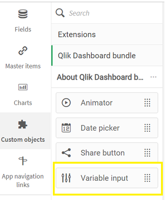
First, I used the Variable Input object to create the user defined date selector. This was good for 2 reasons. First, the user can only select one value at a time and second, the variable allowed me to customize the object based on the corresponding value of the variable.

Variable Input.png


I created the variable vViewGroup and in the Variable Input Object, I selected to show the variable labels as buttons and display them in a row. I then created the Labels to display in the object and their corresponding values to populate the variable.

Variable Input Properties.png


This is how the Variable Input Object displays on the sheet.

Variable Input Object.png


Once that was created, it was time to develop the visualization.

QEM Visualization.png

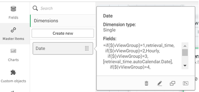
I had to first create a calculated dimension which used the vViewGroup variable to choose the date type.

calculated dimension.png

Using a standard nested IF statement, I created the Date calculated dimension that allowed me to switch the dimension for the visualization on the fly based on the user’s input.

calculated dimension expression.png

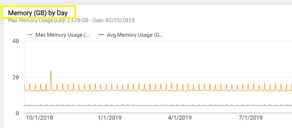
The final area that needed to change based on the user’s input was the visualization title.

QEM Visualization Title.png

In the Title property, I simply used the same nested IF statement from the calculated dimension, as part of the Title expression to Show the ‘Memory (GB) by’ and the user selected Date dimension.

Title Expression.png

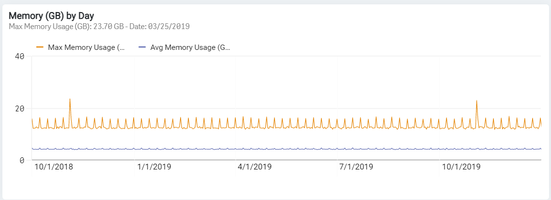
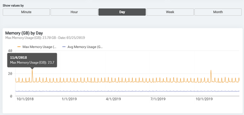
That was it! I had created a single object with a variable dimension to show the data values against any of the 5 different date types.

Complete Object.png

Using this method to create the visualization saved me loads of development time and will help in the future should any of the objects need to be edited.


I hope you find this simple, yet powerful, approach useful in your future app development. Happy Qlikking!

6 Comments
Tanalex
Creator II
Creator II

Very nice @Charles_Bannon! I too lean towards overcomplicating the development process.😉

0 Likes
1,680 Views
mikaelsc
Specialist
Specialist

alternative dimensions (and or measures) in charts are even less "real estate intensive"... 

if the getobjectdimension() function would work in titles (it doesn't 😞 ) , we could have the variable title as well... but then again... trust users  😉 


0 Likes
1,649 Views
BeeGees
Contributor III
Contributor III

Omg, why so many if's. There is MUCH easier way to do this. Simply in "Variable input" in value type "FieldName" and in title type "FiledTitle" -. Then in straight table for example just add dimension (lets assume aour variable is called "vDim"):

Field: [$(vDim)]

Label: ='$(vDim)'

And thats it, not a single ugly looking if in there. Also it is totally dynamic - any valid value in Variable Input will start to work without editing any tables.

1,549 Views
barnabyd
Partner - Creator III

You are correct @BeeGees.

However, you need one more piece to complete the story - human readable field names. For example, in @Charles_Bannon's example, the field for "Year Month" is "retrieval_time.autoCalendar.YearMonth". I wouldn't want that to appear in a chart or table!!

This will need to be renamed in the load script, however this is a problem as it's part of the auto calendar functionality. It seems the workaround is to either not use the auto calendar or continue to use the nested if statements for the label.

Any other ideas? Cheers!

0 Likes
1,489 Views
Or
MVP
MVP

@barnabydYou hit the nail on the head with "Don't use auto calendar", really. What happens when a user selects values from one of these fields, e.g. by clicking on the dimension values? Their current selections bar will now look something like this - not very nice....

Or_0-1610445122091.png

Auto calendar is fine if you're only ever going to use these fields in your behind-the-scenes formulas, but for anything user-facing, one should ideally have human readable names and spare a thought for what will actually fit within the current selection box as well, though the limited space often makes this difficult.

If you'd like the user to just select "Year", "Month" etc. but your fields are actually "Retrieval Year", "Retrieval Month", etc., I believe this is still doable using concatenation, which is cleaner than If() statements and offers much better support for larger lists of options.


1,456 Views
Jeff_Koch
Employee
Employee

One of the MAJOR reasons for not using auto-calendars and other calculated dimensions is the negative performance impact.   Chuck and I have talked about this and with luck we'll see a follow-up to this solution that discusses the performance aspects of this type of solution.

I've measured chart performance using an auto-calendar field versus a data model based calendar field.  Initial calculation time for the auto-calendar field was about 5 seconds.   The data model calendar field for the same chart... a few milliseconds.      hmmm... 23 msec versus 5000 msec...  I'll take the 23 msec calculation time.

Once the initial auto-calendar field was calculated and cache the performance was about the same until, the auto-calendar field calculations results were dropped from cache.  Then I was back to a 5 second calculation time to recalculate and cache the results.

Bottom-line don't use calculated dimensions when you can solve the dimensional problem in the data model.   Note: there are times when a calculated dimension is the only option to get a specific result and that is understood; but in most cases you can avoid them - e.g. data model solution,  simple vars, etc.

Oh, and NEVER use derived fields - under the hood they are just calculated dimensions.

1,402 Views