Unlock a world of possibilities! Login now and discover the exclusive benefits awaiting you.
- Qlik Community
- :
- Blogs
- :
- Technical
- :
- Design
- :
- Nebula.js Plugins — customize your visualizations.
- Subscribe to RSS Feed
- Mark as New
- Mark as Read
- Bookmark
- Subscribe
- Printer Friendly Page
- Report Inappropriate Content
Nebula.js is a collection of product & framework-agnostic JS library that helps developers achieve the following goals:
- allows for developing visualization extensions (e.g. non-native charts in Qlik Sense client)
- develop mashups (e.g. creating/embedding Qlik Sense visualizations to web applications)
For this tutorial, we will focus on the 2nd use case.
BTW if you are just getting started with Nebula, here is an introductory video.
Background:
Before we delve into what plugins specifically allow you to do, please note that they involve dealing with Picasso.jscomponents that run under the hood. Components are the visual building blocks that make up the chart & by combining them in various forms virtually any chart can be created. Typically components can be — axes, grid lines, data points, etc. So, using Nebula plugins we would essentially be interacting with these components to customize our chart. I have tried summing this up in the image below.
What do plugin allows us to do?
- Modify an existing chart component. For instance, changing the interpolation of a line chart from linear to monotone in the below chart.
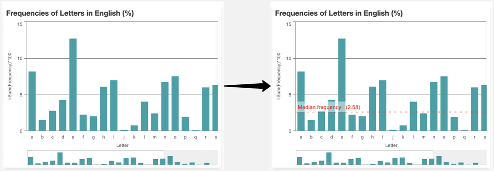
- Add a new chart component. Note that the new component can either be a standard Picasso component(native Picasso) or a custom one(your own). For instance, below we add a reference line at the median of frequency in a bar chart. This is an example of adding a standard component.
Now that we know the usability & background behind Nebula plugins, let’s try to develop some.
1. Modifying an existing component:
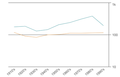
For our first implementation, we will try to modify an existing Picasso component in a Nebula line chart. Currently, this is how our chart looks like -
Our aim is to simply change the interpolation of the line from linear to monotone.
Step 1: Define the plugin
To be able to use a plugin, we need to first define it. Let’s do that as shown below.
const linePluginNew = {
  info: {
    name: "line-plugin",
    type: "component-definition"
  },
  fn: ({ layout, keys }) => {
    const componentDefinition = {
      type: "line",
      key: keys.COMPONENT.LINE,
      settings: {
        layers: { curve: "monotone", line: { strokeWidth: 3 } }
      }
    };
    return componentDefinition;
  }
};
Important things to note:
- A plugin definition is an object, with two properties info and fn. The fn property returns a picasso.js component.
- The info property has an attribute called type which should specify whether you are developing a custom plugin or a standard one. For standard components, the value will be 'component-definition' & for custom ones the value will be 'custom-component'.
- To override an existing component, fn should return a picasso.js component that has the same key as the existing component (keys.COMPONENT.LINE in this example)
- Finally, we change the curve to monotone inside our settings and set stroke-width as per our requirement.
Step 2: Using the plugin
In the next step, we just have to use the defined plugin by passing the name inside the plugins attribute like below.
    nuked.render({
      type: "line-chart",
      element: document.querySelector(".object"),
      plugins: [linePluginNew],
      fields: ["Decade", "=Max(Length)", "=Avg(Length)"],

      properties: {
        title: "Line Chart",
        dataPoint: {
          show: false,
          showLabels: true
        },
        gridLine: {
          auto: false
        },
        dimensionAxis: {
          show: "all",
          dock: "near"
        },
        measureAxis: {
          show: "all",
          logarithmic: true
        }
      }
    }),
Here’s our customized visualization.
2. Add a new component:
As mentioned before, adding a new component can have 2 scenarios — adding a standard component or adding a custom one. We will cover both of them through two implementations below.
Adding a standard component
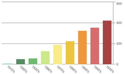
In this example, our goal is to add a native ‘line’ component to a bar chart that goes through the end of the bars. Currently, this is how our chart looks like.
Let us start building our plugin.
- First, since our goal is to add a native line component, our Picasso fn should know about it. We will use the type attribute to pass that info.
fn: ({ keys, layout }) => {
    const componentDefinition = {
      key: "sum-line",
      type: "line",
}
return componentDefinition;
- Next, we need to know the value of each bar, so we can draw our line based on that. Therefore, we have to define the data we want to work with.
const componentDefinition = {
      key: "sum-line",
      type: "line",
      layout: { displayOrder: 10 },
      data: { collection: keys.COLLECTION.MAIN },
}
- Finally, each component uses a settings object that is specific to the component. In this case, we will pass the end value of each of our bars to SCALE.MAIN.MINOR. We also control the aesthetics of the line we are drawing using layers attribute like below.
settings: {
        coordinates: {
          minor: {
            scale: keys.SCALE.MAIN.MINOR,
            fn: d => d.scale(d.datum.end.value)
          },
          major: { scale: keys.SCALE.MAIN.MAJOR,
                 }
        },
        layers: {
          line: {
            stroke: "black",
            strokeWidth: 2,
            opacity: 0.5,
            strokeDasharray: "5 10"
          }
        }
      }
Finally, after applying our plugin to the bar chart, here’s what it looks like.
Adding a custom component
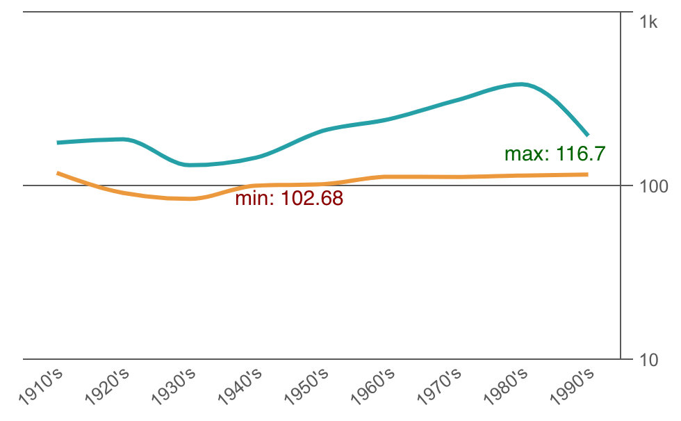
Our final use case is to develop a custom plugin and add it as a component in our native chart. The goal here is to incorporate some custom labels to the min & max positions of one of the lines in our line chart. Remember we changed the native line chart to have monotone interpolation in the 1st use case.
We will try to add the labels in this chart now. Let’s start!
Step 1: Implement the custom plugin.
As discussed before, since we are developing a custom plugin, we will need to specify that in the info property by passing the custom-component to the type attribute.
const minMaxLabelsPluginImplementation = {
  info: {
    componentName: "custom-labels-plugin",
    name: "custom-labels-plugin",
    type: "custom-component"
  }
}
Next, we use the require property to pull in our dependencies. In this case, we will pull the ‘chart’ instance for getting our component-related data and scales as seen below.
const implementation = {
      require: ["chart"],
      render() {
        const items = this.chart
          .component(keys.COMPONENT.LINE)
          .data.items.filter(
            item => item.line.value === 1 && item.label >= "1950's"
          );
        const scale = this.chart.scales();
 }
}
Each component has a type property that identifies the type of component to create. In this case, since we want to just create a label, we will pass a ‘text’ type. The other relevant properties are then added to our code as below.
if (item.end.value === min) {
            labels.push({
              type: "text",
              text: `min: ${item.end.label}`,
              x: timeScale(item.major.value) * width,
              y: lineScale(item.end.value) * height + 15,
              anchor: "middle",
              fontFamily: "Helvetica, san-serif",
              fontSize: "15px",
              fill: "darkred"
            });
}
Step 2: Define the plugin
Now that we have implemented the functionality for our custom plugin, we will use it to define a plugin so it can be used with Nebula charts.
const minMaxLabelsPlugin = {
  info: {
    name: "labels",
    type: "component-definition"
  },
  fn: ({ keys }) => {
    const componentDefinition = {
      type: "custom-labels-plugin",
      key: "my-labels"
    };
    return componentDefinition;
  }
};
Note how the type property inside the fn:( ) changes from standard ones like ‘line’, ‘point’, etc. to ‘custom-labels-plugin’. The type value has to exactly match with the componentName of the plugin defined above.
Step 3: Use the plugin
The final step is to apply the custom plugin to our line chart.
nuked.render({
      type: "line-chart",
      element: document.querySelector(".object"),
      plugins: [linePluginNew, minMaxLabelsPluginImplementation, minMaxLabelsPlugin],
      fields: ["Decade", "=Max(Length)", "=Avg(Length)"],
// Overrides default properties
      properties: {
        title: "Line Chart",
        dataPoint: {
          show: false,
          showLabels: true
        },
        gridLine: {
          auto: false
        },
        dimensionAxis: {
          show: "all",
          dock: "near"
        },
        measureAxis: {
          show: "all",
          logarithmic: true
        }
      }
    }),
And here’s our visualization with the custom labels.
All the code related to this tutorial can be found in this Glitch or my Github.
Hope this tutorial will allow developers to take their first step towards building plugins in Nebula.
~Dipankar, Qlik R&D
You must be a registered user to add a comment. If you've already registered, sign in. Otherwise, register and sign in.


