Unlock a world of possibilities! Login now and discover the exclusive benefits awaiting you.

- Qlik Community
- :
- Blogs
- :
- Technical
- :
- Design
- :
- Recipe for a Histogram

.png "Former Employee") hic
hic
- Subscribe to RSS Feed
- Mark as New
- Mark as Read
- Bookmark
- Subscribe
- Printer Friendly Page
- Report Inappropriate Content
In quality control, you often want to look at the distribution of a measurement, to understand how the output of a process or a machine relates to expectations; to targets and specifications. In such a case, a histogram (or frequency plot) is one possibility.
It could be that you want to examine some physical property of the output of a machine, and want to see how close to target the produced units are. Then you could plot the measurements in a chart like the following:
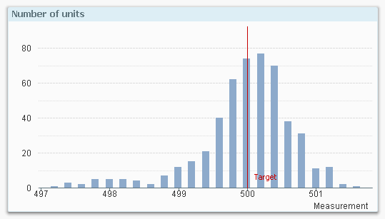
The above graph clearly shows you the distribution of the output of the machine: Most measurements are around target and the peak of the distribution is in fact slightly above target. But the histogram also raises questions: Is the variation small enough? And why is there such a long tail towards lower values? Could it be that we have a problem with a machine?
Finding such questions and their answers is central in all quality work, and the histogram is a good tool in helping you find them.
A histogram is special type of bar chart, and is easy to create in QlikView. A peculiarity is that it uses only one field, not several: As dimension, it uses the measurement in grouped form: Each measurement is assigned to an interval or bin, and this way the dimension gets discrete values.
As expression it uses the count of the measurement, and so the graph shows the distribution of one single field.
One small challenge is to determine how many bins the histogram should have: Having too many bins will exaggerate the variation, whereas too few will obscure it. A simple rule of thumb is to have 10-15 bins.
This is how you create a histogram in QlikView:
- Create an Input Box. In its properties, create a new variable called BinWidth. Click OK.
- Set BinWidth to 1 in the Input Box.
- Create a Bar Chart with a calculated dimension, using =Round(Value, BinWidth)
- Set the label for the calculated dimension to “Measurement”. Click Next.
- Use Count(Value) as expression. Click Next.
- Sort the calculated dimension numerically. Click Next three times.
- On the “Axes” page, enable “Continuous” on the Dimension Axis. Click Next.
- On the “Colors” page, disable the “Multicolored” under Data appearance. Click Finish.
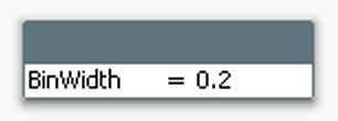
You should now have a histogram.
If you have too few bars, you need to make the bin width smaller. If you have too many, you should make it bigger.
In order to make the histogram more elaborate you can also do the following:
- Add error bars to the bins. The error (uncertainty) of a bar is in this case the square root of the bar content, i.e. Sqrt(Count(Value))
- Add a second expression containing a Gaussian curve (bell curve):
- Convert the chart to a Combo chart
- Use the following as expression for the bell curve:
Only(Normdist(Round(Value,BinWidth),Avg(total Value),Stdev(total Value), 0))*BinWidth*Count(total Value) - Use bars for the measurement and line for the curve.
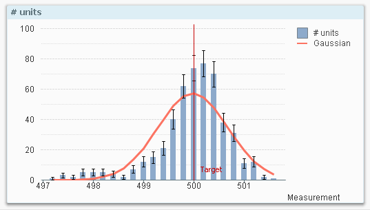
With these changes, you can quickly assess whether the measurements are normally distributed or whether there are some anomalies.
Good luck!
Further reading related to data classification:
You must be a registered user to add a comment. If you've already registered, sign in. Otherwise, register and sign in.