Unlock a world of possibilities! Login now and discover the exclusive benefits awaiting you.

- Qlik Community
- :
- Blogs
- :
- Technical
- :
- Design
- :
- Recipe for a Pareto Analysis

.png "Former Employee") hic
hic
- Subscribe to RSS Feed
- Mark as New
- Mark as Read
- Bookmark
- Subscribe
- Printer Friendly Page
- Report Inappropriate Content
This type of question is common in all types of business intelligence. I say “type of question” since it appears in many different forms: Sometimes it concerns products, but it can just as well concern customers, suppliers or sales people. It can really be any dimension. Further, here the question was about turnover, but it can just as well be number of support cases, or number of defect deliveries, etc. It can in principle be any additive measure.
It is called Pareto analysis. Sometimes also known as 80/20 analysis or ABC analysis.
The logic is that you first sort the products according to size, then accumulate the numbers, and finally calculate the accumulated measure as a percentage of the total. The products contributing to the first 80% are your best products; your “A” products. The next 10% are your “B” products, and the last 10% are your “C” products.
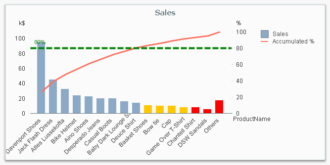
And here’s how you do it in QlikView:
- Create a pivot table and choose your dimension and your basic measure. In my example, I use Product and Sum(Sales).
- Sort the chart descending by using the measure Sum(Sales) as sort expression. It is not enough just to check “Sort by Y-value”.
- Add a second expression to calculate the accumulated sales value:
RangeSum(Above(Sum(Sales), 0, RowNo()))
Call this expression Accumulated Sales. The Above() function will return an array of values – all above values in the chart – and the RangeSum() function will sum these numbers. - Create a third expression from the previous one; one that calculates the accumulated sales in percent:
RangeSum(Above(Sum(Sales), 0, RowNo())) / Sum(total Sales)
Format it as a percentage and call it Inclusive Percentage. - Create a fourth expression from the previous one; one that calculates the accumulated sales in percent, but this time excluding the current row:
RangeSum(Above(Sum(Sales), 1, RowNo())) / Sum(total Sales)
Format it as a percentage and call it Exclusive Percentage. - Create a fifth expression for the ABC classification:
If([Exclusive Percentage] <= 0.8, 'A', If([Exclusive Percentage] <= 0.9, 'B', 'C'))
Call this expression Pareto Class. The reason why the Exclusive Percentage is used, is that the classification should be determined by the lower bound of a product’s segment, not the upper. - Create a conditional background color, e.g.
If([Pareto Class] = 'C', LightRed(), If([Pareto Class] = 'B', Yellow()))
You should now have a table similar to the following. In it you can clearly see the classification of different products.
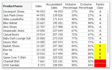
In this table, there are five different expressions that you can use for Pareto analysis. The graph in the beginning of this post uses Sales and Inclusive Percentage for the bars and the line, respectively; and Pareto Class for the coloring of the bars.
Further, you may want to combine the Pareto Class and the Exclusive Percentage into one expression:
Pareto Class =
If(RangeSum(Above(Sum(Sales),1,RowNo())) / Sum(total
Sales) <= 0.8, 'A',
If(RangeSum(Above(Sum(Sales),1,RowNo())) / Sum(total Sales) <= 0.9, 'B', 'C'))
Good luck in creating your Pareto chart.
Further reading related to this topic:
- « Previous
- Next »
You must be a registered user to add a comment. If you've already registered, sign in. Otherwise, register and sign in.