Unlock a world of possibilities! Login now and discover the exclusive benefits awaiting you.
- Qlik Community
- :
- Blogs
- :
- Technical
- :
- Design
- :
- Working with Maps in Qlik Sense: Tips and Tricks
- Subscribe to RSS Feed
- Mark as New
- Mark as Read
- Bookmark
- Subscribe
- Printer Friendly Page
- Report Inappropriate Content
Qlik Sense Map charts are used to geographically display data related to countries, cities, states, regions, or particular geolocations (etc…). Maps offer different ways to present your data by first setting a base layer, then adding multiple layers to the map which are specific locations highlighted in multiple ways including Area, Points, Lines, Density, boundaries etc..
You can add as many layers as you want. These layers are comprised of dimensions and measures that allow to efficiently present geographical distribution of values related to locations in order to display a data story.
Types of layers:
- Point Layer: composed of bubbles or markers (you can choose a shape) positioned in specific coordinates (Lat / Long)
- Area Layer: geographic shapes sized and placed on specific areas
- Line Layer: connect two fields containing point data or a field containing geometries.
- Heatmap Layer: uses color gradient to show data density (intensity is greater at the center and declines towards the outer perimeter)
Base Maps:
Using different base maps can enhance the way data is displayed and aid in analysis. You can choose from:
- Default: Good for when using only 1 or 2 simple layers
- Pale: great for when you add multiple layers with different colors which might be difficult to read if using the default base
- Dark: good for when you color layers with bright colors, this style can also be used when it matches the rest of your dark themed dashboard.
- Satellite: gives a more realistic look to your map
- None: in this case, you can add custom background layers (covered later in this post)
Best Practices when designing Maps:
- Make your maps Simple to read:
- Be sure to use colors purposefully (stick to the default palette or use something like this https://jarrettmeyer.com/2018/08/07/viridis-color-palette)
- Use tooltips when necessary to provide more context when your layers are hovered.
- Change fonts and font colors when necessary, think about contrast between your layer coloring and the overlapping text font color.
- Think about the data you are visualizing:
- Continuous vs Discrete
- If visualizing two or more variable, it’s better to use color and size
- For instance, in a point layer showing office locations, you can color the point based on number of employees and size the bubble based on the Sum of sales made.
Advanced Uses:
Multi-Layer Maps:
When including multiple layers in map chart, it might become hard to interpret data. In that case, you can address this by controlling at what zoom levels different layers appear or have layers that appear only if other values in a drill-down dimensions are selected. This allows to create multiple levels of detail as you make selections and zoom in and out or locations of interest on the map.
- Zoom-Dependent Layer Display
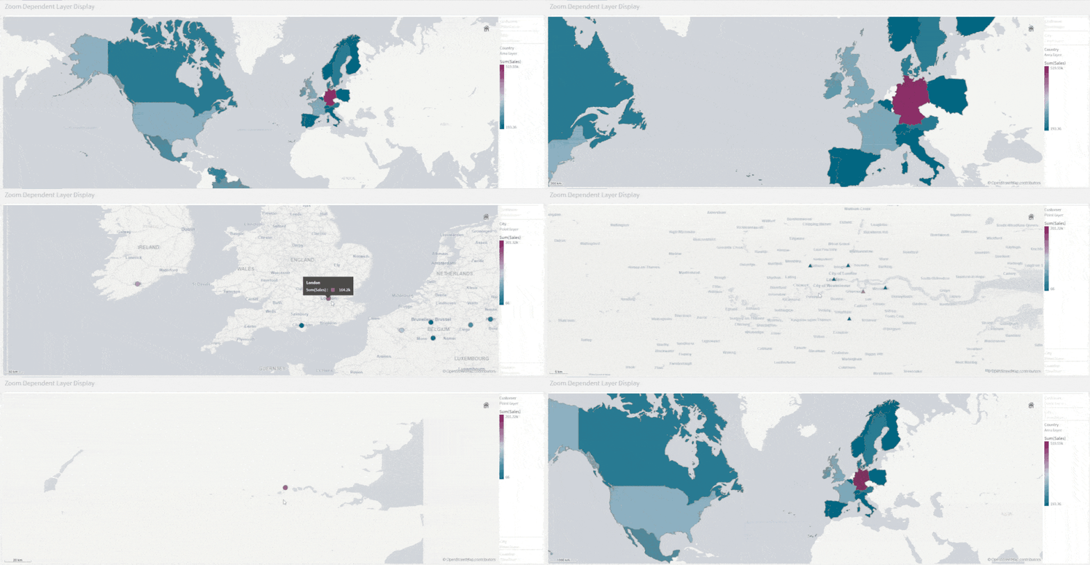
Let’s create a map that relies on Zoom to reveal different layers.
- We start by creating the first layer as an Area layer to represent Countries and we color using the Sum(Sales) aggregated measure.
- We choose the Pale base type in order for the data to stand out more.
- Next, we add two new Point Layers
- First, to represent cities. We choose to color by measure using the Sum(Sales) aggregation.
- Second, to represent Customers. We choose the shape of the point layer to be a Triangle, and we color by Sum(Sales)
- Lastly, we configure the Layers to only show at certain zoom levels. We do that by changing the Layer Display “Show in zoom levels” property from Auto to Custom.
- Country Area Layer will show up until 4x zoom
- City Point Layer will show from 4x to 9x zoom
- Customer Layer will show starting at 10x zoom
The result:
- Drill-Down Layer Display
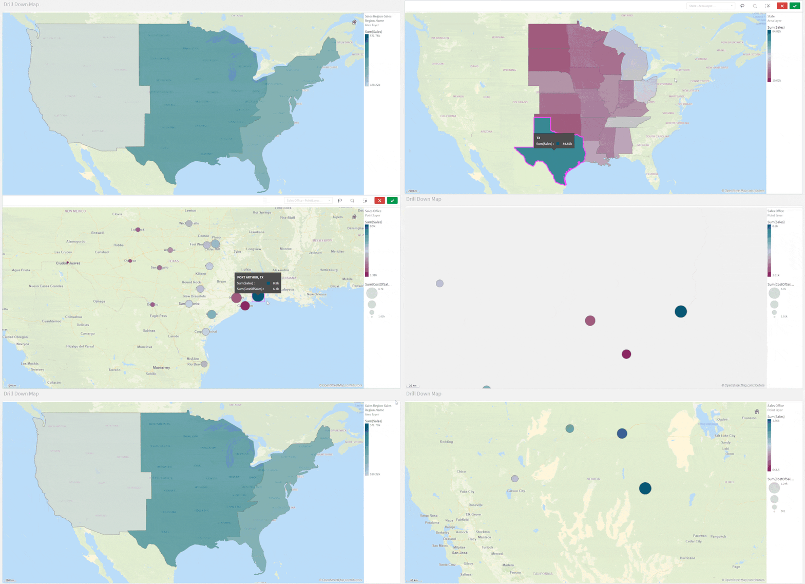
Let’s create a map that uses a drill-down dimension to display layers based on selection. Keep in mind that Drill-down dimensions should have the fields in order of highest geographical are to smallest geographical area.
- First, we create a Drill-down master dimension that contains three levels:
- Sales Region
- State
- Sales office
- Next, we add out 3 layers:
- An Area Layer for Sales Region: Choose the created Master Dimension as the dimension of the layer, and choose Sales Region.Area as the location.
- An Area Layer for the states.
- A Point layer for Sales offices.
- To enable the drill-down functionality. For each layer, navigate to Layer Options > Display. And change the “Visible drill-down levels” property from Auto to Custom and un-select the non-relevant layers, for instance:
The result:
Tip:
If you load data and it appears incorrect like below:
Head to Location, switch off Scope for location from Auto to Custom.
Change Location Type to “Administrative Area (Level 1)” in our case. Then, change Country to your location, in our example it’s ‘US’
Multiple Background Layers:
To use custom base maps beyond the types mentioned above, you can add different background layers.
Let’s create a map with multiple background layers using a TMS and two WMS.
- First, we need to set the Base Map to non under Map Settings.
- Next, we add the first layer as a Background Layer and choose Format to be TMS
- We include the appropriate URL and attribution
- For the second and third layers, we use WMS server URLs, set the version and Load the WMS.
Important:
Keep in mind that when using URLs for TMS and WMS formats for background layers, these URLs that contain resource requests to external resources must have its origins allowlisted in the Content Security Policy, else the resource will not be loaded. WMS resources must have both image-src and connect-src directives allowlisted. More Info here.
- Finally, we add a Point Layer.
The Result:
The QVFs for all three advanced examples can be found below. You can load them to your Qlik Cloud tenant, investigate the chart settings, and tweak the configurations to practice these concepts.
You must be a registered user to add a comment. If you've already registered, sign in. Otherwise, register and sign in.


