Unlock a world of possibilities! Login now and discover the exclusive benefits awaiting you.
- Qlik Community
- :
- Forums
- :
- Analytics & AI
- :
- Products & Topics
- :
- Integration, Extension & APIs
- :
- Re: Export chart PDF
- Subscribe to RSS Feed
- Mark Topic as New
- Mark Topic as Read
- Float this Topic for Current User
- Bookmark
- Subscribe
- Mute
- Printer Friendly Page
- Mark as New
- Bookmark
- Subscribe
- Mute
- Subscribe to RSS Feed
- Permalink
- Report Inappropriate Content
Export chart PDF
We have a web app that allows users to export line charts to PDF. The export process utilizes the Vosialization API’s exportPDF() method. The problem we are having is that the image for longer charts is being clipped in order for it to fit in the PDF page. Is there a way to scale the image smaller so that it can be embedded into the PDF without being clipped? Or is there another recommended way to do this?
thanks
Brian
- Mark as New
- Bookmark
- Subscribe
- Mute
- Subscribe to RSS Feed
- Permalink
- Report Inappropriate Content
In the API, have you tried specifying 'fit to page' option?
- Mark as New
- Bookmark
- Subscribe
- Mute
- Subscribe to RSS Feed
- Permalink
- Report Inappropriate Content
Thanks for your response. I am using the aspectRatio set to 2 as shown in the settings object defined below. I've also experimented with using aspectRatio = 0 and setting the object size to a specific size but so far have not been able to get that setting to work at all, the resulting PDF image is empty - the settings I used for this test is shown commented out below.
var settings = { documentSize: "a4", aspectRatio: 2, orientation: "landscape" };
//var settings = { documentSize: "a4", aspectRatio: 0, orientation: "landscape", objectSize: "{height: 452, width: 1327}" };

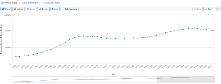
Below is a screen shot of the PDF file that is generated from the above chart using the aspectRatio of 2 setting with the exportPDF() method. As you can see, the chart in the PDF is clipped so that it only shows years 1958 through 1975. My goal is to have the PDF show the full set of years that are visible in the web page (1958 - 2001)
Any additional help you can provide will be greatly appreciated.
Thanks
Brian
- Mark as New
- Bookmark
- Subscribe
- Mute
- Subscribe to RSS Feed
- Permalink
- Report Inappropriate Content
Hopefully someone else can chime in, I think it might just be the fixed nature of the QlikSense sheets.
Although you can extend vertically, you can't make a chart 'super-wide', so I think ( someone correct me ) what's happening is, the visualisation is scaling to a 'default' width, rather than what's specified in your chart when rendering for the PDF.
It's just as unpredictable and uncontrollable when doing stuff for NPrinting too.
The only work around might be to have the axis as a true date axis, display as 'year' only, then have fewer label intervals. It's a shame there's not more control in the chart object around this, like there is in Excel, where the data points in a chart and the label intervals don't need to match up.

