Unlock a world of possibilities! Login now and discover the exclusive benefits awaiting you.
- Qlik Community
- :
- Forums
- :
- Analytics & AI
- :
- Products & Topics
- :
- Integration, Extension & APIs
- :
- Grid Chart in Qlik Sense with visible labels in th...
- Subscribe to RSS Feed
- Mark Topic as New
- Mark Topic as Read
- Float this Topic for Current User
- Bookmark
- Subscribe
- Mute
- Printer Friendly Page
- Mark as New
- Bookmark
- Subscribe
- Mute
- Subscribe to RSS Feed
- Permalink
- Report Inappropriate Content
Grid Chart in Qlik Sense with visible labels in the symbol
Dear Expert,
I'm getting back for asking a support, I'm looking a Grid Chart where is visible the labels into the symbols.
Attached an example of what I'd like to obtain in Qlik Sense. I checked in internet some extension, but I was unable to find a satisfactory solution.
Do you have some ideas of extension that I could use to reach my scope?
I'm using the Qlik Sense November 2021 Path 3, and at the moment there is no schedule for a further upgrade of the system. Therefore, I'm looking a possible solution in the meantime.
Thanks
Regards.
- Mark as New
- Bookmark
- Subscribe
- Mute
- Subscribe to RSS Feed
- Permalink
- Report Inappropriate Content
Hi there,
I can't see exactly what your x and y axis are so the closest chart I could find to meet your requirements is the distribution plot chart.
This chart is available with your version of Qlik Sense
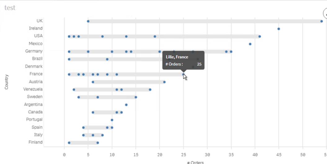
Perhaps you can try the scatter plot object as well in case that is more inline with your requirement.

Kind regards...
- Mark as New
- Bookmark
- Subscribe
- Mute
- Subscribe to RSS Feed
- Permalink
- Report Inappropriate Content
Dear Frank,
thank you for your suggestions, anyway the chart suggested does not work for my purpose. For your understanding, I attached the complete picture of my analysis: in the X-axis the dimension that reports the name of the employee, in the Y-axis a dimension which represents the grouping by days like (0-3 days, 4-10 days, ...). The bubble gives the idea about the magnitude of tickets resolved.
I'm looking a solution that gives me similar visualization where the values are highlighted in the bubbles without using the mouseover.
Hopefully, I'll be able to explain.
Regards.