Unlock a world of possibilities! Login now and discover the exclusive benefits awaiting you.
- Qlik Community
- :
- All Forums
- :
- Visualization and Usability
- :
- Bar chart color help
- Subscribe to RSS Feed
- Mark Topic as New
- Mark Topic as Read
- Float this Topic for Current User
- Bookmark
- Subscribe
- Mute
- Printer Friendly Page
- Mark as New
- Bookmark
- Subscribe
- Mute
- Subscribe to RSS Feed
- Permalink
- Report Inappropriate Content
Bar chart color help
Hi,
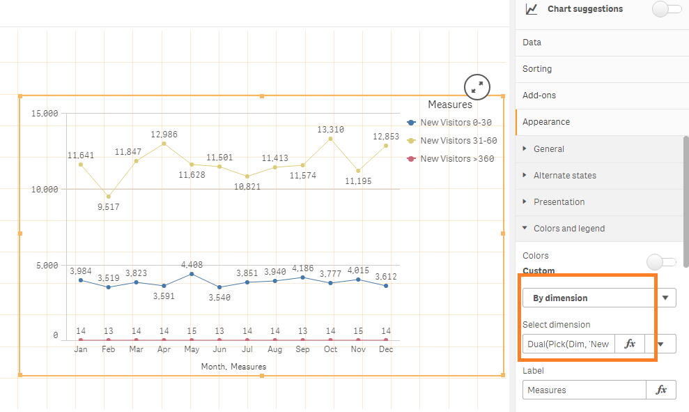
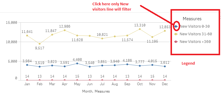
I have build a bar chart with measure filtering by creating the measures in Inline like below.
To display the legend on left side i have used by dimension under color with below expression.
=Dual(Pick(Dim, 'New Visitors 0-30', 'New Visitors 31-60', 'New Visitors >360'),Dim)
But client waht to see custom colors for these lines as
New Visitors 0-30 line in Red
New Visitors 31-60 line in Green
New Visitors >360 line in orange.
can any one please help me to apply the custom colors for these lines by keeping measure filtering.
Please find the below attached app and source file.
Thanks in advance
Accepted Solutions
- Mark as New
- Bookmark
- Subscribe
- Mute
- Subscribe to RSS Feed
- Permalink
- Report Inappropriate Content
Hi all,
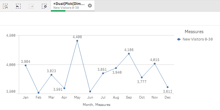
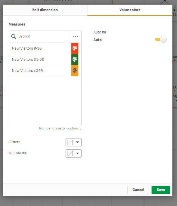
If you add it as a master dimension instead you can also pick individual colors.
The issue then is that the legend will be sorted alphabetically. Therefore you have to use a dual to get the sort order correct.
So try with this as your dimension.
=Pick(Dim, Dual('New Visitors 0-30',1), Dual('New Visitors 31-60',2), Dual('New Visitors >360',3))
Then save that dimension and then edit it and you will have tab with colors.
Attached an updated app.
Cheers,
Patrik.
- Mark as New
- Bookmark
- Subscribe
- Mute
- Subscribe to RSS Feed
- Permalink
- Report Inappropriate Content
Hi @mahitham
Thanks for sharing your project, it helped me a lot; QlikSense allows your to manage the measure color in Line Chart (and eventually everywhere else) when you use Master Items !!! It took me a while to understand your logic with the Pick function, I did not use it at all as it confused me by hidden the measure expression!
I created three master items: New Visitors 0-30; New Visitors 31-60 and New Visitors > 360 (I created the New Visitors master item while trying to understand your Pick logic, I did not use it); each one of these master items assign the color you were asked for. You create your Line Chart as usual, selecting the Dimension (Month) then adding each Master Item, the last step was styling the Line-Chart.
Here some screenshots and attached is the current version of the application file.
These are the three master items:
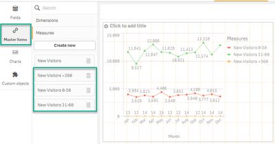
This is the Master Item edit-creation form.

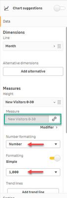
Additional formatting-styling was done at the control attributes:
Hope this helps,
A journey of a thousand miles begins with a single step.
- Mark as New
- Bookmark
- Subscribe
- Mute
- Subscribe to RSS Feed
- Permalink
- Report Inappropriate Content
Hi,
Thanks for your reply. By using master items we can add the color. But in my case I have to use only one expression because if you select any measure item from legend that particular line will be filtered in the chart I have added.
But if we add 3 measures from master items we cant filter the measures. by keeping that expression I am looking for how to apply the custom colors.
- Mark as New
- Bookmark
- Subscribe
- Mute
- Subscribe to RSS Feed
- Permalink
- Report Inappropriate Content
Who is legend? Would you please elaborate? I have the application open and I did not find a legend field.
A journey of a thousand miles begins with a single step.
- Mark as New
- Bookmark
- Subscribe
- Mute
- Subscribe to RSS Feed
- Permalink
- Report Inappropriate Content
Hi,
By using Pick expression on Color --> By Dimension in that we can see the Legend and we can also filter these legends/measures. The requirement is by keeping this measure filtering need to add the custom color.
- Mark as New
- Bookmark
- Subscribe
- Mute
- Subscribe to RSS Feed
- Permalink
- Report Inappropriate Content
Hi all,
If you add it as a master dimension instead you can also pick individual colors.
The issue then is that the legend will be sorted alphabetically. Therefore you have to use a dual to get the sort order correct.
So try with this as your dimension.
=Pick(Dim, Dual('New Visitors 0-30',1), Dual('New Visitors 31-60',2), Dual('New Visitors >360',3))
Then save that dimension and then edit it and you will have tab with colors.
Attached an updated app.
Cheers,
Patrik.
- Mark as New
- Bookmark
- Subscribe
- Mute
- Subscribe to RSS Feed
- Permalink
- Report Inappropriate Content
Also, as a bonus you get a nicer selection bar
Patrik.
