Unlock a world of possibilities! Login now and discover the exclusive benefits awaiting you.
- Qlik Community
- :
- All Forums
- :
- Visualization and Usability
- :
- Chart with three columns
Options
- Subscribe to RSS Feed
- Mark Topic as New
- Mark Topic as Read
- Float this Topic for Current User
- Bookmark
- Subscribe
- Mute
- Printer Friendly Page
Turn on suggestions
Auto-suggest helps you quickly narrow down your search results by suggesting possible matches as you type.
Showing results for
Anonymous
Not applicable
2019-11-28
01:27 AM
- Mark as New
- Bookmark
- Subscribe
- Mute
- Subscribe to RSS Feed
- Permalink
- Report Inappropriate Content
Chart with three columns
Hello qlikers 🙂 ,
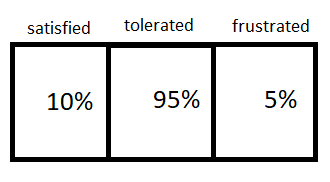
I want to create a chart with three columns.
I could also create a table for this. But I don't want that you can select and I also want to play with colours.
How can I do that? 🙂 Thank you in advance! Looking forward to reading some answers.
447 Views
1 Reply
Partner - Master
2019-11-28
02:26 AM
- Mark as New
- Bookmark
- Subscribe
- Mute
- Subscribe to RSS Feed
- Permalink
- Report Inappropriate Content
Hi Steven,
The Vizlib KPI Designer would be a good match for this. It lets you customize this to your own wishes. You can put three KPIs next to each other and give the exact coloring.
Jordy
Climber
Work smarter, not harder
430 Views
Community Browser
