Unlock a world of possibilities! Login now and discover the exclusive benefits awaiting you.
- Qlik Community
- :
- Forums
- :
- Analytics
- :
- New to Qlik Analytics
- :
- Color Coding Individual Cells in Pivot Table
- Subscribe to RSS Feed
- Mark Topic as New
- Mark Topic as Read
- Float this Topic for Current User
- Bookmark
- Subscribe
- Mute
- Printer Friendly Page
- Mark as New
- Bookmark
- Subscribe
- Mute
- Subscribe to RSS Feed
- Permalink
- Report Inappropriate Content
Color Coding Individual Cells in Pivot Table
Hi everyone!
I am currently working on creating a pivot table that has cells that are color coded by measure from max to min.
Below is an example of what it would look like in excel:
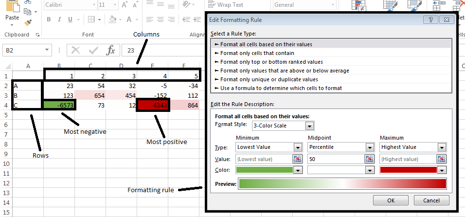
I was already able to sort the rows from max to min by sum of the entire row.
Any recommendations for color expressions for the pivot table would be highly appreciated!
Edit:
I am working in QlikSense.
I found the following tutorial for something similar, but in QlikView: Tile Grid Maps – Qlik Freak
The problem I believe is how I am loading the data in differently from the tutorial.
Here is another source I looked into, but it colors based on each row or column independently, not based on the entire table: Color a Pivot Table