Unlock a world of possibilities! Login now and discover the exclusive benefits awaiting you.
- Qlik Community
- :
- Forums
- :
- Analytics
- :
- New to Qlik Analytics
- :
- Re: Creating filters in qlik sense for pivot table
- Subscribe to RSS Feed
- Mark Topic as New
- Mark Topic as Read
- Float this Topic for Current User
- Bookmark
- Subscribe
- Mute
- Printer Friendly Page
- Mark as New
- Bookmark
- Subscribe
- Mute
- Subscribe to RSS Feed
- Permalink
- Report Inappropriate Content
Creating filters in qlik sense for pivot table
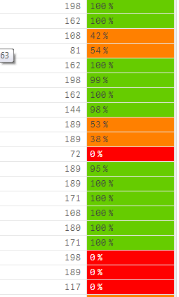
I have a pivot table where I indicated the some margin values to be given in some colors. This is measure in my case. But I need to create filters for the pivot table explicitly within particular range say for example <25 to be red color like that. Is that possible?
- Mark as New
- Bookmark
- Subscribe
- Mute
- Subscribe to RSS Feed
- Permalink
- Report Inappropriate Content
Yes, that's possible. You can specify that you want to use an expression to calculate the background color of the column. You'll need an expression like:
If( ...value... < 0.25, LightRed(), if( ...value... < 0.75, RGB(255,128,0). LightGreen() ))
Change ...value... with the field or expression that calculates the values you see as percentages in the column.
talk is cheap, supply exceeds demand
- Mark as New
- Bookmark
- Subscribe
- Mute
- Subscribe to RSS Feed
- Permalink
- Report Inappropriate Content
ya this I got. But unlike Bar chart can i create legend like for pivot table using some other options available?
- Mark as New
- Bookmark
- Subscribe
- Mute
- Subscribe to RSS Feed
- Permalink
- Report Inappropriate Content
Hi,
You can describe coloring logic using Footnote property of pivot object - this is simple idea but pretty logical. You will find footnote in properties of pivot object under Apperance -> General -> Footnote. Example below.
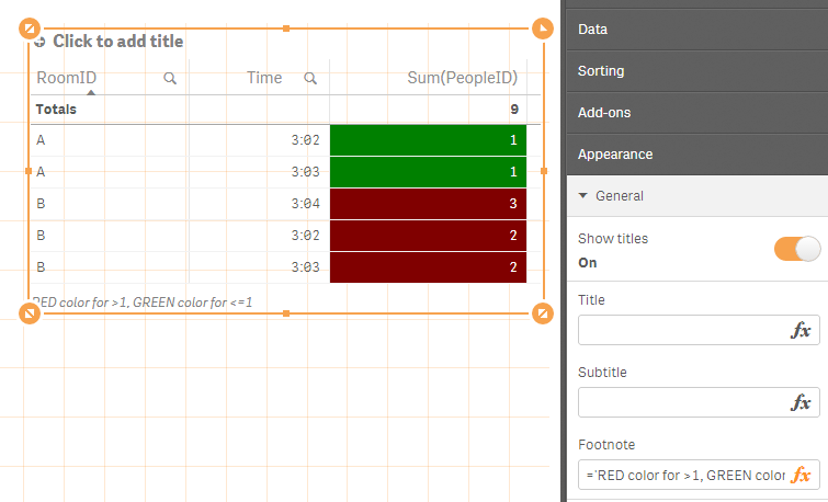
BR,
Milosz