Unlock a world of possibilities! Login now and discover the exclusive benefits awaiting you.
- Qlik Community
- :
- Forums
- :
- Analytics
- :
- New to Qlik Analytics
- :
- Re: Display Time proportionally on the X-axis of a...
- Subscribe to RSS Feed
- Mark Topic as New
- Mark Topic as Read
- Float this Topic for Current User
- Bookmark
- Subscribe
- Mute
- Printer Friendly Page
- Mark as New
- Bookmark
- Subscribe
- Mute
- Subscribe to RSS Feed
- Permalink
- Report Inappropriate Content
Display Time proportionally on the X-axis of a Line Chart?
Can I configure Qlik Sense to display Time proportionally on the X-axis of a Line Chart? Currently each time data point is spaced equidistant from the previous one.
Accepted Solutions
- Mark as New
- Bookmark
- Subscribe
- Mute
- Subscribe to RSS Feed
- Permalink
- Report Inappropriate Content
Hey Phil - I tired a simple - example and with the default product, I don't think it is possible to scale the X-Axis in this matter with a time value at the moment.
Possibly Jonathan Poole might have a solution, but I think it is more a function of the chart object itself.
If not we can push this to PM and open as a feature request.
Mike Tarallo
Qlik
- Mark as New
- Bookmark
- Subscribe
- Mute
- Subscribe to RSS Feed
- Permalink
- Report Inappropriate Content
Hi Phil, can you attach a screen shot please, to get a better picture?
I think I know what you mean, but can't really articulate it. Such as mins within hours, where the mins are displayed as half tick marks on the axis, while the hours are larger tick marks, something like that? The mins are in proper portion to the number of hours, etc.?
Thanks
Mike
Mike Tarallo
Qlik
- Mark as New
- Bookmark
- Subscribe
- Mute
- Subscribe to RSS Feed
- Permalink
- Report Inappropriate Content
Do you want to show all dates or time periods rather than just the ones in your data set ?
An example below. Top chart shows the dates that exist in the data. Its Order data and there wasn't orders on every date. Bottom chart builds a date calendar with ALL dates between the min/max date in the data set... so everything is proportional. Are you looking for something like the bottom chart display?
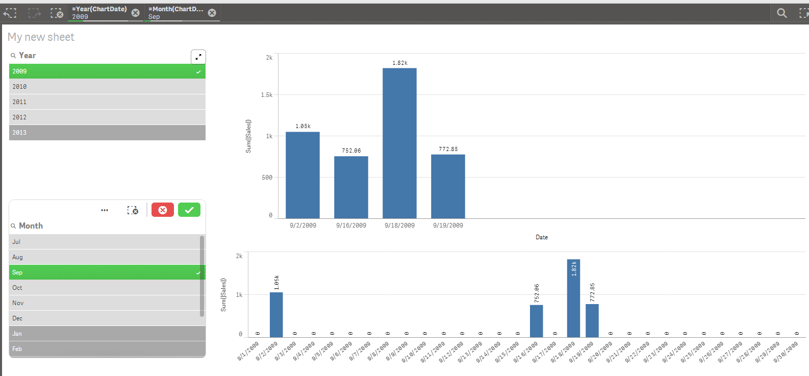
Here is the code i used in the loadscript. ('data' is the name of my source data table that has the date field). Also the year and month field in the screenshot were computed off new date field that has all dates. )
MaxMinDates:
load
max(Date) as MaxDate,
min(Date) as MinDate
Resident Data;
let vMaxDate=Peek('MaxDate',0,'MaxMinDates');
let vMinDate=Peek('MinDate',0,'MaxMinDates');
Dates:
load
date(RecNo()-1 + $(vMinDate)) as ChartDate
AutoGenerate ($(vMaxDate)-$(vMinDate)+1);
drop table MaxMinDates;
left join (Dates)
Load
Date as ChartDate,
Date
resident Data;
- Mark as New
- Bookmark
- Subscribe
- Mute
- Subscribe to RSS Feed
- Permalink
- Report Inappropriate Content
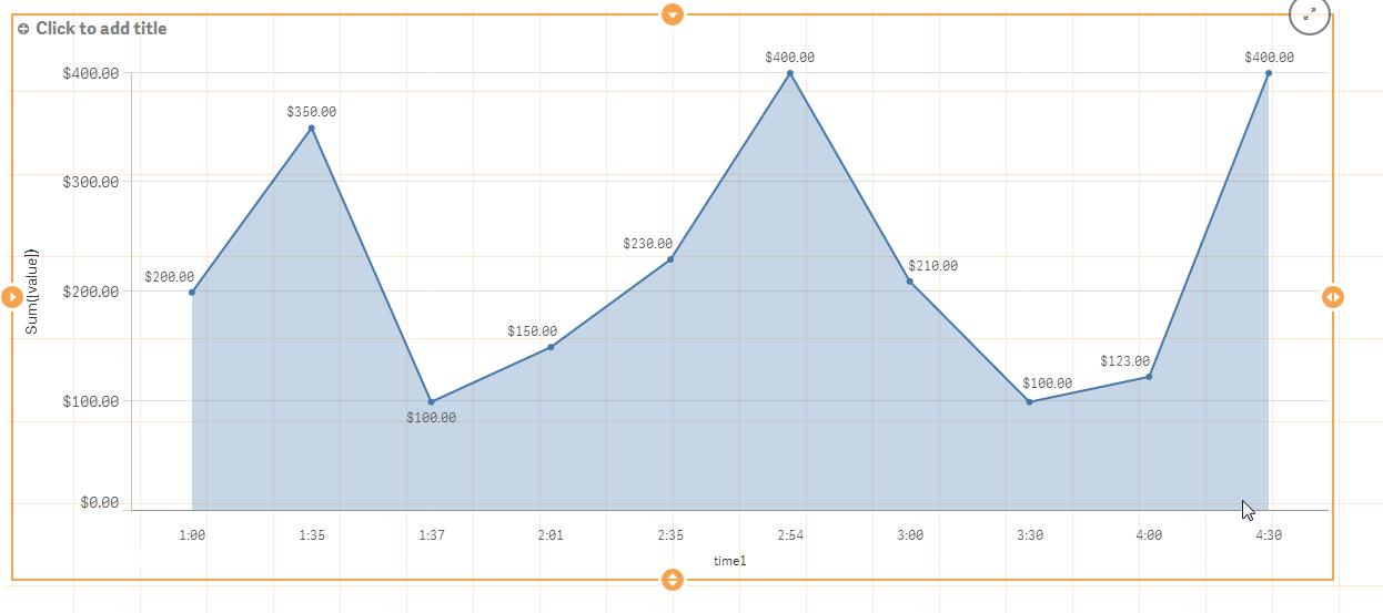
Hi guys, thanks for the replies. I have attached a screen shot that hopefully illustrates what I mean.
My data points are on an irregular time line: 02:00, 02:38, 03:38, 03:38, 04:39, 05:39, 06:00, 06:39, etc.
Currently each time seems to be distributed equidistant from the previous one on the time line. What I would like is to have them distributed proportionally depending on the time interval between them. I don't actually need to have labels for the specific times of the data, just time labels at regular intervals, like 02:00, 03:00, 04:00, 05:00, 06:00, etc.
- Mark as New
- Bookmark
- Subscribe
- Mute
- Subscribe to RSS Feed
- Permalink
- Report Inappropriate Content
Hey Phil - I tired a simple - example and with the default product, I don't think it is possible to scale the X-Axis in this matter with a time value at the moment.
Possibly Jonathan Poole might have a solution, but I think it is more a function of the chart object itself.
If not we can push this to PM and open as a feature request.

Mike Tarallo
Qlik
- Mark as New
- Bookmark
- Subscribe
- Mute
- Subscribe to RSS Feed
- Permalink
- Report Inappropriate Content
Thank you for taking a look. I do believe such a manipulation of the X-axis is possible in QlikView, so I thought it may also be possible in Sense. I think it would be a very useful capability, as line graphs are frequently used to show events along a continuous time line, but the data may not all be taken at regular time intervals.
- Mark as New
- Bookmark
- Subscribe
- Mute
- Subscribe to RSS Feed
- Permalink
- Report Inappropriate Content
Thanks Phil - I added a new feature request into the system
Mike Tarallo
Qlik
- Mark as New
- Bookmark
- Subscribe
- Mute
- Subscribe to RSS Feed
- Permalink
- Report Inappropriate Content
***REVISED COMMENT**
Phil - yes this is possible. As Mike says, there currently isn't a feature to autopopulate the time or date axis with all time points or dates (whether there is data or not). But the workaround is to introduce those data points into the data model through a technique in the 'load editor' . This is what i did with the date example above. Your data goes down to the minute and so you will have 60x24 (=1440) potential bars for each days worth of data. That will introduce some sparsity potentially .
For example, if my raw data is this:
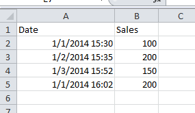
Then my chart will be as follows. The upper includes all minutes in the selection ... you can see 3 very spaced apart bars for the hour (3pm selected) . The bottom is what you have. Just the 3 minutes are displayed but they are grouped as if the minutes came 1 after each other.
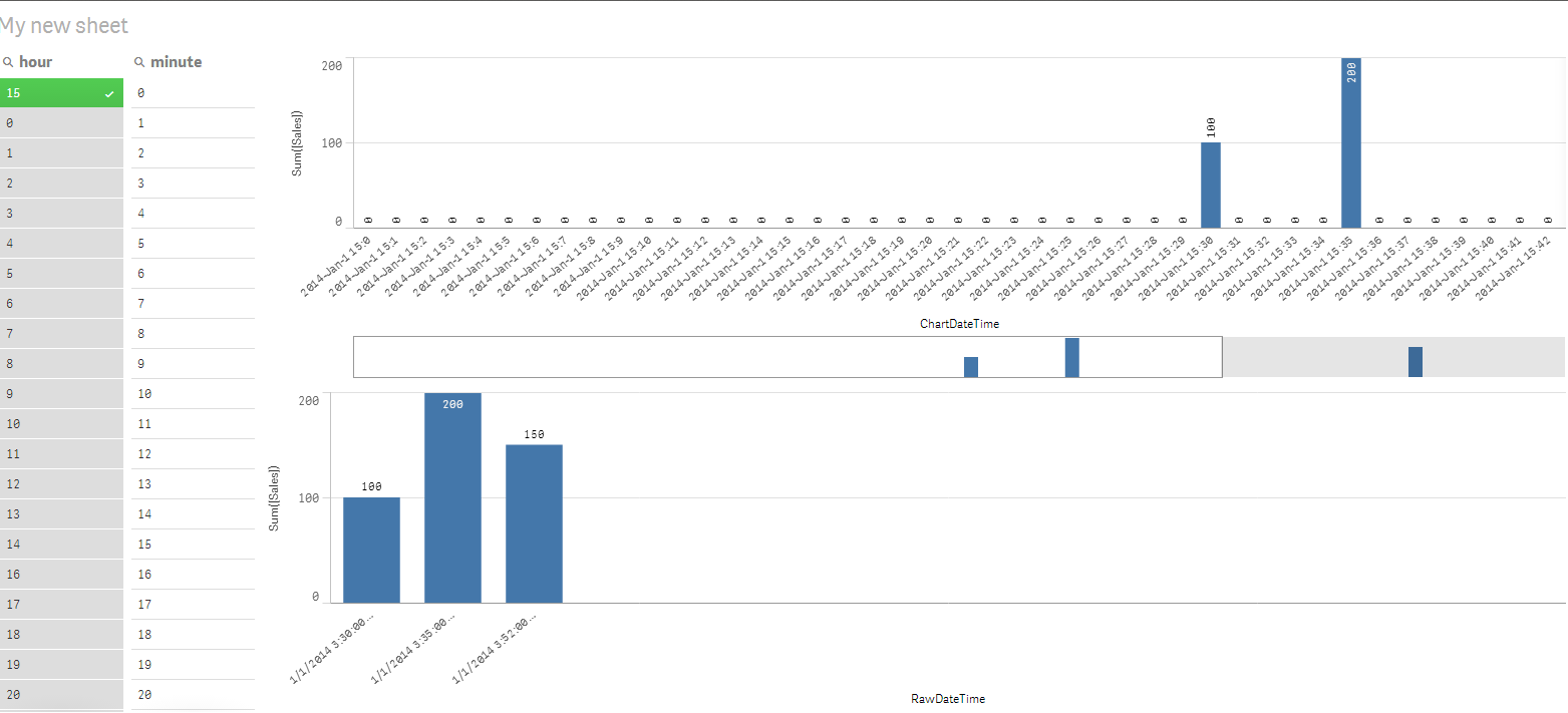
Attached is the QVF with the scripting required as well as the sample source data. Its fairly generic and could be repeated in any QVF that has timestamps in the data. Its therefore repeatable and reusable.
This is a quick example and there are probably a few optimizations to be made as well . Feedback and better approaches are welcome.