Unlock a world of possibilities! Login now and discover the exclusive benefits awaiting you.
- Qlik Community
- :
- Forums
- :
- Analytics
- :
- New to Qlik Analytics
- :
- Re: Display grouped line graph counts.
- Subscribe to RSS Feed
- Mark Topic as New
- Mark Topic as Read
- Float this Topic for Current User
- Bookmark
- Subscribe
- Mute
- Printer Friendly Page
- Mark as New
- Bookmark
- Subscribe
- Mute
- Subscribe to RSS Feed
- Permalink
- Report Inappropriate Content
Display grouped line graph counts.
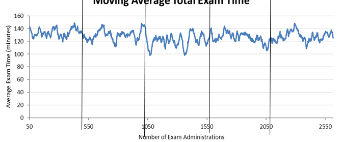
I have a line graph(The first image below) that I need the bottom dimension to look like what is displayed in the second image. where the bottom dimension starts at 50 then 550 then 1050 and so on instead of displaying 34,47,88,210 and so on. Is there a way to do this?
The below expression is what I am using for the bottom dimension in the first image.
=Aggr( Count( Distinct ExamID), ExamAchievedDate)

Accepted Solutions
- Mark as New
- Bookmark
- Subscribe
- Mute
- Subscribe to RSS Feed
- Permalink
- Report Inappropriate Content
It seems like your axis isn't marked as continuous, which is why it's getting labels that match the actual values returned by the aggr() rather than "clean" numeric labels. Try marking it as continuous and see if that helps.
