Unlock a world of possibilities! Login now and discover the exclusive benefits awaiting you.
- Qlik Community
- :
- All Forums
- :
- Visualization and Usability
- :
- Re: Dynamic Filter on a Pivot table Row-Qlik Sense
- Subscribe to RSS Feed
- Mark Topic as New
- Mark Topic as Read
- Float this Topic for Current User
- Bookmark
- Subscribe
- Mute
- Printer Friendly Page
- Mark as New
- Bookmark
- Subscribe
- Mute
- Subscribe to RSS Feed
- Permalink
- Report Inappropriate Content
Dynamic Filter on a Pivot table Row-Qlik Sense
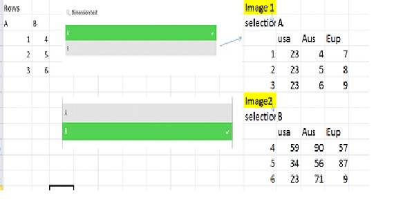
Hi ,Using Qlik sense is there a way to create a dynamic filter on pivot table rows,
In example below
A and B are 2 different fields.
when I select A -which has values 1,2,3 the pivot table has to be my image 1
when I select B- which has values 4,5,6 the pivot table has to be my image 2

Thanks
Prana
- « Previous Replies
-
- 1
- 2
- Next Replies »
Accepted Solutions
- Mark as New
- Bookmark
- Subscribe
- Mute
- Subscribe to RSS Feed
- Permalink
- Report Inappropriate Content
can't you see this?
What you do is creating a pivot table;
as dimension: ID
as measure (your expression; sum(sales) ?)
then add a column : country
Then under complement:
Enter this :
count(distinct YourFilterField)=1
With this way, your graphic won't show unless you select ONLY 1 FILTER ( A or B)
As for the default selections, please follow the thread I suggested you to follow
- Mark as New
- Bookmark
- Subscribe
- Mute
- Subscribe to RSS Feed
- Permalink
- Report Inappropriate Content
Sure, can yous hare your QVF file? I'll show you how?
- Mark as New
- Bookmark
- Subscribe
- Mute
- Subscribe to RSS Feed
- Permalink
- Report Inappropriate Content
See the attached app
- Mark as New
- Bookmark
- Subscribe
- Mute
- Subscribe to RSS Feed
- Permalink
- Report Inappropriate Content
Omar- thankyou for your time on this
I was still figuring out on how to attach qvf file to my reply.
what you have here is pretty much what iam looking for.
I am also looking for a default selection on value A and default visualization to be image 1.
do you mind sharing the .qvf here?
thanks
Prana
- Mark as New
- Bookmark
- Subscribe
- Mute
- Subscribe to RSS Feed
- Permalink
- Report Inappropriate Content
the app is already shared;
as for default selections, please refer to this thread:
- Mark as New
- Bookmark
- Subscribe
- Mute
- Subscribe to RSS Feed
- Permalink
- Report Inappropriate Content
Sorry all I see is images. I don't see an attachment to download qvf file and open in my desktop.
not sure how you loaded the data in filter? and how you passed the filter values to table on selection.
Initially I followed this thread to start my work.
How to use different filters on X and Y in a scatter plot?
but my connections are not working. thought I select my values nothing changes in the chart.
- Mark as New
- Bookmark
- Subscribe
- Mute
- Subscribe to RSS Feed
- Permalink
- Report Inappropriate Content
can't you see this?
What you do is creating a pivot table;
as dimension: ID
as measure (your expression; sum(sales) ?)
then add a column : country
Then under complement:
Enter this :
count(distinct YourFilterField)=1
With this way, your graphic won't show unless you select ONLY 1 FILTER ( A or B)
As for the default selections, please follow the thread I suggested you to follow
- Mark as New
- Bookmark
- Subscribe
- Mute
- Subscribe to RSS Feed
- Permalink
- Report Inappropriate Content
Thankyou - this is helpful.
- Mark as New
- Bookmark
- Subscribe
- Mute
- Subscribe to RSS Feed
- Permalink
- Report Inappropriate Content
Hi Omar,
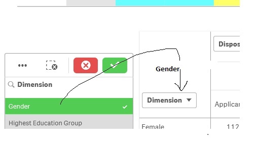
as an extension to this is there a way the row title dynamically changes based on the filter selected? I have read the threads - and also used the Dynamator extension mentioned in the thread here, it didn't work for me.
Emulating dynamic labels in Qlik Sense
Dynamic Label for Dimensions/Measures?
thanks for all your help .

- Mark as New
- Bookmark
- Subscribe
- Mute
- Subscribe to RSS Feed
- Permalink
- Report Inappropriate Content
No, That won't be possible, but you can add the information in the Title for example:
='Dimension is '&GetFieldSelections(Dimension)
- « Previous Replies
-
- 1
- 2
- Next Replies »