- Mark as New
- Bookmark
- Subscribe
- Mute
- Subscribe to RSS Feed
- Permalink
- Report Inappropriate Content
Footnote challenge
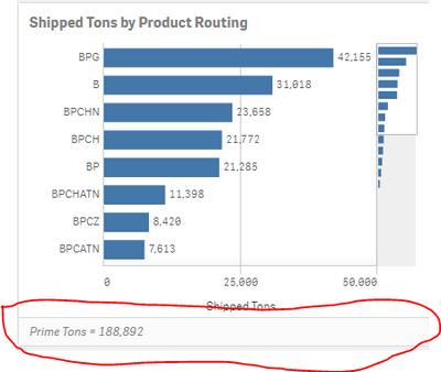
I have searched many forums looking for an answer to this, but I cannot find one. We are on Qlik Server (Nov, 2019 I think). I created an app around 1 year ago that included some calculated numbers in the footer of charts and it displays nicely differentiated with a shaded box like the chart below.
However, I cannot duplicate this same format in any other app. In all other apps I have created, the footer looks like this, undifferentiated from the main chart and to me much less elegant:
The only other difference I notice is that chart objects are all separated by a small gray bar in the app that differentiates the footer with the gray bar.
I cannot find any settings anywhere in either app that controls this.
Thanks,
Jordan
Accepted Solutions
- Mark as New
- Bookmark
- Subscribe
- Mute
- Subscribe to RSS Feed
- Permalink
- Report Inappropriate Content
The appearance of the footer is controlled by the app Theme. Your earlier app with the gray footer appears to be using the "Sense Focus" Theme.
See "Changing the default app theme" https://help.qlik.com/en-US/sense/April2020/Subsystems/Hub/Content/Sense_Hub/Apps/style-app.htm
-Rob
http://masterssummit.com
http://qlikviewcookbook.com
http://www.easyqlik.com
- Mark as New
- Bookmark
- Subscribe
- Mute
- Subscribe to RSS Feed
- Permalink
- Report Inappropriate Content
Thank you so much for the fast reply. You are 100% correct. I tried a few others when I was trying to troubleshoot myself and did not try Sense Focus.
Thanks!
Jordna

