Unlock a world of possibilities! Login now and discover the exclusive benefits awaiting you.
- Qlik Community
- :
- Forums
- :
- Analytics
- :
- New to Qlik Analytics
- :
- Grouping Dates in x-axis on Line Chart
- Subscribe to RSS Feed
- Mark Topic as New
- Mark Topic as Read
- Float this Topic for Current User
- Bookmark
- Subscribe
- Mute
- Printer Friendly Page
- Mark as New
- Bookmark
- Subscribe
- Mute
- Subscribe to RSS Feed
- Permalink
- Report Inappropriate Content
Grouping Dates in x-axis on Line Chart
I am new to Qlik Sense, and am having trouble grouping dates for a line graph. I have a list of values which each has a date and a revenue. I've created a line graph with these values, but the x-axis shows individual dates (it's through two years) and it's really long. How can I group the dates to make the x-axis shorter? I'd like to have a sum value for each month over those two years. Thanks.
- Mark as New
- Bookmark
- Subscribe
- Mute
- Subscribe to RSS Feed
- Permalink
- Report Inappropriate Content
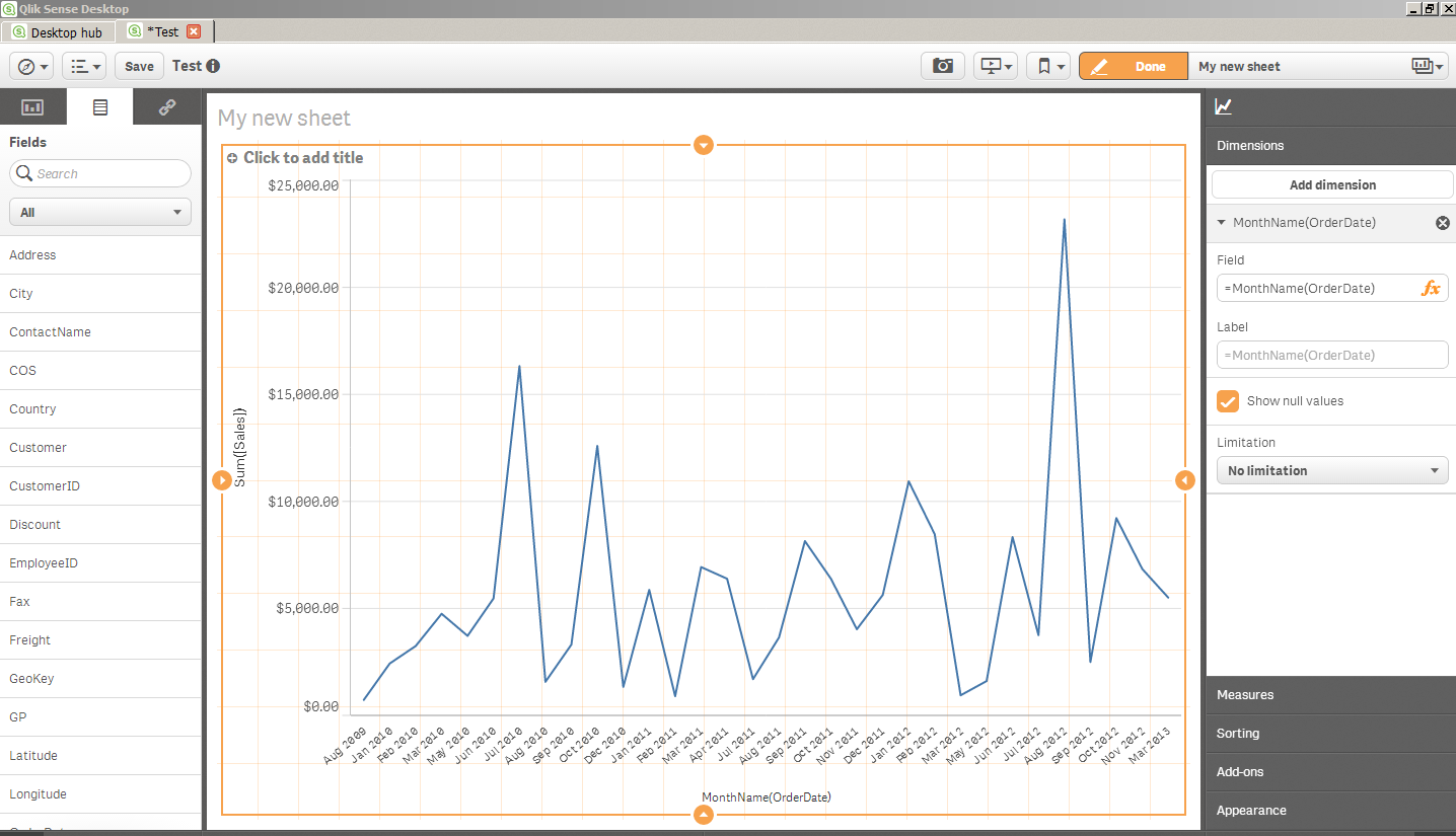
On the right side of this screenshot you'll notice that instead of [Order Date] showing for the Field, I replaced it with a function to 'group' the dates.
In this case i chose monthname() which gives me MMM-YYYY.
You can also try month() , year() etc.. etc... lots of options. Post back here if you can't find the format you want.
You can also put in a mask like this
Date( [Order Date], 'YYYY-MM')
To get say... 2001-01 , 2001-02 etc...
Its very flexible so post back here what would be your ideal grouping

- Mark as New
- Bookmark
- Subscribe
- Mute
- Subscribe to RSS Feed
- Permalink
- Report Inappropriate Content
Hi Jeff,
Another alternate you can use is to include a Master Calendar table in the data model, and link it with the revenue date field. Once created, you can show the different revenue dates grouped by quarter, month name, month number, year, etc. A sample script of the Master Calendar can be found in this QlikCommunity post:
Cheers,
Sean
- Mark as New
- Bookmark
- Subscribe
- Mute
- Subscribe to RSS Feed
- Permalink
- Report Inappropriate Content
But what if you want to show the individual day changes in the line chart, but show only months on the x-axis? For example, the FTSE-100 changes every day, but on the x-axis you want to show Jan, Feb, Mar and on the y-axis the index. I don't want to group it so I get an average for January, I want to see every individual movement but don't want to see every date on the x-axis. How do I do that?
- Mark as New
- Bookmark
- Subscribe
- Mute
- Subscribe to RSS Feed
- Permalink
- Report Inappropriate Content
Hi,
Have anyone found a solution on what Mark precised?
Thank you in advance.
Matteo