Unlock a world of possibilities! Login now and discover the exclusive benefits awaiting you.
- Qlik Community
- :
- Forums
- :
- Analytics
- :
- New to Qlik Analytics
- :
- Re: How can I change the default colour of line ch...
- Subscribe to RSS Feed
- Mark Topic as New
- Mark Topic as Read
- Float this Topic for Current User
- Bookmark
- Subscribe
- Mute
- Printer Friendly Page
- Mark as New
- Bookmark
- Subscribe
- Mute
- Subscribe to RSS Feed
- Permalink
- Report Inappropriate Content
How can I change the default colour of line chart in a Combo Chart (Qlik Sense)
Hi,
Hope you are all well, just a quick question about combo chart (sorry if its a silly Q, I am totally new to Qlik)
I am using Qlik Sense and I have created a combo chart with a stacked bar chart and two line charts.
The default colours for these line charts unfortunately looks the same and I couldn't find any way to change these default colours.
Please advise.
Many thanks in advance
Arun
- Mark as New
- Bookmark
- Subscribe
- Mute
- Subscribe to RSS Feed
- Permalink
- Report Inappropriate Content
You can set the colours by using an expression at the color and legend tab:
if(Variable = 'X',(0,0,0),
if(Variable = 'Y',(255,255,255))
But you have to define every line and bar and the legend won't be visible anymore..
- Mark as New
- Bookmark
- Subscribe
- Mute
- Subscribe to RSS Feed
- Permalink
- Report Inappropriate Content
How did you manage to stack the bars in the native QS Combo Chart?
- Mark as New
- Bookmark
- Subscribe
- Mute
- Subscribe to RSS Feed
- Permalink
- Report Inappropriate Content
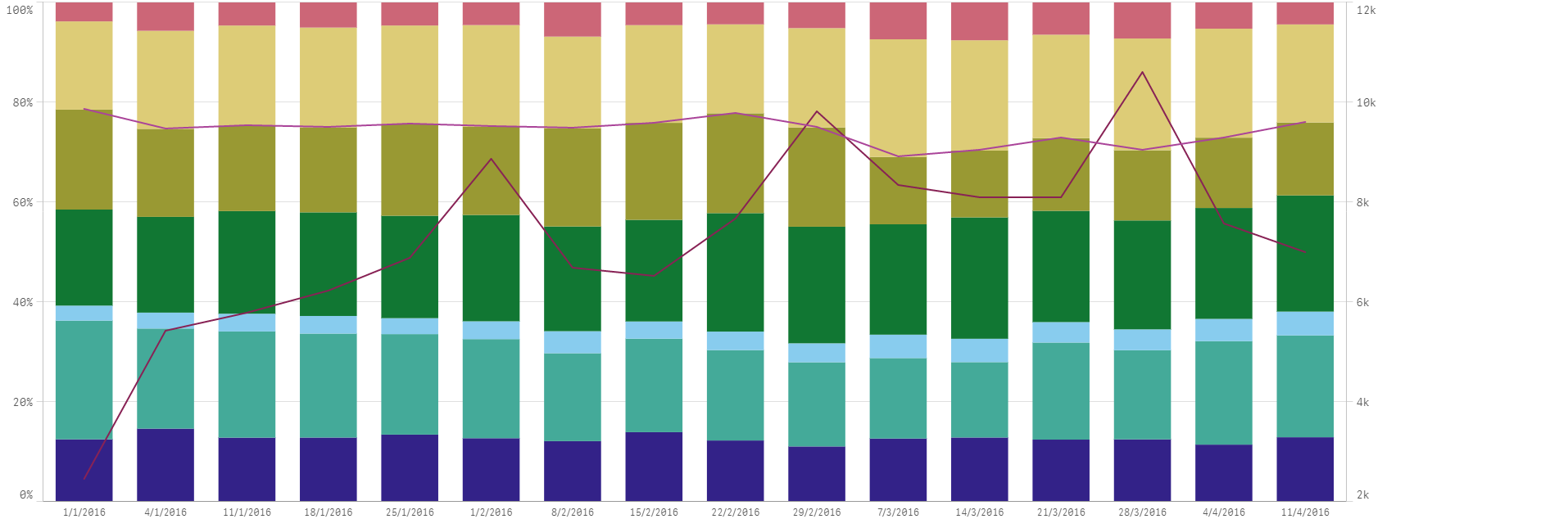
Hi Martin,
I have done that by stacking my 7 measures (calculated the proportion of each by expression; which combinedly adds to 100%) . Please find screenshot attached and as you can see QS by default assigned pretty much the same colour to the two lines which is not of much use if we can't change it. Hope this makes sense.
Thanks
Arun
- Mark as New
- Bookmark
- Subscribe
- Mute
- Subscribe to RSS Feed
- Permalink
- Report Inappropriate Content
You would need to create your own theme to alter the colors - which is not too complicated, albeit not supported by Qlik, yet.
- Mark as New
- Bookmark
- Subscribe
- Mute
- Subscribe to RSS Feed
- Permalink
- Report Inappropriate Content
Thanks, Isabelle but there is no option to colour by expression in this case 
- Mark as New
- Bookmark
- Subscribe
- Mute
- Subscribe to RSS Feed
- Permalink
- Report Inappropriate Content
Thanks Martin, are the themes something we can add to the chart within QS itself?
- Mark as New
- Bookmark
- Subscribe
- Mute
- Subscribe to RSS Feed
- Permalink
- Report Inappropriate Content
Unfortunately no - themes are applied to the whole sheet.
Alternatively, if you have the skill & time, I would recommending using the below library to create an extension object for your use case: