Unlock a world of possibilities! Login now and discover the exclusive benefits awaiting you.
- Qlik Community
- :
- All Forums
- :
- Visualization and Usability
- :
- How to change individual line chart according to f...
- Subscribe to RSS Feed
- Mark Topic as New
- Mark Topic as Read
- Float this Topic for Current User
- Bookmark
- Subscribe
- Mute
- Printer Friendly Page
- Mark as New
- Bookmark
- Subscribe
- Mute
- Subscribe to RSS Feed
- Permalink
- Report Inappropriate Content
How to change individual line chart according to fields?
Hi,
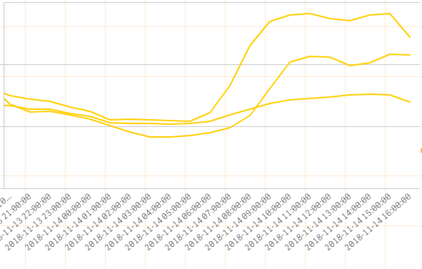
I plotted 3 fields in time series and all 3 line charts are of different colors. My table is as below:
date| price| 75 percentile | 25 percentile |
18 | 8 | 10 | 6 |
19 | 9 | 11 | 7 |
20 | 10 | 12 | 5 |
I have tried something like if (price=price,Red(),Blue()) but it will not even show the price chart.
I wanted price to be in 1 colour and the percentile to be another but 25 percentile colour is same as 75 percentile. How can I code the expression?
- Tags:
- color
- line chart
Accepted Solutions
- Mark as New
- Bookmark
- Subscribe
- Mute
- Subscribe to RSS Feed
- Permalink
- Report Inappropriate Content
Hi,
Create 3 master items (measures). One for price, one for 75 percentile and one for 25 percentile. You can then set a color manually for each measure. After that you can add those measure in your chart and set coloring to auto.
Check from 2.04 in this video:
- Mark as New
- Bookmark
- Subscribe
- Mute
- Subscribe to RSS Feed
- Permalink
- Report Inappropriate Content
Hi,
I have created a measure for sum(price), named it as price and measure color black but my price chart did not change to blank when I choose single colour.
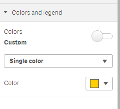
Under my single colour, I also do not have the "use library colours" option. But I have the colour options for all charts. When I change the colour, all lines changed together.
- Mark as New
- Bookmark
- Subscribe
- Mute
- Subscribe to RSS Feed
- Permalink
- Report Inappropriate Content
Hi,
I finally managed to did it. Following the master item example, I had to re-create the chart using master item.

