Unlock a world of possibilities! Login now and discover the exclusive benefits awaiting you.
- Qlik Community
- :
- Forums
- :
- Analytics
- :
- New to Qlik Analytics
- :
- Re: How to compare sales data for 2 select months.
- Subscribe to RSS Feed
- Mark Topic as New
- Mark Topic as Read
- Float this Topic for Current User
- Bookmark
- Subscribe
- Mute
- Printer Friendly Page
- Mark as New
- Bookmark
- Subscribe
- Mute
- Subscribe to RSS Feed
- Permalink
- Report Inappropriate Content
How to compare sales data for 2 select months.
Hello,
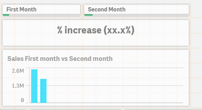
I have some monthly sales data since 2010 and wanted to create a dashboard where a user can compare 2 separate YearMonth sales by using 2 different dropdowns/filters. These 2 months can be anything eg Jan-2013 vs March-2019 etc etc. After applying the 2 filters a user should see a bar chart having the sales of the 2 compared months and an addition KPI chart which contains the difference of the values based on the filter 1. I have the Year.autoCalender.YearMonth that can be used if required. A sample of what I have in mind is shown below.
Please let me know if you require any further information.
Thank you
- Tags:
- new to qlik sense
Accepted Solutions
- Mark as New
- Bookmark
- Subscribe
- Mute
- Subscribe to RSS Feed
- Permalink
- Report Inappropriate Content
- Mark as New
- Bookmark
- Subscribe
- Mute
- Subscribe to RSS Feed
- Permalink
- Report Inappropriate Content
Hi Skate,
please find attached Solution.
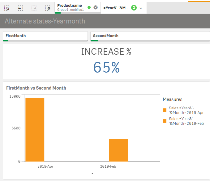
Here is the solution for your Query.We can achieve your problem with Alternate States.
If you want to perform comparative analysis you can use alternate states in QlikSense. Alternate states allow you to make different selections on the same dimension, and compare the selections in a single visualization or in two or more visualizations side by side.
Regards,
raji
- Mark as New
- Bookmark
- Subscribe
- Mute
- Subscribe to RSS Feed
- Permalink
- Report Inappropriate Content
i have tried your problem.please find the attached solution
- Mark as New
- Bookmark
- Subscribe
- Mute
- Subscribe to RSS Feed
- Permalink
- Report Inappropriate Content
This is exactly what I wanted, thank you very much Raji.
- Mark as New
- Bookmark
- Subscribe
- Mute
- Subscribe to RSS Feed
- Permalink
- Report Inappropriate Content
Hi Raji,
Can we perform this task in a similar way but with only 1 filter where the data gets automatically compared to 12 months ago data ? eg if I select 2016 jan+feb data gets compared to 205 jan+feb etc ?

