Unlock a world of possibilities! Login now and discover the exclusive benefits awaiting you.
Announcements
Introducing Qlik Answers: A plug-and-play, Generative AI powered RAG solution.
READ ALL ABOUT IT!
- Qlik Community
- :
- Forums
- :
- Analytics
- :
- New to Qlik Analytics
- :
- Re: How to count qualitative data & create bar cha...
Options
- Subscribe to RSS Feed
- Mark Topic as New
- Mark Topic as Read
- Float this Topic for Current User
- Bookmark
- Subscribe
- Mute
- Printer Friendly Page
Turn on suggestions
Auto-suggest helps you quickly narrow down your search results by suggesting possible matches as you type.
Showing results for
Contributor
2019-02-08
03:15 AM
- Mark as New
- Bookmark
- Subscribe
- Mute
- Subscribe to RSS Feed
- Permalink
- Report Inappropriate Content
How to count qualitative data & create bar charts in analysis
Hi everyone
I have a table with lots of qualitative data and am trying to create charts to analyse them. The fields are something like this:
| Customer | Main Issue | Second Issue |
| ACME | Slow processing | Customer Service |
| Jovan | Online bookings | Customer Service |
| Regional A | Slow processing | Online bookings |
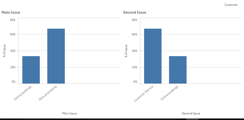
I want to be able to create a visualisation that tells me the % of Main Issue, and then another one with the % of the Second Issue.
Many thanks from a beginner!
1,144 Views
1 Solution
Accepted Solutions
Partner - Master
2019-02-08
10:06 AM
- Mark as New
- Bookmark
- Subscribe
- Mute
- Subscribe to RSS Feed
- Permalink
- Report Inappropriate Content
Hi Starter,
You can do the following:
Make a Bar Chart
Dimension: Main Issue
Measure 1: Count([Main Issue]) / Count(TOTAL [Main Issue])
Do this also for the Second Issue etc.
Jordy
Climber
Work smarter, not harder
2 Replies
Partner - Master
2019-02-08
10:06 AM
- Mark as New
- Bookmark
- Subscribe
- Mute
- Subscribe to RSS Feed
- Permalink
- Report Inappropriate Content
Hi Starter,
You can do the following:
Make a Bar Chart
Dimension: Main Issue
Measure 1: Count([Main Issue]) / Count(TOTAL [Main Issue])
Do this also for the Second Issue etc.
Jordy
Climber
Work smarter, not harder
Contributor
2019-02-10
06:15 AM
Author
- Mark as New
- Bookmark
- Subscribe
- Mute
- Subscribe to RSS Feed
- Permalink
- Report Inappropriate Content
Thanks Jordy for the quick help 🙂
It worked!
1,110 Views
Community Browser