Unlock a world of possibilities! Login now and discover the exclusive benefits awaiting you.
- Qlik Community
- :
- Forums
- :
- Analytics
- :
- New to Qlik Analytics
- :
- Re: How to create a bar chart with two dimensions ...
- Subscribe to RSS Feed
- Mark Topic as New
- Mark Topic as Read
- Float this Topic for Current User
- Bookmark
- Subscribe
- Mute
- Printer Friendly Page
- Mark as New
- Bookmark
- Subscribe
- Mute
- Subscribe to RSS Feed
- Permalink
- Report Inappropriate Content
How to create a bar chart with two dimensions (one with multiple and another with two variables)
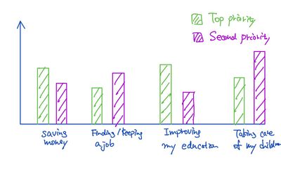
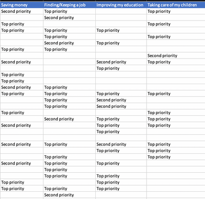
I am new to Qlik sense and trying to learn. I am trying to create a bar chart that has two dimensions (one dimension with several variables and another with two variables.) My dataset and the image of my intended bar chart are shown below. What should I set for the dimensions and measure? Should I revise my dataset?
Accepted Solutions
- Mark as New
- Bookmark
- Subscribe
- Mute
- Subscribe to RSS Feed
- Permalink
- Report Inappropriate Content
I'm assuming each row in your data set represents a single case or scenario and the bars in the bar chart reflect the number of cases/scenarios.
(Using CrossTable load) Convert the data into a format like:
Case / Goal / Priority
1 / Saving Money / Second
1 / Finding Job / Top
1 / Taking Care of Children / Top
2 / Finding Job / Second
etc
Dimensions : Goal & Priority
Measure: count(Case)
- Mark as New
- Bookmark
- Subscribe
- Mute
- Subscribe to RSS Feed
- Permalink
- Report Inappropriate Content
For the attached XL, the load script is:
CrossTable(Goal, Priority)
LOAD Case,
[Save Money],
[Finding Job],
Education,
Children
FROM
[H:\Documents\Priorities.xlsx]
(ooxml, embedded labels, table is Sheet1);
(I used QlikView which has a wizard to build it for you!)
- Mark as New
- Bookmark
- Subscribe
- Mute
- Subscribe to RSS Feed
- Permalink
- Report Inappropriate Content
I'm assuming each row in your data set represents a single case or scenario and the bars in the bar chart reflect the number of cases/scenarios.
(Using CrossTable load) Convert the data into a format like:
Case / Goal / Priority
1 / Saving Money / Second
1 / Finding Job / Top
1 / Taking Care of Children / Top
2 / Finding Job / Second
etc
Dimensions : Goal & Priority
Measure: count(Case)
- Mark as New
- Bookmark
- Subscribe
- Mute
- Subscribe to RSS Feed
- Permalink
- Report Inappropriate Content
- Mark as New
- Bookmark
- Subscribe
- Mute
- Subscribe to RSS Feed
- Permalink
- Report Inappropriate Content
For the attached XL, the load script is:
CrossTable(Goal, Priority)
LOAD Case,
[Save Money],
[Finding Job],
Education,
Children
FROM
[H:\Documents\Priorities.xlsx]
(ooxml, embedded labels, table is Sheet1);
(I used QlikView which has a wizard to build it for you!)
- Mark as New
- Bookmark
- Subscribe
- Mute
- Subscribe to RSS Feed
- Permalink
- Report Inappropriate Content

