Unlock a world of possibilities! Login now and discover the exclusive benefits awaiting you.
- Qlik Community
- :
- All Forums
- :
- Visualization and Usability
- :
- How to create stacked bar chart with line ?
- Subscribe to RSS Feed
- Mark Topic as New
- Mark Topic as Read
- Float this Topic for Current User
- Bookmark
- Subscribe
- Mute
- Printer Friendly Page
- Mark as New
- Bookmark
- Subscribe
- Mute
- Subscribe to RSS Feed
- Permalink
- Report Inappropriate Content
How to create stacked bar chart with line ?
Dear friends,
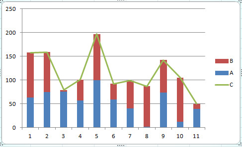
Do anyone know how to create a stacked bar chart, with line in Qlik Sense ? Please see attached image which is what I expect. Number of lIne C is sum of A and B.
Thank you.

- « Previous Replies
-
- 1
- 2
- Next Replies »
Accepted Solutions
- Mark as New
- Bookmark
- Subscribe
- Mute
- Subscribe to RSS Feed
- Permalink
- Report Inappropriate Content
Combo Chart will support one Dimension and more than one expression.
1. Add one dimension
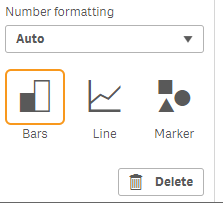
2. Create measure A Eg: Sum(Sales) - Set as Bars
3. Create measure B Eg: Sum(ShippingCost) - Set as Bars
4. Create measure C: Sum(Sales) + Sum(ShippingCost) - Set as Line
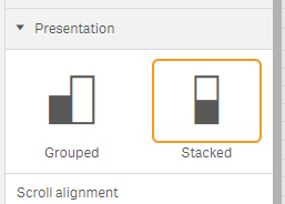
5. In the Appearance -> Presentation > Stacked
- Mark as New
- Bookmark
- Subscribe
- Mute
- Subscribe to RSS Feed
- Permalink
- Report Inappropriate Content
Hi! This is possible with a combo chart.
- Mark as New
- Bookmark
- Subscribe
- Mute
- Subscribe to RSS Feed
- Permalink
- Report Inappropriate Content
Combo Chart will support one Dimension and more than one expression.
1. Add one dimension
2. Create measure A Eg: Sum(Sales) - Set as Bars
3. Create measure B Eg: Sum(ShippingCost) - Set as Bars
4. Create measure C: Sum(Sales) + Sum(ShippingCost) - Set as Line
5. In the Appearance -> Presentation > Stacked
- Mark as New
- Bookmark
- Subscribe
- Mute
- Subscribe to RSS Feed
- Permalink
- Report Inappropriate Content
Thank you so much for this clear guide. I made it and shared with my colleagues. Have a good day to you !
- Mark as New
- Bookmark
- Subscribe
- Mute
- Subscribe to RSS Feed
- Permalink
- Report Inappropriate Content
Thank you. I have made it based on another answer.![]()
- Mark as New
- Bookmark
- Subscribe
- Mute
- Subscribe to RSS Feed
- Permalink
- Report Inappropriate Content
I am using Qlik Sense Enterprise version and I don't see stacked Bar. I only see side-by-side bar chart, in the Combo chart option. Please suggest how do I create stacked chart with line
Thank you,
- Mark as New
- Bookmark
- Subscribe
- Mute
- Subscribe to RSS Feed
- Permalink
- Report Inappropriate Content
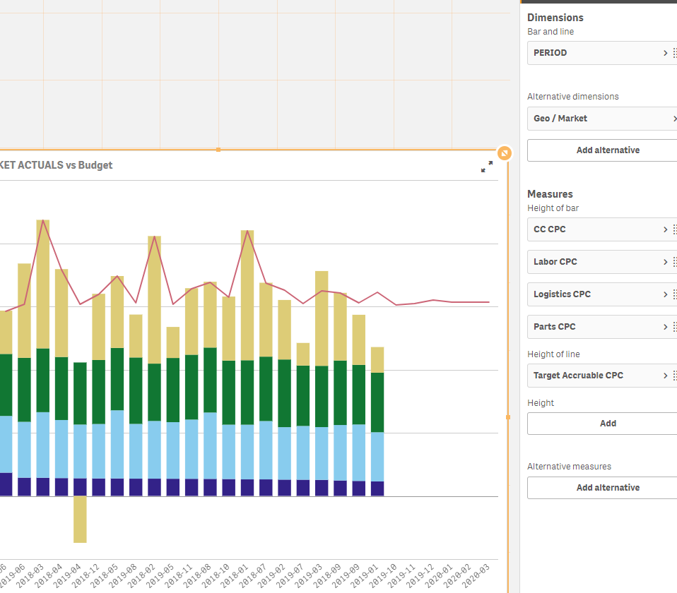
I just solved this in the Enterprise edition by using the Qlik Sense Combo Chart. The trick is to cut the individual stack elements (A, B,C) into separate measures using the set analyses (e.g. measure A=sum({$<CATEGORY={'A'}>} Sales), B=sum({$<CATEGORY={'B'}>} Sales)...)
This solution works good if you have reasonable number of categories (A,B,C) that stack up to the total measure (here Sales), or you would build say 4 measures for the biggest categories and the rest would just be as 'Other' (of course the number of stacks depends on you, but you have to build each separately as a measure).
This makes it possible to stack the individual measures (A,B,C..) on top of each other to show as the total (Sales)...
Here is my actual solution in my scenario:
Just select the Stacked option in Presentation:
If you add a line (like a target ) then switch the line to Primary Axes
- Mark as New
- Bookmark
- Subscribe
- Mute
- Subscribe to RSS Feed
- Permalink
- Report Inappropriate Content
Hello,
You can also vote on
Best regards,
Simon
- Mark as New
- Bookmark
- Subscribe
- Mute
- Subscribe to RSS Feed
- Permalink
- Report Inappropriate Content
Hi, I have a combo chart with two bars (stacked) and two lines and I want the two lines also to be stacked like the bars. Is there any possibility to do that??
Thanks,
Anil
- Mark as New
- Bookmark
- Subscribe
- Mute
- Subscribe to RSS Feed
- Permalink
- Report Inappropriate Content
Hi all, is there a way for the line total to not be presented in a label in the chart when you hover over the bars? Because I believe for the user can be confusing!
- « Previous Replies
-
- 1
- 2
- Next Replies »


