Unlock a world of possibilities! Login now and discover the exclusive benefits awaiting you.
- Qlik Community
- :
- All Forums
- :
- Visualization and Usability
- :
- Re: How to style straight table border color in Ql...
- Subscribe to RSS Feed
- Mark Topic as New
- Mark Topic as Read
- Float this Topic for Current User
- Bookmark
- Subscribe
- Mute
- Printer Friendly Page
- Mark as New
- Bookmark
- Subscribe
- Mute
- Subscribe to RSS Feed
- Permalink
- Report Inappropriate Content
How to style straight table border color in Qlik Sense Cloud
I've tried to edit the theme.css file and added this
.qv-st table {
border: 1px solid #666666 !important;
}
zipped the theme and uploaded it in the SaaS QMC.
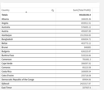
but it has no effect on the straight table. The borders are still barely visible...
How can I change the cell's border color to a darker color?
- « Previous Replies
-
- 1
- 2
- Next Replies »
- Mark as New
- Bookmark
- Subscribe
- Mute
- Subscribe to RSS Feed
- Permalink
- Report Inappropriate Content
Hi,
If you want something like this, then you gotta find the correct division/class for the object. In your above instance you need to change the values for the cells data, so basically you need to apply the properties to the data cell class of the object.
border-color: black!important;

- Mark as New
- Bookmark
- Subscribe
- Mute
- Subscribe to RSS Feed
- Permalink
- Report Inappropriate Content
Hi DeepanshuSh,
Thanks for your reply. I tried
.qv-st-data-cell {
    border-color: black!important;
}
but it has no effect. Is this supposed to work with Qlik Sense SaaS?
- Mark as New
- Bookmark
- Subscribe
- Mute
- Subscribe to RSS Feed
- Permalink
- Report Inappropriate Content
Thanks @deepanshuSh, I tried again, now its working. How can I find the correct class/division? Is there a list somewhere?
- Mark as New
- Bookmark
- Subscribe
- Mute
- Subscribe to RSS Feed
- Permalink
- Report Inappropriate Content
There is no such list, you can try to youtube or google it how to find the parent class of CSS element using inspect element. Maybe, I will try to create a tutorial of a kind over the weekend if time permits.
- Mark as New
- Bookmark
- Subscribe
- Mute
- Subscribe to RSS Feed
- Permalink
- Report Inappropriate Content
@deepanshuSh I tried to find out with google, but the usual inspect functionality from Chrome isn't working.
I posted this as a general question here: https://community.qlik.com/t5/New-to-Qlik-Sense/How-to-find-out-CSS-classes-for-designing-themes/m-p...
A short tutorial would be highly appreciated, I found several other posts here people asking for this.
- Mark as New
- Bookmark
- Subscribe
- Mute
- Subscribe to RSS Feed
- Permalink
- Report Inappropriate Content
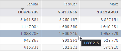
Here is my final solution for straight table CSS with alternating row colors (sort function is working too!) and a nice hover effect on the rows.
/* format straight tables */
.qv-st-header-cell {
    border: 1px solid #999999 !important;
    background: #e6e6e6 !important;
}
.qv-st-header-cell-search:hover {
    background: #a7b8cc !important;
}
.qv-st tr:hover {
    background: #a7b8cc !important;
}
.qv-st-data-cell {
    border: 1px solid #999999 !important;
}
.qv-st-data-row {
    background-color: #f6f6f6;
}
.qv-st-data-row tr:nth-child(odd){
    background-color: #f6f6f6 !important;
}
.qv-st-total-cell {
    background-color: #e6e6eb !important;
}

/* format pivot tables */
.qv-pt .cell {
    border: 1px solid #999999 !important;
}
now I want the same look on pivot tables...
- Mark as New
- Bookmark
- Subscribe
- Mute
- Subscribe to RSS Feed
- Permalink
- Report Inappropriate Content
Sure, will try to find some time and create a user friendly tutorial for everyone. A basic understanding on how to use CSS can be taken from my channel on which I recently started with some basic tutorials.
https://www.youtube.com/channel/UCTXsf7RJpMkdsPUlbJuVQYA
Will post out the new tutorial on how to find out class and some more cool effects using CSS by the weekend.
- Mark as New
- Bookmark
- Subscribe
- Mute
- Subscribe to RSS Feed
- Permalink
- Report Inappropriate Content
Good work, for most of the changes that you made you don't need the CSS, it is part of basic functionality of tables and pivot tables, by using custom coloring and styling options on presentation tab.
- Mark as New
- Bookmark
- Subscribe
- Mute
- Subscribe to RSS Feed
- Permalink
- Report Inappropriate Content
@deepanshuSh That would be great! I'm aware of including CSS indivually to sheets using object ID. But what we are looking for are the dafault classes we can use in our theme. Thats why I modified the straight tables via the global theme.css file, is that it saves a lot of work if its done once globally. So our designer dont need to think about it every time, just add a table and fill it with data. And every table looks the same now everywhere.
- « Previous Replies
-
- 1
- 2
- Next Replies »

