Unlock a world of possibilities! Login now and discover the exclusive benefits awaiting you.
- Qlik Community
- :
- Forums
- :
- Analytics
- :
- New to Qlik Analytics
- :
- Label and data value together in a pie chart
- Subscribe to RSS Feed
- Mark Topic as New
- Mark Topic as Read
- Float this Topic for Current User
- Bookmark
- Subscribe
- Mute
- Printer Friendly Page
- Mark as New
- Bookmark
- Subscribe
- Mute
- Subscribe to RSS Feed
- Permalink
- Report Inappropriate Content
Label and data value together in a pie chart
Hi All,
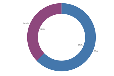
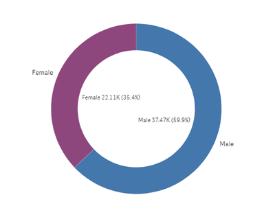
I have a donut chart and the labels are male and female. Now the data values are coming inside the donut chart and the labels are outside the donut chart. Is there any way i can put data values under the label. So i am looking for Female(22.11K) and Male(37.47K)
Thanks
- « Previous Replies
-
- 1
- 2
- Next Replies »
Accepted Solutions
- Mark as New
- Bookmark
- Subscribe
- Mute
- Subscribe to RSS Feed
- Permalink
- Report Inappropriate Content
Okay, so I put this in Qlik Cloud using the standard Pie Chart.
Dummy Data:
Gender:
load * Inline [
Gender, Column
Female, 22000
Female, 1100
Male, 37000
Male, 400
Male, 200
];
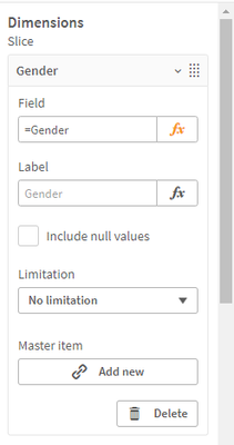
Dimension: Slice
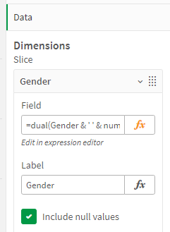
=dual(Gender & ' ' & num(AGGR(Count(distinct[Column] ),Gender)/1000,'#,###K')
& ' (' & num(AGGR(Count(distinct[Column] ),Gender)/AGGR(COUNT(total DISTINCT [Column]), Gender),'#0.0%') & ')',
num(AGGR(Count(distinct[Column] ),Gender)/1000,'#,###K') )
Measure: Angle
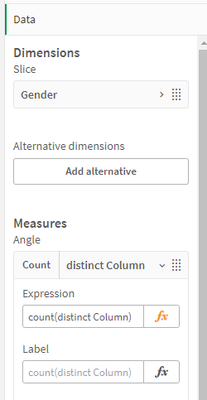
Count(distinct Column)
Appearance > Presentation > Donut Chart
Value Labels Off
Custom > None
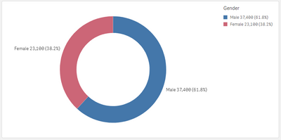
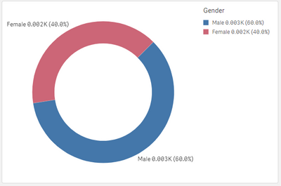
These are the only steps I took in creating the below chart.
You could try simplifying down to just the Dimension and the amount and break it down.
=dual(Gender & ' ' & num(AGGR(Count(distinct[Column] ),Gender)/1000,'#,###K')
,num(AGGR(Count(distinct[Column] ),Gender)/1000,'#,###K') )
I did notice when I copied and pasted the above into the dimension that if it wasn't on the top line it would add an extra "=" sign which caused the same error you saw above.
Let me know how you go.
Thanks
Anthony
- Mark as New
- Bookmark
- Subscribe
- Mute
- Subscribe to RSS Feed
- Permalink
- Report Inappropriate Content
Sorry but i checked everything in my app and in the help pages for the latest version.

That level of dimension/expression presentation customization does not appear to be available.
You can submit your idea here however. Ideas | Qlik Community
Kind regards...
- Mark as New
- Bookmark
- Subscribe
- Mute
- Subscribe to RSS Feed
- Permalink
- Report Inappropriate Content
Hi @Pragya ,
This reminded me of something I saw in one of Patric Nordstrom's Top 10 Viz Tips Part VI (Embedded Labels)
In this he did it it with a slope graph but I managed to get the same effect by amending the dimension.
To achieve this, instead of only using the column name in the dimension I used the below formula.
=dual(Gender & ' ' & num(aggr(sum(Value),Gender),'###,###') & ' (' & num(aggr(sum(Value),Gender)/aggr(sum(total Value),Gender),'##.#%') & ')'
, num(aggr(sum(Value),Gender),'###,###'))
The bold section creates the percentage share in the brackets. Go into the presentation and turn off the Value Labels.
I hope this helps.
Regards
Anthony
- Mark as New
- Bookmark
- Subscribe
- Mute
- Subscribe to RSS Feed
- Permalink
- Report Inappropriate Content
Hi AnthonyJ,
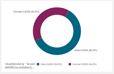
I tried and i am getting the pie chart like this
Am i able to remove the original dimension labels.
My expression is:
dual(Gender & ' ' & num(Count(distinct[Column] )/1000,'#,###K')
& ' (' & num(Count(distinct[Column] )/sum(total Aggr(COUNT(DISTINCT School),[Column])),'#0.0%') & ')',
Count(distinct[Column]))
- Mark as New
- Bookmark
- Subscribe
- Mute
- Subscribe to RSS Feed
- Permalink
- Report Inappropriate Content
Hi,
By the looks of the chart the value is in the middle and dimension is on the outside. It looks like you've added the expression to the measure. (I may be wrong). The DUAL function code goes on the Dimension instead of the Measure. The fact that your counts aren't wrapped in the Aggr() function would cause an error if placed in a dimension. Try this.
Dimension:
dual(Gender & ' ' & num(AGGR(Count(distinct[Column] ),Gender)/1000,'#,###K')
& ' (' & num(AGGR(Count(distinct[Column] ),Gender)/AGGR(COUNT(total DISTINCT [Column]), Gender),'#0.0%') & ')',
num(AGGR(Count(distinct[Column] ),Gender)/1000,'#,###K') )
Measure:
Count(distinct [Column])
Doing it this way, The Dimension values will include the counts and percentages and you won't need to turn them off. You will, however be able to the Presentation section and turn off Value Labels.
I noticed that you added a count of school as the denominator for the percentage however I think this is going to cause incorrect values. I see your percentages of the two sections don't add up to 100%. The calculation for percentages over the dimension column needs to be in the format of count(distinct Column) / count(TOTAL distinct Column).
I hope this helps clear things up. If not let me know.
Thanks
Anthony
- Mark as New
- Bookmark
- Subscribe
- Mute
- Subscribe to RSS Feed
- Permalink
- Report Inappropriate Content
Hi Anthonyj,
Thanks for your reply.
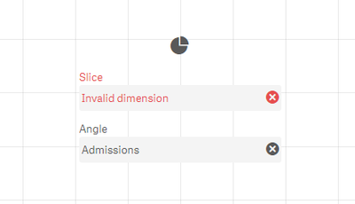
i tried putting the formula in dimension and i got this message
Dimension:
dual(Gender & ' ' & num(AGGR(Count(distinct[Column] ),Gender)/1000,'#,###K')
& ' (' & num(AGGR(Count(distinct[Column] ),Gender)/AGGR(COUNT(total DISTINCT [Column]), Gender),'#0.0%') & ')',
num(AGGR(Count(distinct[Column] ),Gender)/1000,'#,###K') )
Measure:
Count(distinct [Column])
I got his error message
- Mark as New
- Bookmark
- Subscribe
- Mute
- Subscribe to RSS Feed
- Permalink
- Report Inappropriate Content
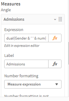
When i do opposite
Dimension
Gender
Measure
dual(Gender & ' ' & num(AGGR(Count(distinct[Column] ),Gender)/1000,'#,###K')
& ' (' & num(AGGR(Count(distinct[Column] ),Gender)/Aggr(COUNT(total DISTINCT [Column]), Gender),'#0.0%') & ')',
Count(distinct[Column]))
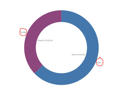
I get this donut chart
- Mark as New
- Bookmark
- Subscribe
- Mute
- Subscribe to RSS Feed
- Permalink
- Report Inappropriate Content
That's weird because when I copy and paste the code that you said gets the error into my Dimension and only have count(Distinct Column).
- Mark as New
- Bookmark
- Subscribe
- Mute
- Subscribe to RSS Feed
- Permalink
- Report Inappropriate Content
- Mark as New
- Bookmark
- Subscribe
- Mute
- Subscribe to RSS Feed
- Permalink
- Report Inappropriate Content
I am working on Qlik Cloud. Is that the difference.
- « Previous Replies
-
- 1
- 2
- Next Replies »
