Unlock a world of possibilities! Login now and discover the exclusive benefits awaiting you.
- Qlik Community
- :
- Forums
- :
- Analytics
- :
- New to Qlik Analytics
- :
- Re: Link a table with a chart
- Subscribe to RSS Feed
- Mark Topic as New
- Mark Topic as Read
- Float this Topic for Current User
- Bookmark
- Subscribe
- Mute
- Printer Friendly Page
- Mark as New
- Bookmark
- Subscribe
- Mute
- Subscribe to RSS Feed
- Permalink
- Report Inappropriate Content
Link a table with a chart
Hi,
i have a chart with different dimensions and measures with script filters. I want to have a table in the sheet that depicts the data of the chart . How can i do this? It seems that the table shows a lot more data than the chart. It takes into account only the filter panes of the sheet. (Which seems logical)
Thank you.
Lawrence
Accepted Solutions
- Mark as New
- Bookmark
- Subscribe
- Mute
- Subscribe to RSS Feed
- Permalink
- Report Inappropriate Content
Two ways.
1. If there is a direct association on date then the table should automatically filter down
2. If the association is indirect then use set analysis to join the table dates where appropriate with the ones above something like
tablemonth=p(chartmonth) in your set analysis.
- Mark as New
- Bookmark
- Subscribe
- Mute
- Subscribe to RSS Feed
- Permalink
- Report Inappropriate Content
if you have the same dimensions as in your chart then you will not have any extra rows
If a post helps to resolve your issue, please accept it as a Solution.
- Mark as New
- Bookmark
- Subscribe
- Mute
- Subscribe to RSS Feed
- Permalink
- Report Inappropriate Content
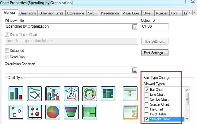
To view the tabular format of the chart you can select FAST Type change option in your Chart to switch to Straight table or pivot table view.
- Mark as New
- Bookmark
- Subscribe
- Mute
- Subscribe to RSS Feed
- Permalink
- Report Inappropriate Content
In this example I have a chart and table dynamically changing dimensions based on a variable I set. Is this what you are thinking of?
- Mark as New
- Bookmark
- Subscribe
- Mute
- Subscribe to RSS Feed
- Permalink
- Report Inappropriate Content
Hi, I think you are talking about Qlikview but i have Qliksense.
- Mark as New
- Bookmark
- Subscribe
- Mute
- Subscribe to RSS Feed
- Permalink
- Report Inappropriate Content
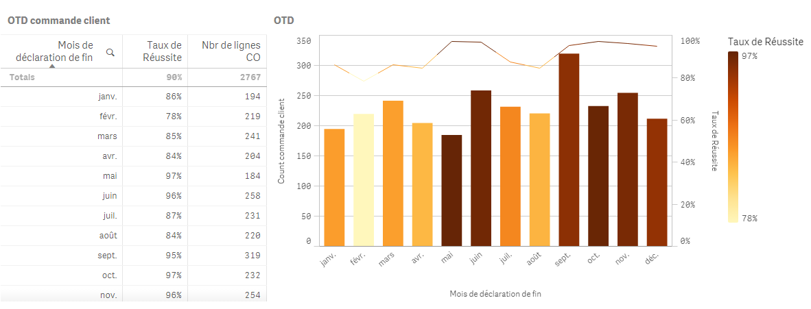 So, i have the above graph and info, mostly coming from set analysis. I would like to have the below table show exactly the data from the graph. If i choose for example January i should see only 194 lines in the table. How can i do this?
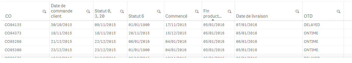
Thanks in advance,
Lawrence
- Mark as New
- Bookmark
- Subscribe
- Mute
- Subscribe to RSS Feed
- Permalink
- Report Inappropriate Content
depends how your underlying data model is setup.
If you have an association either directly or indirectly on January then your data in the third table will filter automatically.
Easiest way to check is to include the field in your third chart then filter on your other chart. If you add the field and January has a bunch of null values in the columns next to it then you know you need to do some work on your model.
Hope this helps
Andy
- Mark as New
- Bookmark
- Subscribe
- Mute
- Subscribe to RSS Feed
- Permalink
- Report Inappropriate Content
Hi there,
i have realized that what is missing are the duplicate line. This means that for every customer order there are several lines which the table does not show. This is why in the upper table i have always a bigger number of lines that the actual in the lower table.
Any ideas how can i align the 2 tables?
Thank you in advance,
Lawrence
- Mark as New
- Bookmark
- Subscribe
- Mute
- Subscribe to RSS Feed
- Permalink
- Report Inappropriate Content
Two ways.
1. If there is a direct association on date then the table should automatically filter down
2. If the association is indirect then use set analysis to join the table dates where appropriate with the ones above something like
tablemonth=p(chartmonth) in your set analysis.