Unlock a world of possibilities! Login now and discover the exclusive benefits awaiting you.
- Qlik Community
- :
- Forums
- :
- Analytics
- :
- New to Qlik Analytics
- :
- Re: Plotting bar graph with distinct time values
- Subscribe to RSS Feed
- Mark Topic as New
- Mark Topic as Read
- Float this Topic for Current User
- Bookmark
- Subscribe
- Mute
- Printer Friendly Page
- Mark as New
- Bookmark
- Subscribe
- Mute
- Subscribe to RSS Feed
- Permalink
- Report Inappropriate Content
Plotting bar graph with distinct time values
Hi,
I'm new to Qlik Sense and trying to create a simple visualization but struggling with what I wish to achieve.
I have table which looks like this
| BTimeHHMM | Destination |
|---|---|
| 09:43 | Home |
| 04:36 | Walking |
| 05:29 | Office |
| 08:52 | Walking |
| 09:07 | Pub |
| 09:57 | Walking |
| 13:44 | Office |
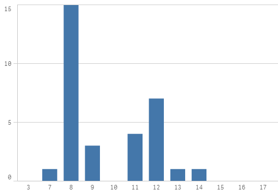
I was hoping to plot a bar graph with the count of how many times I have visited office during certain class of hours. So between
05:00 - 06:00 - 1
13:00 . 14:00 - 1
And so on.
Problem is that time keeps repeating itself.
OR something like the google popular time would also do
I would prefer to have the calculation in the dimension or measure rather than in the load script but this is just because editing the load script will break the data manager.
Thanks in advance.
Regards,
Biju
- Mark as New
- Bookmark
- Subscribe
- Mute
- Subscribe to RSS Feed
- Permalink
- Report Inappropriate Content
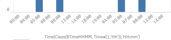
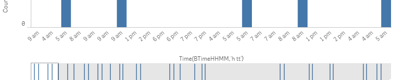
I think this can be done by simply using Time(BTimeHHMM,'h tt') as dimension.
- Mark as New
- Bookmark
- Subscribe
- Mute
- Subscribe to RSS Feed
- Permalink
- Report Inappropriate Content
Hi Glenn,
We have to implement a class here as I understand, so that all the visits during say 9-10, 10-11 etc need to be grouped as one.
I tried your suggestion and its great to see the plot being displayed in AM/PM but there are multiple entries for 09 for example and not just one entry on the X axis.
Thanks for your time and let me know if you have other suggestions.
- Mark as New
- Bookmark
- Subscribe
- Mute
- Subscribe to RSS Feed
- Permalink
- Report Inappropriate Content
My colleagues helped me with it. The trick was to load the data with the Left statement and cast into another variable.
statement that works
Left(Time([BeginTime], 'hh'),2) AS BHour;
statement that does not work
Time([BeginTime], 'hh') AS BHour