Unlock a world of possibilities! Login now and discover the exclusive benefits awaiting you.
- Qlik Community
- :
- All Forums
- :
- Visualization and Usability
- :
- Re: QS value on data point for stack bar chart it ...
- Subscribe to RSS Feed
- Mark Topic as New
- Mark Topic as Read
- Float this Topic for Current User
- Bookmark
- Subscribe
- Mute
- Printer Friendly Page
- Mark as New
- Bookmark
- Subscribe
- Mute
- Subscribe to RSS Feed
- Permalink
- Report Inappropriate Content
QS value on data point for stack bar chart it is possible ?
Hi All
I like to know the above it is possible for stack chart ? i try to set , unable to find it.
See my Enclosed QVF file.
Paul
Accepted Solutions
- Mark as New
- Bookmark
- Subscribe
- Mute
- Subscribe to RSS Feed
- Permalink
- Report Inappropriate Content
Gysbert is correct you have to get used to the fact Sense controls much more of the appearaNce than VIew. This is for 2 reasons:
1. The layout of you're sheet is responsive. sEnse is always trying to display your content in the best way for your device. To that end font size component parts of your charts will shrink/hide to accomedate the space. You need to accept this when designing your dashboards and set expectations accordingly
2. this is a product aimed at business users rather than developers as such it's good the charts are quick to build with minimalcustomisation points. It about quickly buildingviews discovering insights and moving on rather than a canned reporting approach which VIew is more suited to.
IF your values are not visible you as a user have a number of options
1 export the chart data to excel
2 change the visualtion type if values visibility is more important a table,pie or heat map could all work with your data and may in this case look better for your needs.
HOpe this helps
ANdy
- Mark as New
- Bookmark
- Subscribe
- Mute
- Subscribe to RSS Feed
- Permalink
- Report Inappropriate Content
Yes by going to Appearance> Presentation and click on stacked.
- Mark as New
- Bookmark
- Subscribe
- Mute
- Subscribe to RSS Feed
- Permalink
- Report Inappropriate Content
Hi Andy
Thank you for your help again.
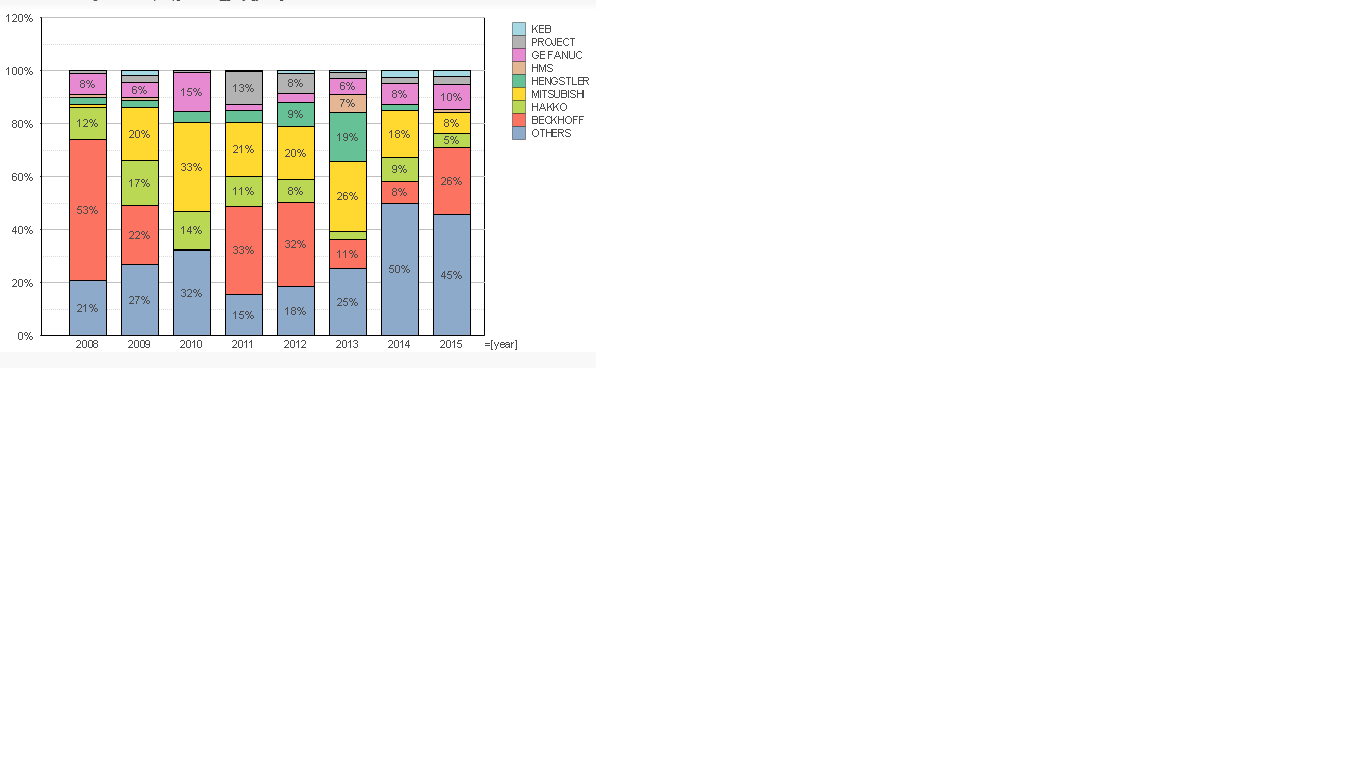
I have already tick stacked , but % still not display on the bar , what i mean is i need each color have a % value display on the bar , so that user can know the contribute on each product by month.

- Mark as New
- Bookmark
- Subscribe
- Mute
- Subscribe to RSS Feed
- Permalink
- Report Inappropriate Content
Hi Andy
I want to achieve like below , notice that each color have % value display.

- Mark as New
- Bookmark
- Subscribe
- Mute
- Subscribe to RSS Feed
- Permalink
- Report Inappropriate Content
That's not possible. You can set the option Value labels to Auto. But you won't get value labels inside the segments.
talk is cheap, supply exceeds demand
- Mark as New
- Bookmark
- Subscribe
- Mute
- Subscribe to RSS Feed
- Permalink
- Report Inappropriate Content
Gysbert is correct you have to get used to the fact Sense controls much more of the appearaNce than VIew. This is for 2 reasons:
1. The layout of you're sheet is responsive. sEnse is always trying to display your content in the best way for your device. To that end font size component parts of your charts will shrink/hide to accomedate the space. You need to accept this when designing your dashboards and set expectations accordingly
2. this is a product aimed at business users rather than developers as such it's good the charts are quick to build with minimalcustomisation points. It about quickly buildingviews discovering insights and moving on rather than a canned reporting approach which VIew is more suited to.
IF your values are not visible you as a user have a number of options
1 export the chart data to excel
2 change the visualtion type if values visibility is more important a table,pie or heat map could all work with your data and may in this case look better for your needs.
HOpe this helps
ANdy
- Mark as New
- Bookmark
- Subscribe
- Mute
- Subscribe to RSS Feed
- Permalink
- Report Inappropriate Content
Hi Andy
thank you for yr sharing. Your point are right.