Unlock a world of possibilities! Login now and discover the exclusive benefits awaiting you.
- Qlik Community
- :
- Forums
- :
- Analytics
- :
- New to Qlik Analytics
- :
- Re: Qlik Sense line chart forecast min-max
- Subscribe to RSS Feed
- Mark Topic as New
- Mark Topic as Read
- Float this Topic for Current User
- Bookmark
- Subscribe
- Mute
- Printer Friendly Page
- Mark as New
- Bookmark
- Subscribe
- Mute
- Subscribe to RSS Feed
- Permalink
- Report Inappropriate Content
Qlik Sense line chart forecast min-max
Hello experts,
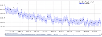
Can we build this line chart in QlikSense?
From 2018 to 2022 is forecast data. I know that we could create a line chart with 4 measure to display 4 lines, but i want to have the area between min and max colored.
- « Previous Replies
-
- 1
- 2
- Next Replies »
- Mark as New
- Bookmark
- Subscribe
- Mute
- Subscribe to RSS Feed
- Permalink
- Report Inappropriate Content
Anyone wanting a free example of this (with no user limit) you can use the WoW predictive line chart.
https://blog.webofwork.com/predictive-line-chart-for-qlik-sense/
- Mark as New
- Bookmark
- Subscribe
- Mute
- Subscribe to RSS Feed
- Permalink
- Report Inappropriate Content
Hi @Quy_Nguyen ,
Can you share how to create line for forecast, min and max?
- Mark as New
- Bookmark
- Subscribe
- Mute
- Subscribe to RSS Feed
- Permalink
- Report Inappropriate Content
Hi Adambrian,
Sorry for this late reply. Hope you already found the solution for it.
For this kind of forecasting data, I used SSE for the calculation. More info here: https://github.com/nabeel-oz/qlik-py-tools
- Mark as New
- Bookmark
- Subscribe
- Mute
- Subscribe to RSS Feed
- Permalink
- Report Inappropriate Content
Hi Quy_Nguyen,
Thanks for your solution, i'll try later
- Mark as New
- Bookmark
- Subscribe
- Mute
- Subscribe to RSS Feed
- Permalink
- Report Inappropriate Content
Hello Quy_Nguyen,
I found your post very useful. I have requirement to do the same thing in Qlik Sense.
However I already have the Min Max Actual and Forecast values coming in as fields from database. My challenge is to shade the area between Min and Max, something like the image attached. Could you please give some suggestions as to how it can be achieved using Vizlib Line Chart extension. As I understand we do not need to use the advanced section forecasting for this since I already have the forecasted values.
Any help will be highly appreciated.
Thanks
- « Previous Replies
-
- 1
- 2
- Next Replies »
