Unlock a world of possibilities! Login now and discover the exclusive benefits awaiting you.
- Qlik Community
- :
- Forums
- :
- Analytics
- :
- New to Qlik Analytics
- :
- Re: Qlik sep 2017: 'greying out' lines in line cha...
- Subscribe to RSS Feed
- Mark Topic as New
- Mark Topic as Read
- Float this Topic for Current User
- Bookmark
- Subscribe
- Mute
- Printer Friendly Page
- Mark as New
- Bookmark
- Subscribe
- Mute
- Subscribe to RSS Feed
- Permalink
- Report Inappropriate Content
Qlik sep 2017: 'greying out' lines in line chart when coloring by dimension
I've just updated to the Qlik Sense Sep. 2017 version, an has run into an issue with my line charts. I'm not sure whether this is a bug or just a undesirable feature:
I have a line-chart with an expression where I ignore the current selection on the field 'Year'. I looks something like this:
sum({<
Year=
>}Sales)
In my line chart I also have the dimensions Month ('Jan', 'Feb', etc) and the lines are colored by the Year dimension, making me a nice chart showing me a line for each year with each their own color.
So here's the issue: when I select a specific year, let's say 2017, the chart will still show me a line for each year, though, only the 2017-line will have a color - all the other lines will be light grey, making it impossible to compare the sales on a year-to-year basis.
It seems like, the coloring are ignoring the 'Year=' part of my script, though the lines are including it.
This issue wasn't there before I updated to the Sep. 2017 version.
- Mark as New
- Bookmark
- Subscribe
- Mute
- Subscribe to RSS Feed
- Permalink
- Report Inappropriate Content
I can totally follow you on this one, and I get the same behavior.
It's like the coloring doesn't respect the set analysis. Also the legend removes the description of the years, that has not been selected.
- Mark as New
- Bookmark
- Subscribe
- Mute
- Subscribe to RSS Feed
- Permalink
- Report Inappropriate Content
can you share sample application?
- Mark as New
- Bookmark
- Subscribe
- Mute
- Subscribe to RSS Feed
- Permalink
- Report Inappropriate Content
The attached app is an simple example using the test script.
Dim3 does here indicate the Year.
Would like to select a value in Dim3 while maintaining all there lines and their color in the chart.
- Mark as New
- Bookmark
- Subscribe
- Mute
- Subscribe to RSS Feed
- Permalink
- Report Inappropriate Content
Hi,
I experienced the same, looks like a bug I think.
Has someone reported this to Qlik support?
Regards
M.
- Mark as New
- Bookmark
- Subscribe
- Mute
- Subscribe to RSS Feed
- Permalink
- Report Inappropriate Content
Hi Monica,
I have reported it to Qlik Support - they are currently trying to recreate the issue.
BR
Lars
- Mark as New
- Bookmark
- Subscribe
- Mute
- Subscribe to RSS Feed
- Permalink
- Report Inappropriate Content
Hi Lars,
Did you get any response from Qlik support on this issue?
I have the same issue as yourself.
Thanks.
- Mark as New
- Bookmark
- Subscribe
- Mute
- Subscribe to RSS Feed
- Permalink
- Report Inappropriate Content
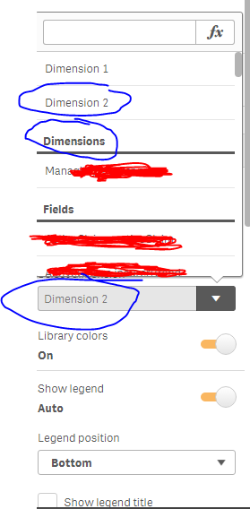
Make sure that you select "dimension 1" or "dimension 2" in the "Colors and legend", and not the Master Item Dimension containing the already set colors. Just like the snapshot below.
